The Ultimate Guide to High-Performance B2B Websites

By on June 20, 2024
A woman typing on a laptop

Ever stumbled upon a B2B website that made you want to hit the “back” button faster than you could say “lead generation”? You know, the kind that’s less than captivating and with information overload, broken links, and a loading time that could rival a snail’s pace?

If so, you’ve experienced firsthand the consequences of a poorly designed website—a missed opportunity for that business to capture your interest and potentially gain a valuable customer. You don’t want your website to be the one users flee from.

In this in-depth guide, we’ll cover the best practices, strategies, website features, and technical aspects it takes to build the best website for your B2B company—complete with design examples you can draw from. Let’s begin.

Understanding B2B Website Foundation

What is a B2B Website and How is it Different from B2C?

A B2B (Business-to-Business) website is for businesses selling products or services to other businesses. It facilitates transactions, showcases offerings, and enables communication between companies.

How is it different from Business-to-Customer (B2C) websites? Here’s a short summary of their key differences:

Feature B2B Website B2C Website
Target Audience Other businesses, organizations, and professionals Individual consumers
Purchase Decisions Often complex, involving multiple stakeholders and longer sales cycles Typically simpler and faster, driven by personal needs and preferences
Content Focus Product specifications, technical information, case studies, white papers Lifestyle imagery, emotional appeal, product benefits, customer reviews
Call-to-Action “Request a demo,” “Start your free trial,” “Contact us,” “Get a quote” “Buy now,” “Add to cart,” “Shop now”
Pricing Often customized or negotiated based on volume and specific requirements Usually fixed and displayed upfront
Relationship Focus Building long-term partnerships and fostering trust Generating immediate sales and encouraging repeat purchases

B2B websites serve several critical purposes. They:

  • Act as lead generation tools to attract potential clients and gather their contact information
  • Help establish long-term relationships by creating content that showcases your expertise
  • Enhance brand awareness which positions the company as a leader in its industry
  • Support the sales process by providing product catalogs, pricing information, and technical documentation
  • Offer customer support resources like self-service tools and knowledge bases

The ultimate goal of a B2B website is to drive sales. But the approach is more nuanced, focusing on building relationships, establishing credibility, and providing the information B2B companies need to make purchasing decisions.

Audience Identification

Understanding your target audience is the first step to creating a B2B website.
Why?
B2B buying cycles involve multiple decision-makers, with an average of six to ten stakeholders involved in the purchase decision. These buying cycles tend to be longer, with an average duration of 2.1 months. Plus, the stakes are often higher compared to B2C purchases since B2B transactions typically involve larger volumes and longer-term commitments.
Getting this right means identifying the key personas involved in the buying cycle. These personas typically include:

  • Decision-makers: These individuals have the final authority to approve the purchase. They typically focus on ROI, risk mitigation, and alignment with overall business goals.
  • Influencers: While they may not have the final say, their opinions and recommendations carry significant weight. They often possess technical expertise or a deep understanding of specific needs.
  • End-users: The individuals who will ultimately use the product or service. Their feedback on usability, functionality, and efficiency is invaluable.
  • Gatekeepers: These individuals control access to decision-makers and influencers. They often filter information and may have their own agendas.
  • Champions: Internal advocates who actively promote your solution within their organization. Their enthusiasm and influence can be crucial in driving the decision-making process.

Of course, you need to understand your audience’s pain points, motivations, and information-seeking behaviors to engage them.

How? By:

  • Conducting surveys and interviews
  • Speaking to your existing customer base
  • Analyzing industry trends
  • Chatting with your sales team and listening to sales recordings
  • Monitoring online conversations
  • Creating buyer personas

Investing time and resources in audience identification and research ensures you tailor your website to click with the right people.

Best Practices for High-Performance B2B Websites

These practices form the bedrock of successful B2B websites. They ensure you attract potential clients and guide them through the sales funnel.

Responsive Design

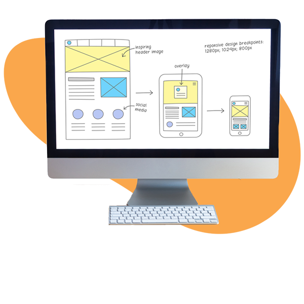
A responsive B2B web design automatically adjusts its layout and content to provide an optimal viewing experience across various devices, including desktops, tablets, and smartphones.

Why is this important? In the last quarter of 2023 alone, mobile devices (excluding tablets) generated almost 60% of global website traffic. Walmart Canada even increased conversions by 20% with responsive design.

For example, Slack’s website adapts its design to fit different screen sizes, ensuring a consistent and user-friendly experience across devices.

User-Centric Design

User-centric design prioritizes the needs, preferences, and behaviors of the target audience when creating a B2B website.

But what exactly signifies user-centric B2B website design? It includes:

  • Intuitive navigation: A clear, logical menu structure and site hierarchy that allows users to find the information they need quickly and easily.
  • Clear and concise content: Well-written, scannable content that addresses user needs, answers questions, and guides website visitors through the buying journey.
  • Compelling calls-to-action (CTAs): Strategically placed, action-oriented buttons or links that encourage users to take desired actions like requesting a demo or downloading a whitepaper.
  • Personalization: Tailored content, recommendations, and experiences based on user behavior, preferences, or demographics.
  • Fast load times: Quick-loading pages that minimize user frustration and reduce bounce rates.
  • Accessible design: A website that’s easy to use for people with disabilities, adhering to Web Content Accessibility Guidelines (WCAG).
  • Consistent branding: A cohesive visual identity and messaging that reinforces trust and credibility.
  • User feedback and support: Easily accessible customer support, FAQ sections, and feedback mechanisms that address user concerns and improve the overall experience.

Content Strategy

A content strategy is a plan that guides you in creating and sharing valuable content that attracts and engages your target audience.

A well-rounded content strategy generates leads, builds trust with potential customers, and positions your company as an expert in your field. The numbers support this—84% of B2B marketers believe content marketing helps them create brand awareness and 76% believe it helps them generate demand and leads.
Sprout Social understands this. They create:

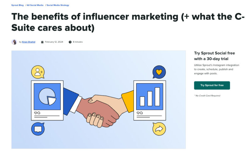
Blog posts and articles that offer practical advice and industry insights

the benefits of influencer marketing - what C Suite cares about

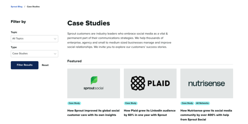
Case studies and customer stories that show how their products help

case studies on sprout social

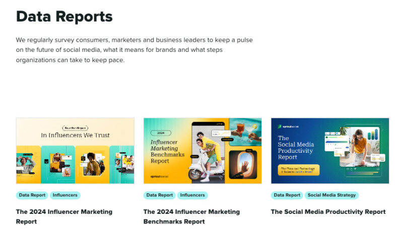
Research reports that provide the latest information on topics their audience cares about

data reports survey sprout social

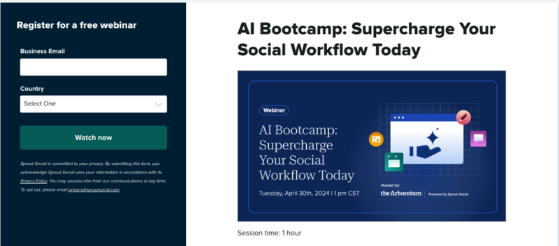
Webinars and podcasts that let them connect with them audience and share their expertise

ai bootcamp webinars and podcasts

Balancing Visual Aesthetics and Functionality

You want your site to be visually appealing, but not at the expense of making it hard to use. A website that’s too flashy or cluttered can be overwhelming and confusing, causing visitors to leave without finding what they need.

On the other hand, a site that’s too plain or boring might not hold people’s attention or communicate your brand’s personality.

Find a middle ground where your design enhances the user experience instead of getting in the way.

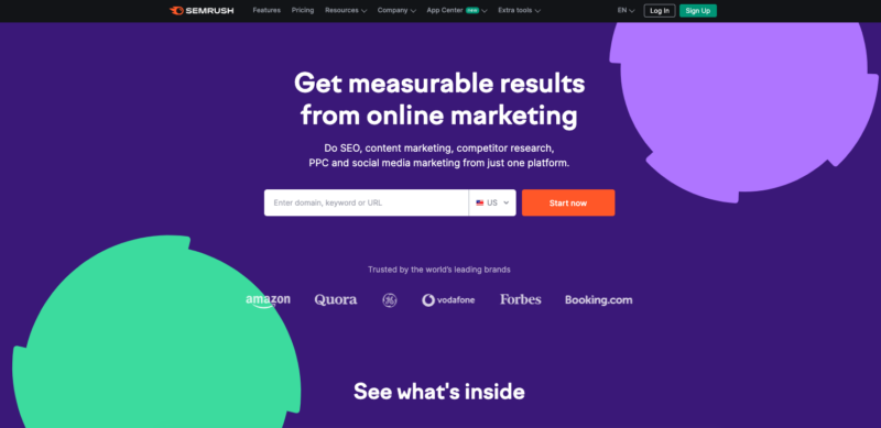
Take Semrush, for example. They’re a company that provides digital marketing tools and analytics, so their website needs to be informative and easy to navigate.
However, they also use clean, modern design elements and pops of color to make their site visually engaging.

get measurable results - semrush homepage

It guides visitors’ eyes to important information and calls-to-action without being distracting.

Advanced Strategies for User Engagement and Conversion

While basic strategies lay the foundation for a successful website, advanced tactics maximize its potential. These strategies go beyond the fundamentals to create a more personalized, interactive, and persuasive user experience, which is key to standing out among the best B2B SaaS websites in your industry.

Behavioral Analysis

Behavioral analytics help you track and study how people interact with your website—where they click, how far they scroll, and where they get stuck or drop off.

This analysis pinpoints areas where your website isn’t working as well as it could. There could be a button that doesn’t do anything, or visitors are leaving before they get to the good stuff.

Behavioral analytics tools like Hotjar help you do this detective work. Four features that help you do this:

  • Heatmaps: These colorful maps show you where people click the most and how far they scroll down your pages.
  • Recordings: Hotjar can record visitors’ sessions, so you can spot any confusing parts or places where they might give up.
  • Funnels: This feature lets you track how people move through different steps, like filling out a form or making a purchase.
  • Feedback Polls: You can ask visitors questions right on your site to get their opinions and suggestions.

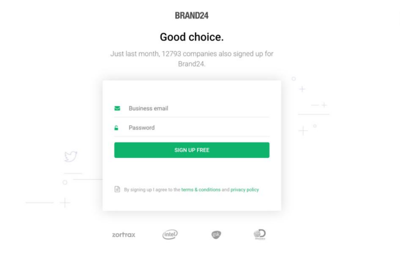
For example, social listening platform Brand24 used Hotjar’s Recordings feature to see how people interacted with their sign-up forms. Too many distractions on the page and a confusing promo field were causing a leaky funnel.

They created a sleek sign-up form which led to a 300% increase in conversions.

brand24 hotjar tool

Like Brand24, use tools like Hotjar to see how users are really behaving, and then make changes based on those insights.

Lead Generation Optimization

Lead generation optimization involves making changes to your site that encourage more visitors to share their contact information, so your sales team can follow up.

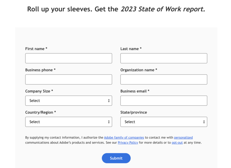
Lead magnets like Adobe’s 2023 State of Work offer value in exchange for a visitor’s email address.

adobe state of work report

Here’s how you can also optimize your lead generation:

  • Create Compelling Offers: Think free ebooks, white papers, webinars—content your target audience will appreciate enough to give you their email address.
  • Use Strong Calls-to-Action (CTAs): Make your buttons and links stand out with clear, action-oriented words like “Download Now” or “Get a Free Consultation.”
  • Optimize Landing Pages: Keep your forms short and make sure the page design matches the offer you’re promoting.

Generating leads is just the first step—you also need a plan for nurturing those leads and moving them through the sales funnel. Optimizing your site for lead generation gives you a steady stream of potential customers to work with through email marketing, social media, and other channels.

Conversion Rate Optimization

Conversion rate optimization (CRO) involves getting more site visitors to take a desired action. Like filling out a form, signing up for a free trial, or making a purchase. The goal is to turn casual browsers into customers.

Why does CRO matter?

Even small improvements in your conversion rate can make a big difference on your bottom line. If you get just a few more people out of every hundred visitors to take action, that adds up to a lot more revenue over time.

Here’s how you start optimizing your conversion rates: identify the key actions you want people to take on your site.

Then, look at your analytics to see where people are dropping off in the process. Are they not seeing your calls-to-action? Are they starting to fill out a form but then abandoning it?

Make changes to smooth out the conversion path once you know where the roadblocks are. It might mean simplifying your forms, adding more compelling copy to your CTAs, or redesigning your landing pages.

The key with CRO is to let the data be your guide. Don’t make changes based on gut feelings—look at the numbers to see what’s actually moving the needle.

A/B Testing

A/B testing, also known as split testing, is a method of comparing two versions of a webpage, app, email, or any other digital content to determine which one performs better in achieving a specific goal.

Essentially, you create two versions (A and B) of the content, each with a single variation, and show them to two similar-sized audiences. By analyzing the results, you can determine which version resonates better with your users and drives more conversions.

Why is A/B Testing Important?

A/B testing eliminates guesswork and relies on concrete data to inform decisions about your content and user experience. By identifying the elements that resonate best with your audience, you can create a more engaging experience, leading to increased time on site, lower bounce rates, and higher conversions.

Through testing different variations of your content, you can uncover the optimal combination of elements that drive more users to take the desired action, such as making a purchase, signing up for a newsletter, or downloading an app.

Most importantly: A/B testing is an ongoing process that allows you to improve your content and user experience.

(By the way, Stratabeat is the only B2B SEO agency that uses behavioral analytics and A/B tests on tech companies’ content. If you’re looking for an agency that will lift the heavy load for you, contact us!)

Technical Aspects of B2B Websites

Neglecting the technical aspects leads to a clunky, slow, and frustrating experience for potential clients, ultimately hindering your ability to convert them into customers. Let’s explore essential technical components that power high-performing B2B websites.

SEO Best Practices

Search engine optimization (SEO) makes our site more visible and attractive to search engines like Google, so the algorithm ranks you higher in search engine results pages (SERPs).

Here’s why this matters: Think about how you find websites yourself—you start with a search engine.

If your site isn’t showing up on the first page of results, you’re missing out on a lot of potential traffic and leads.

Here’s what good B2B SEO involves:

  • Keyword Research: Finding out what words and phrases your ideal customers are searching for, and then using those words on your website. Use tools like Ahrefs and Semrush to uncover relevant keywords with high search volume and low competition.
  • On-Page Optimization: Making sure your website’s content is well-organized and easy for search engines to understand. This includes using clear headings (H1, H2, etc.), descriptive meta tags, and relevant keywords throughout your content. Tools like Yoast SEO and SurferSEO guide you through this process.
  • Technical SEO: Keeping your website’s “behind the scenes” stuff in top shape. This involves ensuring fast page load times, mobile responsiveness, clean code, and a secure connection (HTTPS). Use Google PageSpeed Insights to assess and improve your website’s technical performance.
  • Content Creation: Regularly publishing high-quality blog posts, articles, or white papers that answer your customers’ questions and establish your expertise. BuzzSumo can help you discover trending topics and content formats people are interested in.
  • Link Building: Earning backlinks from reputable websites, which acts as a vote of confidence from other businesses in the eyes of search engines. Use tools like Ahrefs to analyze your backlink profile and identify SaaS link building opportunities for acquiring new, high-quality links.

Security Considerations

B2B websites often deal with sensitive information like financial data, trade secrets, and customer details. A security breach could damage your reputation, cost you money, and even put you in legal trouble.

Here’s what good B2B website security involves:

  • SSL Certificate: This creates a secure connection between your website and your visitors’ browsers, making sure any information they share stays private. Look for the padlock icon in your browser’s address bar to see if a site has an SSL certificate.
  • Strong Passwords and Authentication: Make sure your website’s login system requires strong passwords and consider adding extra layers of security like two-factor authentication.
  • Regular Software Updates: Keeping your website’s software up-to-date helps protect against vulnerabilities that hackers could exploit.
  • Web Application Firewall (WAF): This acts like a shield for your website, blocking malicious traffic and attacks before they can do any harm.
  • Regular Backups: Make sure you regularly back up your website’s data, so you can quickly restore it in case of a disaster or security breach.
  • Security Monitoring: Keep an eye on your website for any suspicious activity, like failed login attempts or unusual traffic patterns.

Dynamic Content Personalization

Dynamic content personalization means showing different visitors different versions of your site based on what you know about them. It could be as simple as greeting a returning customer by name, or as complex as completely redesigning your homepage for visitors from a particular industry.

Personalizing the experience boosts engagement, conversions, and customer loyalty.

Dynamic content personalization involves collecting visitor data (like their location, job title, or past behavior) and using tools to provide customized content. It could be through something like smart content modules that swap out blocks of text or images, or via personalized product recommendations and offers.
Real-World Website Examples

Now, we’ll look at how these B2B businesses integrate the strategies discussed above, to create a cohesive user experience.

Asana

When it comes to SaaS, your homepage is a potential customer’s first impression of the UX and UI of your product. If your homepage sucks, users may believe your product sucks. And vice versa.

Asana’s website nails the fluidity and ease of use.

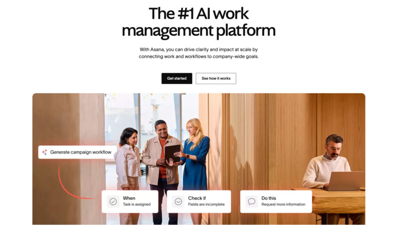
The first thing you notice is how clean and straightforward the homepage is. There’s no clutter, just a big, bold value proposition about being the #1 AI work management platform. It’s inviting and makes you want to click “Get started” or “See how it works” without hesitation.

Take a look at that section with the team gathered around a tablet. It subtly illustrates collaboration in action.

asana ai work management platform

Then there are these intuitive prompts like “Generate campaign workflow” with clear steps: When, Check if, Do this. It breaks down what could be a complex process into manageable chunks.

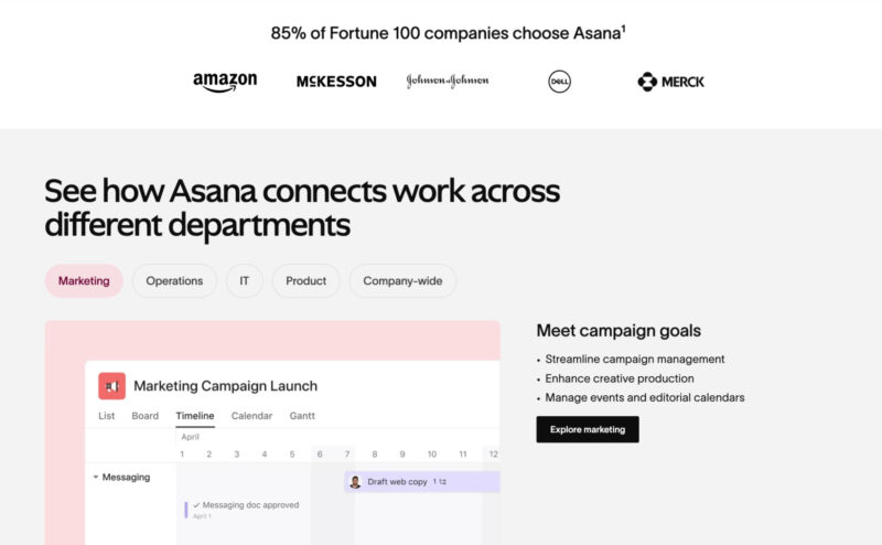
Scrolling down, you see how Asana connects work across different departments. The tabs for Marketing, Operations, IT, Product, and Company-wide are clickable and the animations change the content.

asana tabs on website

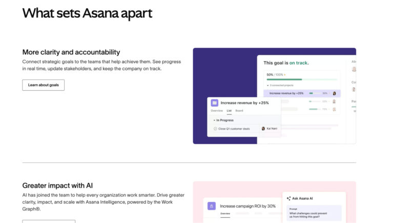
When you hit the section on what sets Asana apart, the clarity and accountability theme stands out. The visuals here show progress tracking and goal-setting in action.

what sets asana apart

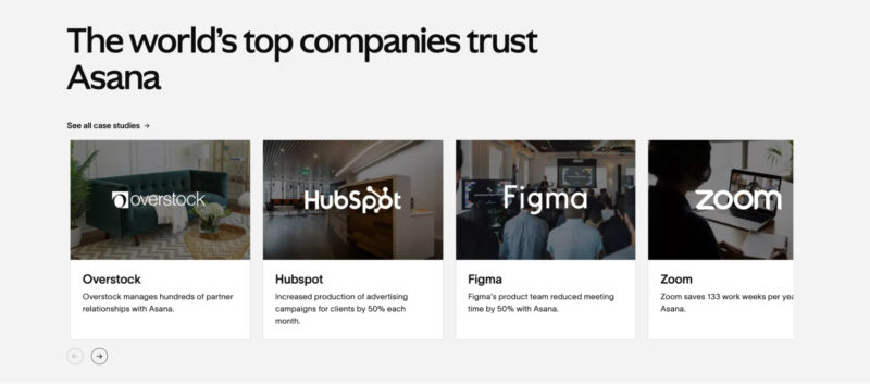
The case studies featuring Overstock, HubSpot, Figma, and Zoom are cleverly placed. Each one comes with a brief success story too.

top companies trust asana

For example, Figma reduces meeting time by 50% with Asana. These snippets build trust and reliability without overwhelming you with too much information.

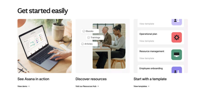
Finally, the “Get started easily” section wraps it up perfectly. Whether you want to see a demo, explore resources, or start with a template, everything is one click away. The images show actual screens from the platform, so you know exactly what you’re getting into.

get started on asana banner

The call-to-actions are clear, and the web design is consistent, keeping you engaged throughout your visit.

Mailchimp

Mailchimp’s website design shows fluidity, ease of use, and responsiveness effectively. Let’s break it down.

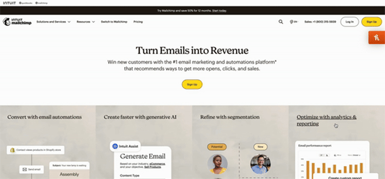
The homepage starts strong with a bold headline, “Turn Emails into Revenue,” and a prominent “Sign Up” button. This clarity of purpose and call-to-action (CTA) immediately guides users on what to do next.

mailchimp turn emails into revenue homepage

The minimalist design with ample white space ensures users don’t get overwhelmed.

Mailchimp also presents four clear goals: Convert with email automations, Create faster with generative AI, Refine with segmentation, and Optimize with analytics & reporting.

A visual and a brief description supports each goal which makes it easy for users to understand the benefits at a glance.

Mailchimp also builds trust by showcasing their credentials right on the website. It displays stats like “Up to 25x ROI” and “11M+ Users globally” prominently.

mailchimp best in class banner

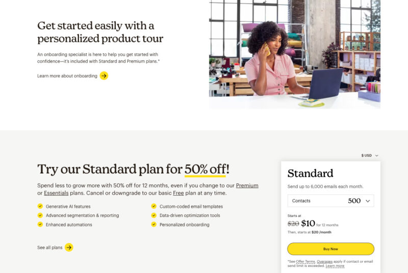
The website also personalizes the onboarding process. “Get started easily with a personalized product tour” section is a great example of making onboarding easy and user-friendly.

mailchimp personalized product tour

The image of an onboarding specialist ready to help gives a personal touch, reinforcing that new users won’t be left to figure things out on their own.
The CTA to learn more about onboarding keeps the user journey smooth and informed.

In the pricing section, Mailchimp’s offer of “Try our Standard plan for 50% off!” is clear and attractive. The detailed breakdown of what’s included—generative AI features, advanced segmentation, enhanced automations—provides transparency, making it easier for users to decide which plan suits them best.

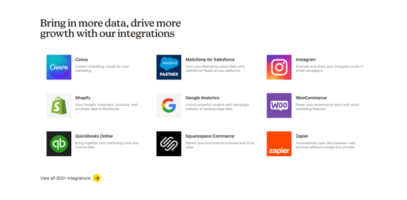
Finally, the integrations section showcases various tools like Canva, Shopify, and Google Analytics that can be connected with Mailchimp. Clearly, Mailchimp can integrate with existing workflows thanks to its wide range of integrations.

mailchimp integrations

Virtual, Inc.

We redesigned Virtual, Inc.’s website. The results: 107.4% increase in organic site traffic within six months and 114.9% increase in page views within six months.

Here’s why the new website works so well.

The homepage immediately captivates visitors with a bold message and a clear call-to-action button, inviting them to explore further. The sleek design and professional visuals create a strong first impression.

make your mark virtual inc banner

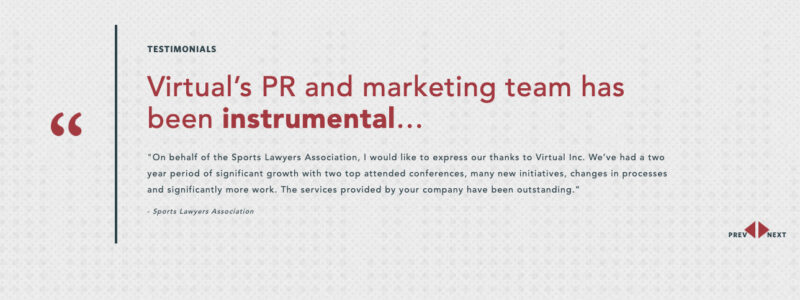
The website also presents Virtual, Inc.’s services using a combination of images and strong messaging. The success stories and testimonials provide concrete evidence of their impact, with impressive statistics and client quotes that build trust and credibility.

10x growth virtual inc pci security standards

virtual pr marketing team instrumental

Throughout the site, the user experience remains seamless and intuitive. The responsive design makes the website look great on any device, including desktops, phones, and tablets.

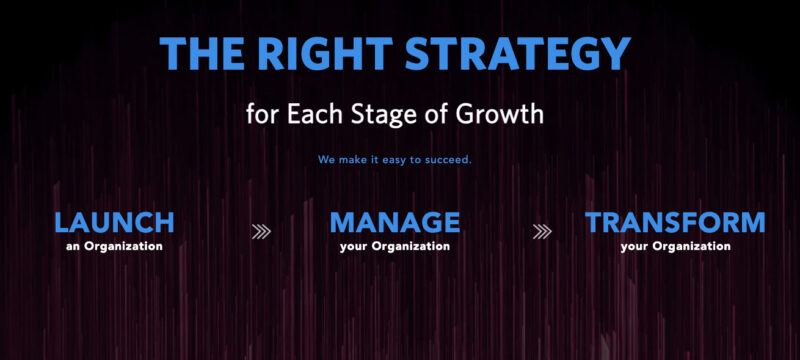
The clear explanation of their process, broken down into three simple steps, helps potential clients understand how Virtual, Inc. can support them at every stage of their growth.

virtual inc right strategy for each stage of growth

It also shows Virtual, Inc.’s awards and achievements, proving its expertise and industry recognition. Including specific, quantifiable results, like more traffic and page views for a client’s site, shows how their work is making a difference.

virtual inc awards and achievements

Future Trends and Innovations

The future of B2B sites is about creating personalized, engaging, and informative experiences that cater to the specific needs of business customers. Five trends we’ll see more of:

1. Personalization and customer-centric experiences

B2B websites will use data and AI to deliver personalized experiences tailored to individual users. This includes customized content recommendations, product suggestions, and targeted messaging based on user behavior, demographics, and preferences.

The goal is to create a more relevant and engaging experience for each visitor, ultimately driving higher conversions and customer satisfaction.

2. Interactive and immersive content

Static content is giving way to interactive elements like product configurators, 360-degree product views, augmented reality (AR) experiences, and virtual tours.

These immersive formats allow potential customers to explore products and services more engaging and informatively, leading to better-informed purchasing decisions.

3. Integration of AI and Chatbots

AI-powered chatbots are becoming more sophisticated and are being integrated into B2B websites to provide instant customer support, answer questions, and guide users through the buying process.

This improves customer service and frees up human resources for more complex tasks.

4. Evolving Content Strategies

B2B content strategies will continue to evolve, focusing on thought leadership, educational resources, case studies, and interactive content that addresses target audiences’ specific needs and challenges.

B2B content marketing strategy will remain crucial for building brand authority, attracting potential customers, and generating leads.

Build a High-Performance B2B Website With Stratabeat’s Help

Your website is your digital storefront, your 24/7 sales representative, and your most powerful tool for attracting, engaging, and converting website visitors into potential clients.

We understand how important it is. That’s why we’re here to help. Contact Stratabeat, a B2B SaaS marketing agency today, and let’s build a website that amplifies your online presence and gets you the conversions you’ve been missing.