10 Elements of Modern Website Design

If you’re of a certain age, then the following picture may seem vaguely familiar:
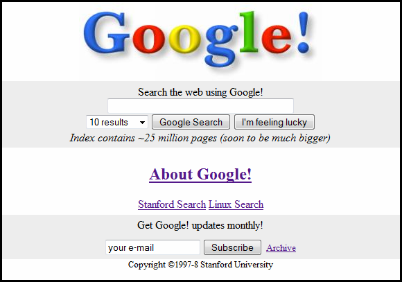
The image is Google’s original home page, circa 1998. Yes, we know, back when dinosaurs still roamed the Earth and MTV played music videos.
Now take a look at Google’s home page today:
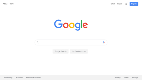
Shockingly different, isn’t it?
What these two screencaptures represent is two-plus decades of evolution in website design. The new page is based on modern website design principles. The old page was based on… well, not really sure what that was.
When considering modern website design, Google is an excellent source of inspiration to draw from. For starters, they’ve created one of the most successful, yet remarkably simple websites of all time. An impressive feat considering the clunky iterations that defined their earliest days.
What makes a B2B website truly great? What is modern website design? And what are the principles that you should follow in order to ensure your website is modern, aesthetically pleasing, AND effective at producing business results? Understanding B2B SaaS website best practices is key to achieving these goals. Read on to find out more.
1. Design for the User First
When designing a new website, the most important thing that you can do is to have your target audience in mind. It’s all about delivering a superior customer experience, everything from their initial arrival to their navigation through the site, to any conversion events.
With that said, your website may have multiple target audiences. For example, if you’re in biotech, perhaps you need sections or pages of your site that appeal to physicians, hospital administrators, patients, investors, the press, community members, partners, and nonprofits.
But you want to ensure the overall design and interface are embraced by all groups.
Many companies begin the website design process by defining the sections and pages and what they want to include in the site. A section for products, services, and solutions. A section about the company. A blog. An area for career opportunities, etc. The problem with this is that it’s all internally focused. Instead, flip the perspective on the head.
What are they going to benefit from the most? When each unique persona arrives at your site, are they going to be thrilled (or at least happy and satisfied) with the experience?
How will you achieve that?
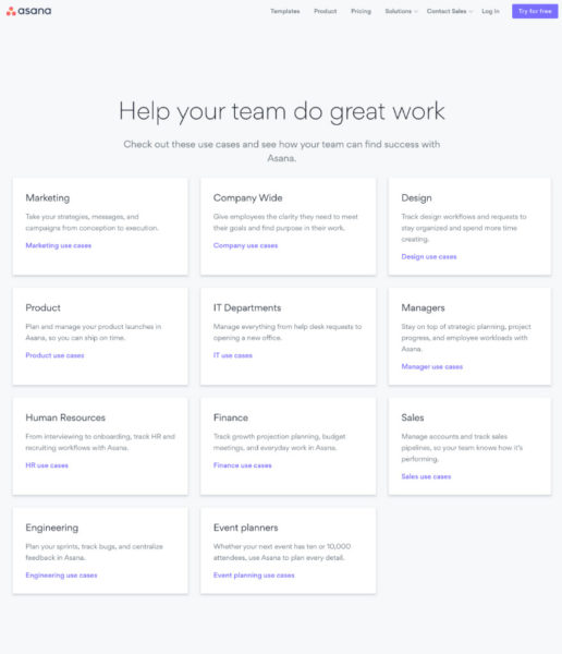
Asana empowers each site visitor with the ability to customize their experience based on the specific team they are a part of or the workflow they are looking to facilitate.
And once your site taxonomy is in place, you should use behavioral analytics to monitor and confirm that your designs are intuitive, frictionless, and delivering an awesome experience for each audience segment.
It’s your prospect who will determine if they want to work with you and if your business is successful, so your website design needs to start with them.
2. Design for Business Results
Websites are not static billboards. You want visitors to do something, not just peruse your home page and then go somewhere else.
Define ahead of time how your website should be contributing to business growth. How will you measure the success of the site? Many companies don’t determine that until after the site goes live, but that’s completely backwards. Determine the success metrics upfront, and then proactively and deliberately design to those specifications.
Your site should be designed in such a way that moves visitors to take specific actions that will ultimately result in positive outcomes (email sign up, free trial, download, appointment with sales, etc.).
With modern website design, take a multifaceted approach to driving business results. How? Use a combination of funnels and calls to action (CTAs).
Your funnels can include product- or service-related paths, as naturally that’s how they can purchase from you. But beyond this, you should first determine the specific challenges and problems they are trying to solve when they hit your site, and guide them towards relevant information in the most appropriate way. Sometimes individuals are looking for information. Other times they are looking for solutions.
Build-in strategic calls to action at natural engagement points, like a free trial button after a description of your product benefits. And then do something that too many websites leave untapped – expand the types of CTAs.
A pro tip is to launch your CTAs based on behavioral triggers. This aligns the request with the demonstrated behavior of your site visitors. For example, like a consultation booking offer after someone has been to more than one of your solution pages. Or, if you see that your blog readers are scrolling to the bottom of the post, hit them with an inivitation to subscribe to your mailing list.
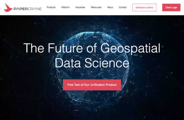
Paper Crane is a good example of a site designed to achieve business results. Notice the multiple invitations to see the product in action, whether through a demo or free test. On the home page alone, there are 14 CTAs, including the top, middle, and bottom of the page. The CTAs range from joining the mailing list to downloading a whitepaper, downloading data, accessing the API, and as mentioned above, scheduling a demo or taking the software platform for a test drive.
3. Mobile-Friendly Responsive Layout
4. Make It Visual
Humans are visual creatures. The way something looks either draws us in or pushes us away.
Half of the brain’s neurons are dedicated to vision. That means that not only are we hardwired to want to see cool stuff, nature actually designed us to crave seeing cool stuff.
Not only do our brains enjoy visual input, we also remember visual input far more than text. Whereas individuals remember 10% of text after 72 hours, the number jumps to 65% for visuals.
When users visit your website, they’ll react more powerfully when they are met with compelling visuals. Although design sense may differ based on the industry or market, there are certain modern website design principles that apply across the board, including:
- Whether it’s your home page, product/service/solution pages, keep your audience’s attention with bold visuals and a cohesive design scheme.
- Steer clear of large, dense walls of text. Instead, break text into digestible amounts and try to communicate visually just as much as through text.
- Add accent colors to your site to add some visual “POP”.
- Avoid bland stock photos.
- Instead, use high-quality, visually engaging images.
- Where possible, show faces. Through the brain’s Fusiform Face Area (FFA), we are hardwired to enjoy looking at faces.
The Vi3 website is a prime example of using visuals in web design. The website layout, color scheme, large-scale isometric illustrations, photos, and even full-width diagonally-oriented visual testimonials all work together to create a visually compelling experience for users.

5. Big, Bold Typography
In modern web design, you’ll find ample use of big, bold typography. The reason is that it looks very cool. It’s also attention-grabbing and impactful. Beyond that, it’s also effective at a subconscious level in evoking an emotive response from site visitors.
Typography Matters
Typography, which is the fonts you use for your brand and website, is one of the more straightforward concepts for website design. However, it’s easy to get wrong. If you miss the mark, it misrepresents your brand and adds unappealing elements to your site.
Need proof about the power of fonts? When Lebron James left the Cleveland Cavaliers in 2010, owner Dan Gilbert wrote an impassioned letter to fans, criticizing James’ lack of loyalty and going back on his promise to deliver a championship.
The only problem? He wrote it using the childish-looking Comic Sans font (in purple!). It quickly became a big joke and Gilbert came off looking silly.
Choose your typography wisely.
Choose a Font that Represents Brand Attributes
When selecting typography, think about what your brand represents. Is it modern? Traditional, classic, and dependable? Youthful? Compassionate? Whimsical? Scientific? Innovative? Cutting-edge? Forward-thinking and insightful? Do you want to communicate femininity or masculinity?
The font you choose for your website design needs to be easily readable, consistent with your brand, and appealing to your target audience. For example, if you sell rugged outdoor gear to a primarily male audience, a curly, scripted font isn’t going to be your best choice.
Any text you add to your website must look good on every screen a user might view it, especially mobile devices.
Example of Big, Bold Typography
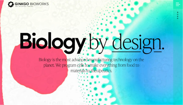
The Ginkgo Bioworks website is a good example of effectively using big, bold typography. And you can see it not only on the home page, but throughout the site, even on content pages. Ginkgo blends a strong, bold, thick font together with a more elegant font, effectively communicating the power of biological engineering while alluding to the magic in what they are bringing to the world.
6. Ample White Space
The idea of white space is simple in modern website design: less is definitely more.
The more white space (or any negative space, really) you can implement on your website, the more appealing it tends to be to the site visitor.
With ample white space, your headings stand out more. Your subheadings are more identifiable. Your text is easier to read. And your pictures are more vibrant.
With ample white space, your business comes across as more professional and confident.
White space makes it much easier for users to scan your website. It makes the information easier to read and process, which is critically important if you hope to communicate a lot of information. Even more so if a large number of your prospects visit your site via mobile devices.
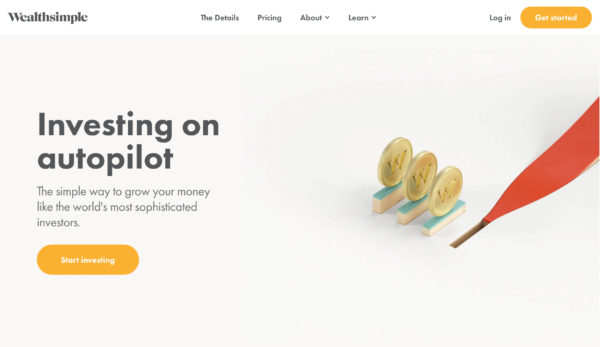
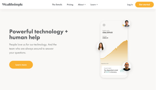
Notice how the home page for Wealthsimple uses ample white space throughout the entire page to draw attention to big, bold messages. Powerful!
7. Strong Color Palette
8. Video Integration
Video is the future of web engagement, and the future is now. The incorporation of video in modern website design carries massive engagement potential.
How popular is video, you ask? People watch more than one billion hours of video on YouTube every day. YouTube is the second most-visited website on the planet, only behind Google. In fact, YouTube pulls more unique monthly visitors than Twitter, Instagram, and Amazon combined.
So when approaching your website design, make space for video. You can integrate moving pictures in numerous creative ways. A few ideas include:
- Background videos
- Explainer videos
- Product videos
- Thought leadership videos
- Sizzle reels
- Culture videos
- Webinar recordings
- Client testimonials
- Client success stories
- Employee day-in-the-life videos
But don’t just re-use video that you’ve created elsewhere. In other words, don’t just post a commercial or webinar recording. Customize it for what would be most impactful for someone visiting your website. Think of the context, and then customize accordingly.
Your video integration should be fluid, seamless, and serve your overall design theme. For example, utilizing a video as background imagery versus a static picture should do just that, sit in the background without being overly distracting. It needs to provide a visually exciting point of reference without becoming the singular reference point.
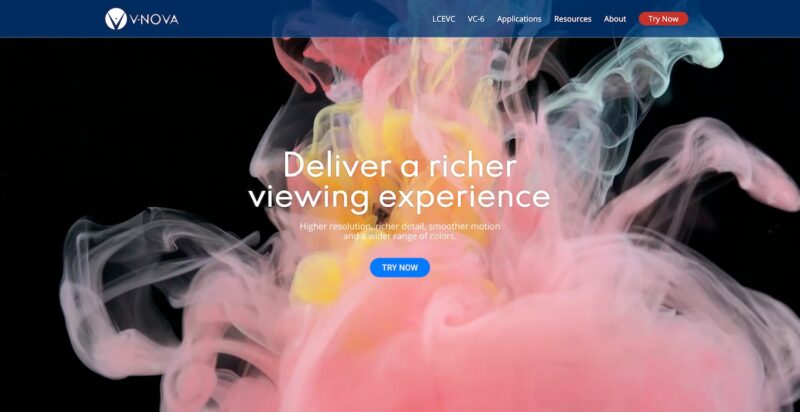
The V-NOVA website uses a visually stunning background video on its home page as a way of immediately engaging visitors and showing off its advanced video technologies. The impact is undeniable.
9. Movement
An element in modern web design that is starting to catch fire is movement. By adding a bit of movement to your website, you make the site come alive. Your site visitors will notice, and you’ll be able to grab their attention more easily.
I’m not talking about full-screen video or animation that takes over your entire site. Often, more subtle movements on the page can be just as effective at capturing their attention, keeping them on your site, and getting them to scroll further.
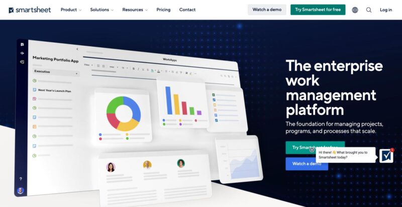
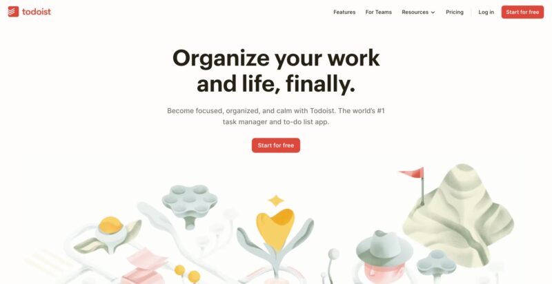
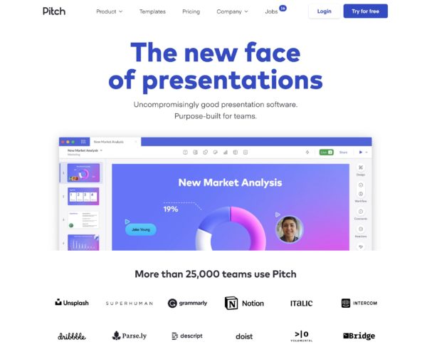
Examples of websites that incorporate movement effectively into the very core of their site design include Smartsheet, Todoist, and Pitch.
10. Design for Fast Page Load Speed
Summary: Elements of Modern Website Design
Related Posts