Marketing Strategy Blog

UI and UX: How They’re Different and Why You Need Both

UI and UX Design Graphic

Given the astronomical capabilities of today’s technology, it’s hard to believe there was life before giants like Apple and Microsoft pioneered the digital age. These innovators transformed how we interact with technology and set the foundation for the critical roles of user interface (UI) and user experience (UX) design.

As technology continues to permeate every aspect of our lives, the demand for intuitive and effective UI and UX becomes essential. Without these, even the most innovative products will struggle to meet user expectations and remain competitive.

Today, every digital touchpoint—from websites to apps—must be designed to meet diverse user needs and skill levels, ensuring accessibility, engagement, and satisfaction.

To attract business, you must build a reputation, inspire trust, and outshine your competition. Your digital storefronts—website and app—transmit all of this.

UX vs. UI: What’s the Difference?

UX (User Experience) and UI (User Interface) design go hand in hand when developing a seamless and effective product. While both are crucial, they focus on different facets of the product development process.

UX is all about the overall feel of the experience. It involves designing and refining a user’s journey through an app or website, ensuring that it is intuitive, functional, and enjoyable. This includes researching user needs, crafting user flows, and optimizing workflows to ensure that every aspect of the user interaction is thoughtfully mapped out. UX aims to reduce user friction, enhance retention, and lower bounce rates by making the system predictable and easy to navigate, ensuring every call-to-action (CTA), navigational system, and pagination structure intuitively guides users through the digital environment.

UI, on the other hand, focuses on the visual aspects of the product. It involves the creation of interactive elements, the selection of color schemes, and the choice of typography. UI design is about how the product looks; it complements the UX by making the interfaces visually appealing, easy to use, and aligned with the expected user interactions. Effective UI design makes performance stats pop, ensures information is easy to read, and includes intuitive sorting and filtering that all contribute to a straightforward and engaging user interaction.

Together, they create a high-quality user experience.

UI: The Gateway to User Engagement

The user interface design of a product often forms the first impression. It acts as the gateway through which users experience your service or application. An intuitive and aesthetically pleasing UI can reduce the initial learning curve and help new users feel at home quickly.

For example, a well-designed dashboard can streamline the process of data analysis, allowing users to make informed decisions faster and with greater confidence. It’s not just about looks; it’s about creating an interface that users can navigate intuitively. This reduces cognitive load, which in turn increases user engagement and satisfaction.

UX: Building Long-Term Relationships

UX goes deeper than the immediate interaction. It’s about anticipating the end-user’s needs over time and evolving the product to meet those needs. Effective UX creates a seamless journey for the user from start to finish, even as their goals and interactions with the product change.

For example, a progressive disclosure design can help manage how new users are introduced to complex features over time, which enhances learning and retention without overwhelming them initially.

How UI and UX Work Together

UI and UX work hand-in-hand to craft a holistic product experience. UX sets the blueprint, mapping out the structure, flow, and logic of a product based on users’ needs. Then, UI brings it to life.

This partnership starts from day one. UX research shapes personas and journey maps that give UI designers the insight they need to create interfaces that hit the mark.

Imagine you’re working on a CRM website for sales teams. The UX team kicks things off by chatting with sales reps to understand their daily grind, frustrations, and must-have info. They identify personas like “Sales Manager” and “Sales Rep,” figuring out that managers need to see their team’s performance at a glance, while reps need quick access to their leads.

The UX team uses these insights to draft a dashboard layout that includes performance summaries for managers and a lead database for reps. They mock up wireframes to show where everything goes.

Now, it’s UI’s turn. They pick colors that make performance stats pop and fonts that make data easy to read. They design distinct buttons for easy navigation, and the lead database includes intuitive sorting and filtering.

While UI makes the initial connection with users, UX reinforces that relationship by ensuring every interaction is meaningful and efficient. Together, they create a powerful user-centric approach that can dramatically improve the overall effectiveness of a product. Integrating thoughtful UI with robust UX strategies ensures that your product is not only used but also appreciated and endorsed by users.

This synergy is particularly important in today’s competitive market, where user expectations are high and attention spans are short. A product that combines a stunning UI with a thoughtful UX is more likely to succeed and achieve business objectives, such as increased user retention, higher conversion rates, and improved customer loyalty.

Modern Website Design

10 Elements of Modern Website Design

Read the Post

Fundamentals of UX Design

A UX designer’s job draws from psychology, research, and creativity to create digital experiences that meet users’ needs and expectations. It goes beyond aesthetics and functionality—product development instead focuses on the entire journey.

Understanding the fundamentals of the overall user experience allows product teams to create solutions that cater to user and business needs.

User-Centered Focus

A user-centered design keeps the user’s needs, desires, and challenges at the forefront of every UX design decision. Why is this crucial? Designing with empathy allows for the creation of products that solve real problems and improve users’ lives.

Research by Deloitte and Touche found that customer-centric companies are 60% more profitable than those that aren’t. That’s not all—64% of companies with a customer-focused CEO outperform their competitors. Both statistics emphasize user insights throughout the design process—from ideation to iteration—leading to products that truly make a difference.

User Research

User research involves gathering and analyzing data about users to inform digital design decisions. This process helps designers understand user behaviors, motivations, and pain points.

Here’s a tweet that pretty much sums up how integral it is:

jim spol tweet about user research

User research enables designers to create solutions that address user needs and preferences. Use methods like:

  • Interviews
  • Surveys
  • Usability tests
  • Feedback
  • Session recordings

Keeping a pulse on how users interact with your product allows you to pivot as needed.

Information Architecture

Information architecture (IA) focuses on organizing and structuring content logically and intuitively.

The idea is simple: users can easily find what they’re looking for by categorizing and labeling information clearly. Well-designed IA reduces cognitive load, minimizes frustration, and enhances overall user satisfaction.

For example, Sprout Social’s intuitive website navigation demonstrates how effective IA helps users quickly locate necessary information.

sprout social IA

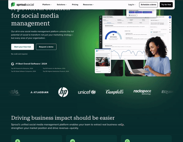
The site divides content into clear categories, uses descriptive labels, and has a straightforward layout that helps users locate the necessary information.

User Journeys

Understanding the steps a user takes to achieve a goal within a product is crucial. User journeys help designers identify potential pain points and optimize user flows. Insights gained from mapping these journeys allow designers to prioritize features and anticipate user needs, leading to more informed design decisions.

Here’s an example: Matalan, one of the UK’s leading family-value fashion and homeware retailers, achieved an impressive 400% ROI through good UX.

matalan ux experience dashboard

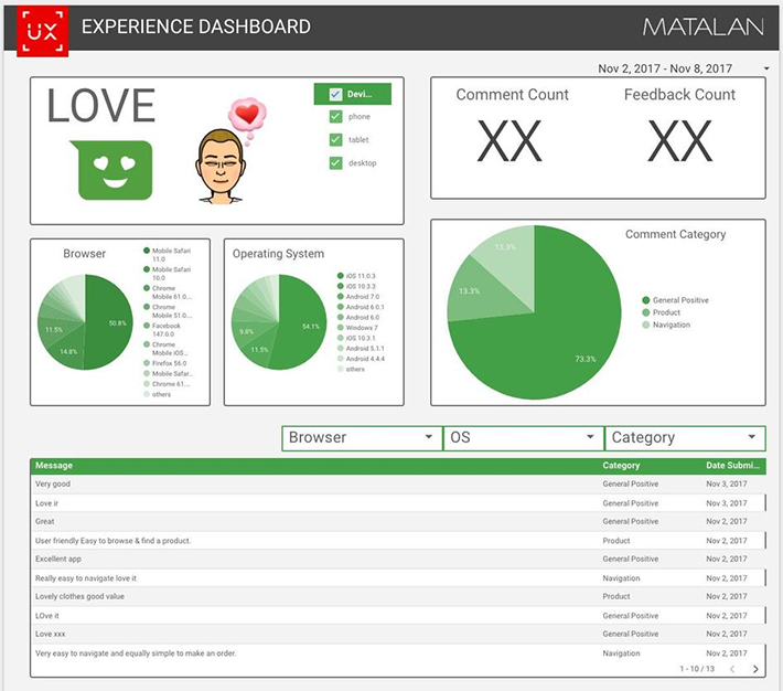
How did they do it? By using Hotjar’s session recordings to uncover bugs and glitches early on, allowing them to resolve issues during the migration process instead of at the end. They also used incoming feedback to identify problems and paired it with session recordings to understand the user journeys leading to them.

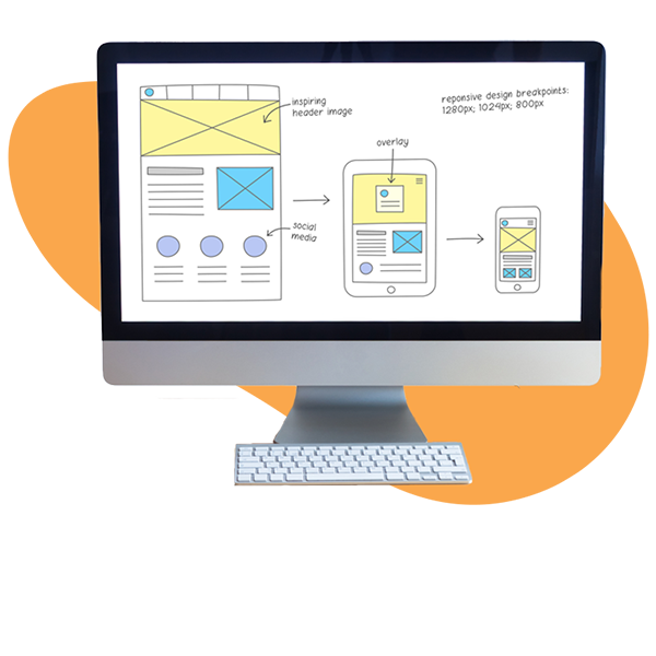
Prototypes and Wireframes

UX designers create wireframes and prototypes to map out the structure and interactions of digital products. Wireframes look like this:

mobile desktop wireframe

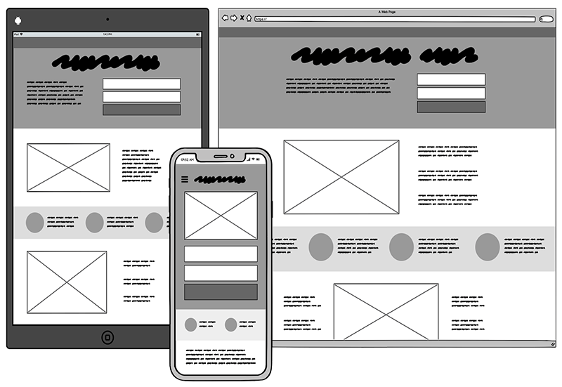
Wireframes provide a skeletal view of the layout and enable a focus on core functionality and usability. They help designers focus on usability without getting bogged down in visual details.

Prototypes are interactive models that simulate user experiences. They allow stakeholders to see the envisioned product in action and provide valuable feedback before full-scale development.

Importance of UX in Product Design

Bad UX can make or break a product. UX is the secret sauce in web development—it’s the key ingredient that turns a good product into a great one. Here’s how it affects product development:

Enhancing customer satisfaction and loyalty

Want to keep your customers coming back for more? It all starts with a great user experience. When you prioritize UX in your product design, you show your customers you care about their needs and wants.

Think about it: if your product is easy to use, visually appealing, and solves a real problem, customers will love it.

But it’s not just about feel-good factors. Satisfied customers are loyal customers. They’re more likely to stick around, recommend your product to others, and even pay more for a better experience.

The payoff is huge. Good UX design could yield conversion rates of up to 400%.

Impact on conversion rates and business metrics

When you invest in UX, you’re not just improving your product—you’re boosting your bottom line.

Here’s how it works: a great user experience makes it easy for people to find what they need, understand how to use your product, and take the desired action. Whether that’s making a purchase, signing up for a newsletter, or recommending your product to others, UX is what makes it happen.

The numbers don’t lie. Studies show that every $1 invested in UX yields a return of $100, a staggering ROI of 9,900%.

But it’s not just about the immediate payoff. A strong UX strategy can also lead to long-term business growth. You can keep your customers coming back by continuously gathering feedback and iterating on your product.

overcoming sensory adaptation

Overcome Sensory Adaptation Through Effective Marketing

Read the Post

Fundamentals of UI Design

While UX focuses on the user journey, UI design concentrates on the visual elements that make an interface attractive and engaging. Good UI design combines usability with aesthetic appeal, ensuring that users find joy and ease in interacting with the product.

Here’s what they focus on:

Visual Hierarchy

Visual hierarchy organizes content in a way that emphasizes the most critical information first and naturally guides users’ attention.

HubSpot’s web design is a great example. It uses large, bold headings to highlight product names and smaller text for details. Their imagery and spacing also emphasize key products to ensure visitors immediately see the latest developments.

Using fonts, colors, and sizes strategically can draw users’ attention to the most important details.

Intuitive UI Elements

Think of UK elements as the building blocks of your interface—the buttons, menus, icons, and forms that users interact with every day. The key is to make these elements so simple and straightforward that using them feels like second nature.

Take Google’s search bar, for example. It’s just a simple rectangle with a magnifying glass icon, but it’s instantly recognizable and easy to use. UI elements make complex actions feel effortless.

But how do you design intuitive UI elements that are truly intuitive? You have to understand your users. Use familiar patterns and conventions, like placing the navigation menu at the top of the page or using a hamburger icon for mobile menus.
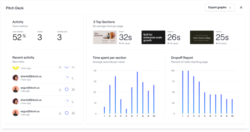
Data Visualization

Data visualization turns complex data into clear, compelling visuals that users can understand at a glance. When done right, data visualization turns overwhelming information into actionable insights.

Onboarding platform, Dock, for example, organizes its fundraising data room quite neatly.

data visualization example from Dock

Understanding your users’ goals is key. What information do they need to see? What actions do they need to take?

Answer these questions to design visualizations that look good and are also functional.
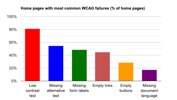
Accessibility

Accessibility ensures that everyone, regardless of ability, can navigate and interact with digital products. With a staggering 95.9% of home pages found to have WCAG 2 compliance failures, there’s a clear gap that needs addressing. Here are some of the most common issues that arise:

wcag 2 compliance failures

Prioritize features like alt text for images, keyboard navigation, and high-contrast text to make interfaces usable for all. Making your digital product truly inclusive broadens your audience reach and enhances the user experience.

To check your UI’s accessibility, conduct audits using tools like WAVE or aXe. These tools identify accessibility issues and provide guidance on how to fix them. Also, test your interface with users with different abilities to gather real-world feedback.

Responsiveness

Responsive product design ensures interfaces work well across devices, whether through mobile apps, websites, or desktop apps. It’s crucial—especially given mobile’s impact today. With mobile devices (excluding tablets) accounting for almost 60% of global website traffic in the last quarter of 2023.

Responsiveness helps create user-friendly interfaces that adapt to smartphones and desktops alike. Responsive design means delivering a seamless experience for different ways people access digital content.

Brand Consistency

Consistency creates a strong, recognizable brand. In UI design, brand consistency means ensuring your interface aligns with and reinforces your brand’s visual identity, tone, and values across all touchpoints.

Why is this important? Marq’s research shows that a business with consistent branding tends to experience up to 20% greater overall growth and 33% higher revenue than one struggling with off-brand content.

Consistent use of colors, typography, imagery, and messaging creates a sense of familiarity and trust, which can lead to higher engagement and loyalty. Regular audits can help you identify inconsistencies or deviations from your brand guidelines.

Mockups

Mockups represent a polished version of a graphic design that captures its visual aspects with detailed graphics, colors, and typography. Unlike wireframes, which outline the basic structure, mockups provide a realistic preview of the final product’s appearance, including visual elements and layout specifics.

They bridge concept and development, allowing designers and stakeholders to refine the visual design before committing to the final build. By seeing a product’s aesthetics early, teams can ensure visual consistency and address any design issues before development begins.

B2B SaaS Marketing Strategies

23 B2B SaaS Marketing Strategies To Grow Your Brand (+ Examples)

Read the Post

Importance of UI in Product Design

UI design is the next step after UX and focuses on how the product looks and feels to the target users. Throughout the development process, UI designers use color, typography, layout, and other visual elements to guide the user’s interaction with the product to make it easy and enjoyable to use.

Creating an attractive and engaging visual experience

A visually appealing, well-designed interface can make all the difference in how users perceive and interact with your product.

Think about it: when you land on a website or open an app, what’s the first thing you notice? Chances are, it’s the visual design. A beautiful, intuitive UI can make all the difference in how users perceive and interact with your product.

But it’s not just about looks. A great UI is also intuitive and easy to navigate. It guides users through your product seamlessly, making it a pleasure to use.
The benefits are clear. Aesthetically pleasing interfaces can increase users’ perception of usability. And when users enjoy using your product, they’re more likely to return and recommend it to others.

Impact on user engagement and ease of use

When done right, an attractive and engaging UI can greatly impact user behavior. It can increase time spent on your site or app, boost engagement rates, and even drive conversions.

Users want to get things done quickly and easily. They don’t want to waste time figuring out how to navigate your product or hunt for the features they need. That’s where a great UI comes in.

By designing an interface that’s intuitive and easy to use, you’re removing barriers to engagement. Users can find what they need fast, without frustration. And when they have a smooth, seamless experience, they’re more likely to keep using your product and explore all it has to offer.

Ready to take your online presence to new heights?

Drive your audience to action with a UI and UX that pushes your brand to the next level. Let’s Talk
DESTROY MEDIOCRE MARKETING

How to Improve Collaboration Between UX and UI Design Teams

UX and UI design are two sides of the same coin. They work hand in hand to create digital products that users can’t resist. Here’s how to make sure your UX and UI teams are in sync.

Integrated Workflows

Integrated workflows streamline collaboration between UX and UI teams, making it easy to go from research to design. Shared tools, aligned goals, and standardized processes reduce friction and promote synergy. These workflows make it easy to transform UX insights into intuitive UI elements, improving user experience.

InVision’s design maturity report highlights that teams with integrated workflows are 3 times more likely to deliver products on time.

Figma, Sketch, and Adobe XD are the most popular tools among designers. They allow them to collaborate on the same project and support these workflows. This enables constant communication, quick feedback, and faster iterations. A unified user experience design system also ensures each design decision aligns with the product vision.

Cross-Functional Communication

Cross-functional communication aligns UX and UI teams around a shared vision. This involves regular meetings, open feedback channels, and shared tools. Team collaboration ensures that user research and design insights flow smoothly between departments.

A practical step is to schedule regular UX/UI design reviews that include both teams. These sessions allow for quick feedback and adjustments and prevent misalignment and rework. Tools like Slack or Microsoft Teams enable instant communication.

Set clear goals and timelines. This helps everyone understand their roles and how their work contributes to the product.

Iterative Design Approach

An iterative design approach involves a cycle of designing, testing, and refining to improve products progressively. For UX and UI teams, this means frequently revisiting designs based on feedback and knowledge of overall design principles while incorporating evolving requirements to ensure that the end product effectively meets user needs.

This approach starts with an initial design concept, which is then tested with users to gather insights. Based on this feedback, the design is refined and improved, and the process repeats. Such continuous iteration enables the teams to catch issues early, adapt to changing requirements, and enhance the product step-by-step.

A good practice for iterative design is to establish short, regular design sprints. These sprints focus on specific design elements or features and quickly gather feedback for adjustments. Tools like Figma and InVision make sharing designs and gathering feedback easy.

Drive Leads with a Better UI and UX

Want to take your digital presence to the next level? It all starts with a killer UI and UX. When you nail these two essential elements, you’re not just creating a pretty website – you’re driving leads and growing your business.

Think about it: a seamless, intuitive user experience makes it easy for potential customers to find what they want and take action. Pair that with a visually stunning UI, and you’ve got a recipe for success.

But creating a top-notch UI and UX isn’t always easy. It takes design skills, experience, and a deep understanding of your users’ needs. That’s where Stratabeat comes in. Our expert web developers and designers can help you create a website that looks great and drives leads and conversions.