12 Web Design Principles to Increase Your Conversion Rate

Marketers are reportedly spending 92X more on traffic generation than on conversion optimization. Yikes!
Let’s get real. Only in a fantasy dreamland would a business expect to maximize conversions, leads, and revenue with a spending ratio like this.
Conversions are the lifeblood of a business. If you want to increase the value of your website, focus more of your attention, resources, and time on increasing your conversion rates.
A good place to start is with your web design. Your website is the precise location in which they convert and where you have full control of the digital environment.
Here are 12 ways to increase conversion rates through better web design:
1. Be Consistent in Everything You Do
Consistency across your entire website is key to increasing conversion rates. If a visitor lands on your site and is confronted with a confusing mix of navigational options, colors, buttons, effects, and movement on the page, they will probably be confused and unlikely to convert.
On the other hand, if people see the same navigation and design elements on every page, they’ll feel more comfortable and confident navigating through various pages and exploring what you offer.
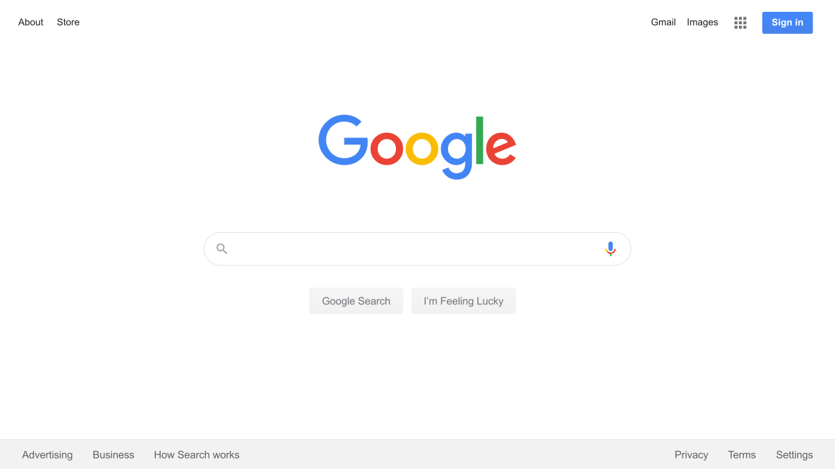
If you need any proof of this, look no further than Google’s triumph over every other search engine. In the mid-2000s, search sites like Yahoo! functioned as portals, offering everything from search to news, finance, shopping, games, sports, weather, and more with wildly different interfaces.
Google, on the other hand, presented users with a simple, easy to use interface. From start to finish, the entire experience was consistent. Consistency beats clutter every day.
If you want to improve conversion rates, consistency in design is where you should start.
The navigation menu and any type of navigation system on the page should be consistent so that your site visitors can intuitively navigate without even thinking. Similarly, the footer on every page should be consistent, making it easy for visitors to explore your site.
If you use visual cues to direct visitors towards navigational options or actions they can take, they should all work and feel the same way. CTA buttons, as well, should be consistent in style and structure.
Bottom line: The easier and more intuitive it is for them to use your site, the more likely it will be a positive experience. This will likely translate into a higher conversion rate.
2. Use Visual Directional Cues
Visual directional cues are elements on a web page that draw attention to areas of importance and help users interact with the site. They direct a person’s attention to important sections, like CTAs or products. Rather than browsing an entire page, they help visitors know exactly what they should be looking at.
Essentially, there are two main types of visual cues: explicit and suggestive.
- Explicit cues directly tell people what to do, like an arrow pointing to a “Download Now” button on a landing page.
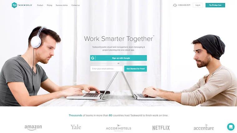
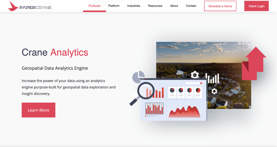
- Suggestive cues are more subtle. They suggest a particular behavior rather than directly call it out. The following screenshot is a good example of a suggestive cue. The two laptops converging in the middle draws the eyes to the signup button and encourages site visitors to sign up for the product.
Use explicit cues in places on your site where it’s appropriate to directly call the visitor to action, like a landing page for a downloadable resource. Throughout the rest of your site, use suggestive cues to guide visitors and increase conversion rates.
3. Use Negative Space Effectively
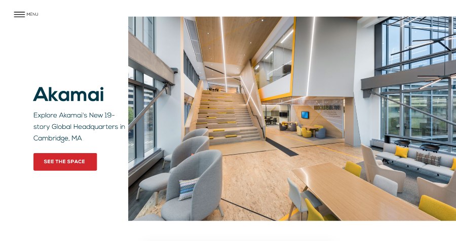
When something is surrounded by negative space (aka whitespace), it draws attention to and emphasizes that thing. For example, on the Officeworks home page, negative space is used to draw attention to the “See The Space” CTA buttons, as can be seen in the representative example below:
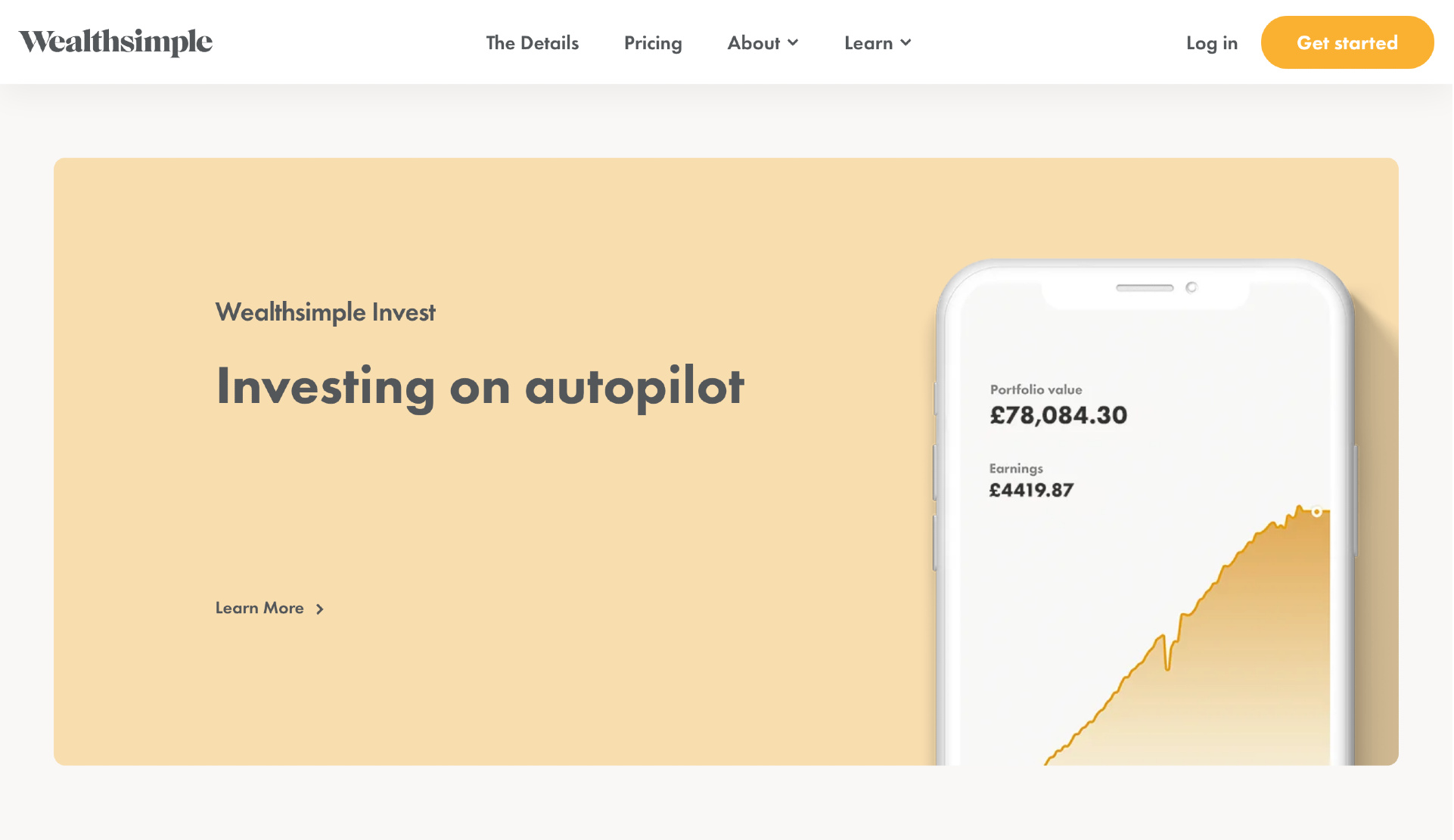
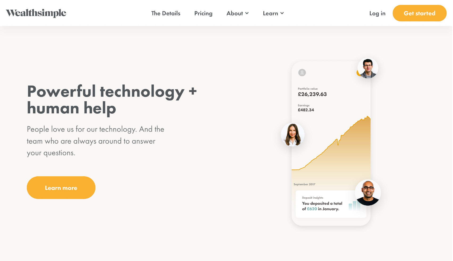
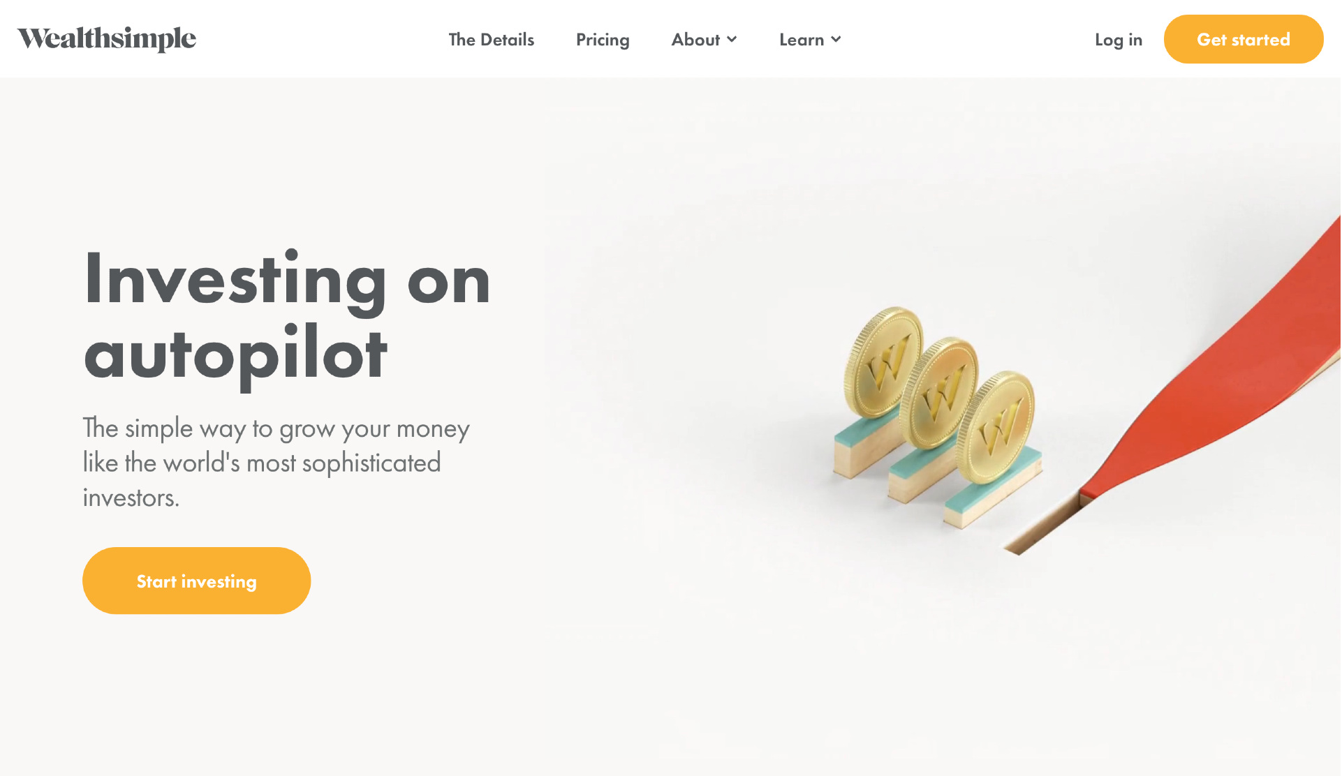
Or, see how the home page for Wealthsimple uses ample white space to draw attention to big, bold messages and the CTAs.
When designing your website, less is more. If you want to improve conversions, use negative space to highlight important content, images, etc. This is also the case if you have a blog. Use lots of headers, paragraph breaks, and bullet lists to break up walls of text and make posts easily skimmable.
4. Employ Emotional Design
If you want your conversion rate to increase, design your site for emotion.
We like to think that all our purchasing decisions are rational, but they’re usually not. Harvard Business School professor emeritus Gerald Zaltman professes that 95% of a buying decision is made at the subconscious level. A major component of that is emotions.

Gerald Zaltman, Professor Emeritus, Harvard Business School
The neuroscientist Antonio Damasio conducted studies of people with damage to the part of the brain that triggers emotions. In other words, fully functioning adults, but who could not feel emotions (they couldn’t feel angry, or sad, etc.). What he found was that because they couldn’t feel strongly enough about any options, they would endlessly waffle when faced with a decision.
Reverse-engineering all of this, emotions are essential to human decision making.
Individuals, including your site site visitors, tend to make decisions mostly based on emotions, and then they justify those decisions with logic.
Emotions guide decision making, and if you want to drive conversions, you need to tap into the emotions of your visitors.
Visitors are much more likely to remember and refer others to your site if it touches them emotionally. And emotions also create relationships. When your brand personality resonates with someone, it makes them much more likely to want to work with you, purchase your products/services, and be associated with you.
5. Limit Text to Digestible Chunks on Product & Service Pages
If someone lands on your site and is immediately confronted with a large wall of text, they’re going to bounce, no matter how good the writing is.
On product and service pages, you may be tempted to try to list out in great detail all of your features and benefits. And while this is understandable, it’s going to hurt your conversion rates.
Instead, use concise, snackable, digestible chunks of text to highlight only those that are most impactful.
If they need more detail, you can provide it to them via a user-controlled “expand/hide” feature, or you can direct them to a different page meant for those visitors who explicitly are seeking that level of detail.
Of course, if someone is looking for an educational answer to a question and they hit upon your blog, flowing text on the page will meet their expectations. However, even with a blog, Stratabeat has found through a variety of behavioral analyses that readers will engage more and scroll further down the page with posts that are broken up into more digestible components and have a variety of other elements (e.g., images, videos, call-outs, CTAs, etc.) mixed into the body of the page.
6. Understand How Color Impacts Psychology
The color scheme you choose for your website will have an impact on the way visitors both think and feel. You want to use colors to evoke emotions in visitors that match your brand personality.
For example, the color red increases a person’s heart rate and breathing, and is commonly associated with love, energy, desire, etc. Yellow often evokes feelings of happiness, joy, optimism, light, and youth. Green often elicits ideas and feelings of growth, health, nature, money, and calmness.
As you design your website, consider the emotions you want visitors to experience and then employ the appropriate colors. For example, if you’re trying to convey class and professionalism, using a neon color palette is going to leave you very disappointed with your site results.
7. Keep It Simple
Simplicity is essential in website design. A study by Google found that visitors form an opinion about your website within 50 milliseconds. One key insight from the study is that visually simple websites are much more appealing to visitors than cluttered or complex sites.
This makes sense on several levels. The more complex a website, the more difficult it is for visitors to understand the content and navigate. If they can’t understand your website quickly, they’re more likely to form a negative opinion about your company.
On top of this, Hick’s Law states that the more options a person has, the longer it will take them to make a decision. If a person comes to your site and is confronted by dozens of buttons, menus, and links, they’re more likely to experience decision paralysis and probably won’t take the action you want them to.
Additionally, the human brain is designed in such a way that we enjoy being able to consume and process information quickly. The higher the cognitive fluency, the more enjoyable the experience. This is why trying to assemble something from Ikea can be such a maddening experience. It requires significant mental energy to understand the directions and then properly put the item together.
If you want to create a superior experience for your visitors, keep your site simple. Don’t overthink your design, overwhelming visitors with too much information or too many options.
8. Make It Mobile-Friendly
This will be obvious to some, but given its importance, it bears repeating: your website must be mobile-friendly.
Your mobile site visitors will of course simply leave if your site is not easily viewed on mobile. Nobody has the patience to zoom in and out, trying to find the right place to click. Your site needs to look good and be easy to use from all types of mobile devices or your conversion rate will seriously suffer, possibly even dropping to zero.
Your organic search traffic will also suffer since Google now ranks pages based on whether they’re mobile-friendly via mobile-first indexing. If your website isn’t mobile-friendly, don’t count on getting much search traffic.
9. Implement Calls-to-Actions (CTAs) Effectively
If you want to increase your conversion rates, you have to use CTAs strategically and effectively throughout your site.
How do you do this?
In at least three ways.
First, your CTAs need to be clear, both in terms of visibility and in terms of the desired action. Every CTA should be clearly visible and easy to spot. Test various color contrasts to determine which gets the most results.
It should also be clear what action you want the visitors to take. Do you want them to download an ebook? Sign up for a webinar? Join your email list? Use language that is crystal clear in this regard.
Second, you should use multiple CTAs on your pages. It’s common for visitors to ignore the first CTA and then take action on the next one. For example, you could have a signup form strategically placed at the top of a page, and then a signup button at the bottom that takes them up to the initial signup form.
Obviously, you don’t want to annoy your visitors with too many CTAs, but having a few in strategic places will certainly help your conversion rate.
Third, use behavioral CTAs that trigger based on specific actions a visitor takes. For example, if a user scrolls more than 50% down a page, a pop-up could appear, inviting them to download a resource related to the content on that page. Or if a visitor appears to be leaving your site, they could be greeted by a pop-up that incentivizes them to stay.
10. Study Behavioral Analytics
Behavioral analytics tools, such as heat maps, scroll maps, and click maps allow you to analyze the digital body language of your site visitors.
Using behavioral analytics, you can see where they’re spending the most time, which areas are being ignored, where they’re clicking, how far they’re scrolling, etc. Identify areas of friction, as well as hot spots that draw people’s attention. You get deep insights into how visitors experience your site.
Based on this data, you can then make changes to improve the performance of your site.
For example, you could move a call to action button to a more visible, clickable area on a page. Or if many of your site visitors aren’t scrolling more than 20% down a page, then you can make the content above the fold much more engaging.
Behavioral analytics allows you to make data-driven decisions about how best to optimize your site, which results in higher conversion rates.
11. Use High-Quality Images
This is simple, yet incredibly important. You need to use high-quality images throughout your site. In other words, photos taken by a professional photographer with a high-quality camera, or graphics designed by a professional graphic designer. Using stock photos is fine, as well, just make sure they are high-quality images.
Don’t use cheesy stock photos or fuzzy graphics.
If the photos on your site are poor quality, it conveys a lack of professionalism to site visitors. It subconsciously erodes trust.
Remember, people form an opinion about your site in 50 milliseconds or less. If you want them to form a good opinion, use great images.
12. Show Human Faces
The Fusiform Face Area (FFA) is the area of the brain that recognizes human faces, and our brains have been hardwired to both recognize and enjoy looking at faces.
Unfortunately, many stock photos crop people’s faces out of the picture. Avoid these types of shots. If you use these kinds of photos, you remove the human element from your website and make it far less personable.
When someone visits your site, you want them to feel a sense of human connection. Wherever relevant, use photos of people that include their faces conveying the types of feelings that you’re aiming to elicit from your audience.
The ROI of Increasing Conversion Rates
Optimizing your website to increase conversion rates has an incredibly high ROI. Even a small improvement in conversion rates can lead to a significant increase in leads and revenue.
With each improvement, you reap more benefits. Your acquisition costs fall, your customer lifetime value increases, and you’re able to invest more into driving new traffic to your site. And with each new site visitor, you’re able to convert them more easily. It’s a virtuous cycle that builds upon itself.

