What Makes the Best B2B SaaS Websites So Great? [Elements + Examples]

Key Takeaways
- Creative Meets Functional: A successful B2B SaaS website combines eye-catching design with a user-friendly layout that reflects your brand identity and makes navigation intuitive.
- Targeted SEO and Content: Tailored content addressing specific audience pain points, alongside strategic keyword optimization, drives organic traffic and increases relevancy.
- Enhanced User Experience: Responsive design across all devices, clear navigation, and streamlined interfaces keep visitors engaged and reduce bounce rates.
- Strategic Homepage Design: An effective homepage communicates a clear value proposition with visual proofs like screenshots, testimonials, and trust signals, guiding visitors toward action.
- Focused Landing and Pricing Pages: Dedicated landing pages with single, clear calls-to-action and transparent, interactive pricing structures boost conversion rates.
- Showcasing Integrations: Highlighting product integrations and features demonstrates compatibility with other tools, expanding your product’s appeal and functionality.
- Resource Centers for Thought Leadership: Regularly updated blogs and resource centers establish expertise, improve SEO, and keep your audience coming back for insights.
- Leveraging Modern Technologies: Incorporating AI tools, interactive calculators, and ensuring mobile optimization and accessibility create a modern, seamless user experience that builds trust.
With website and blog SEO holding the second-place title in B2B marketing strategies, it’s clear your online presence can make or break your business.
However, building a website that attracts visitors and converts them into loyal customers requires a strategic approach. What key ingredients separate high-performing, successful SaaS websites from the rest?
Our comprehensive guide will cover the essential elements, with examples from the best SaaS websites, to help your website stand out.
What Makes a Great B2B SaaS Website?
Essential Elements of the Best B2B SaaS Websites
Landing Pages
Landing pages are standalone web pages designed with a single, focused objective: to convert visitors into leads or customers. Unlike a SaaS company’s homepage, which is a general introduction to your company and its offerings, a landing page is laser-focused on a specific campaign or offer.
Why do they matter?
Landing pages eliminate distractions and guide visitors toward a single call to action (CTA), increasing the likelihood of conversion.
You can tailor the messaging and design of a landing page to resonate with a specific audience segment, improving engagement and relevance.
It’s no wonder that a significant portion of marketers, 44%, according to HubSpot, rely heavily on landing pages as their primary lead generation tool. Segmentation allows you to gather valuable information like email addresses for future nurturing.
Our report also shows that websites offering original research on their landing pages increase organic traffic by an average of 41.2%, compared to just 14.9% for those without. Among the B2B websites that successfully increased organic traffic through original research, the average increase was an impressive 45.5%. Including unique, data-driven insights can improve both user engagement and SEO.
Interactive tools, such as calculators, quizzes, or configurators, can also enhance the user experience and increase time spent on the page. Increased engagement can lead to better conversion rates and improved search engine rankings.
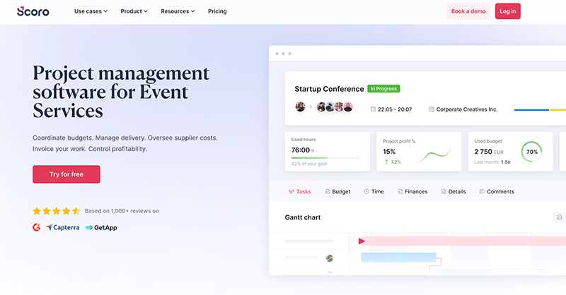
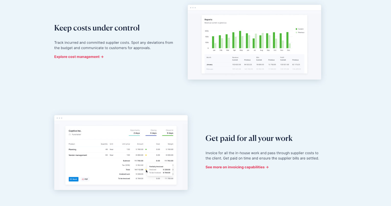
Project management tool Scoro’s landing page for event services shows several elements in action. At the top, a clear value proposition outlines key features like coordinating budgets, managing delivery, and controlling profitability.
The page prominently displays a “Try for free” button in a contrasting color, making it easy for interested visitors to take action.
Scoro also includes a visual preview of its software interface, helping potential customers understand what the product looks like and how they might use it.
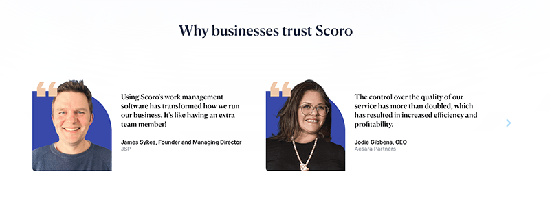
To build trust, Scoro displays testimonials from actual customers as social proof.
Scoro highlights key features such as used hours tracking, project profit percentage, and budget management as you scroll down. Each feature is illustrated and briefly explained, giving visitors a quick software overview.
The page’s overall design is clean and simple, using plenty of white space and a limited color palette. This approach makes the page easy to read and prevents visitors from being overwhelmed with too much information at once.
Pricing Page Design
The pricing page directly influences purchasing decisions, so you need to be clear and transparent about your pricing.
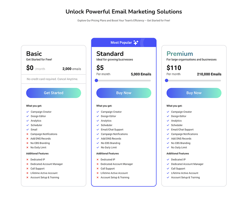
Email marketing tool EmailBulkSender offers distinct pricing tiers catering to different customer needs and budgets. Each tier has a descriptive name (e.g., “Basic,” “Standard,” “Premium) and a clear price point.
The website also uses a table to highlight the key features included in each tier. A side-by-side comparison emphasizes the unique value propositions of higher tiers.
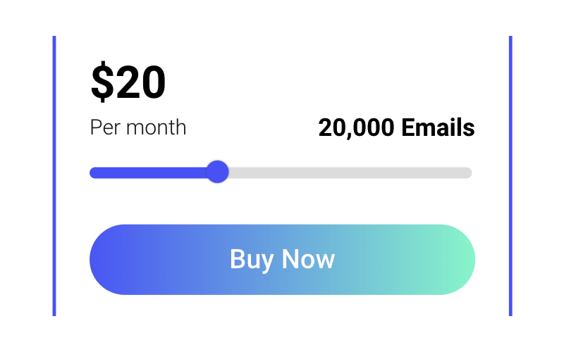
One handy feature is the dynamic pricing slider.
The slider allows customers to adjust the number of emails they wish to purchase, and the corresponding price automatically updates in real time.
Here’s what Farhan Siraj, Co-Founder of EmailBulkSender, had to say about the reasoning behind this slider:
“My goal was to make sure that customers clearly understand what they are paying for and can see how the price scales with their needs. There’s nothing extremely unique or creative about this feature, but I believe it is crucial to maintain a serious and transparent approach to pricing.”
The slider eliminates hidden fees or complex pricing structures. It clearly states what’s included in each plan and any potential add-ons.
Apart from this, other standout details on the pricing page include:
- A strong, action-oriented CTA—”Buy Now”
- Clean web design, ample white space to improve readability
- Most popular plan highlighted reduces decision fatigue
A transparent pricing structure reinforces trust and simplifies the decision for potential customers.
Integration and Product Pages
Integration pages showcase the various third-party apps, platforms, or services your software integrates with. They highlight the benefits of these integrations, such as streamlined workflows, data syncing, or enhanced functionality.
A product integration page shows how your product fits into a broader ecosystem of tools, making it more attractive to businesses already using those other platforms.
Each integration partner can bring new users to your website who are specifically looking for solutions compatible with their existing tools. A dedicated integration page demonstrates a commitment to collaboration with other companies, potentially leading to stronger partnerships and co-marketing opportunities.
Zapier, an automation platform, excels in its integration and product page strategy:
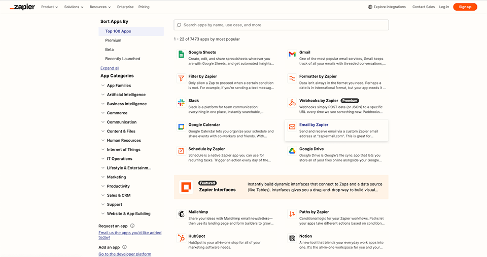
The page displays a massive library of apps (over 7,000), categorized and searchable, immediately demonstrating Zapier’s versatility.
Each app integration page highlights the specific benefits and use cases, explaining how the integration saves time and automates tasks.
You can filter by app category, popularity, or new launches, making it easy to find relevant integrations. The page also includes “Premium” and “Beta” labels to highlight specific partners—driving traffic to those apps and strengthening relationships.
A well-organized integrations page makes it easy for visitors to find the integration that best suits their needs and expands the usability of a tool.
Resource Centers and Blogs
Resource centers and blogs establish thought leadership and boost SEO.
Educational SaaS content marketing positions your company as an industry expert. It shows potential customers you know your stuff and can help solve their problems.
But that’s not all.
Regularly updated blogs and resource centers significantly impact organic traffic. How much? According to our report, websites publishing 9+ blog posts per month saw a 41.5% increase in Google monthly organic traffic year-over-year.
Compare that to B2B websites blogging just 1-4 times monthly. They only saw a 21.3% increase.
Even more impressive? For those high-frequency bloggers who did see an increase, the average jump was a whopping 51.7%.
Mention, a social listening tool, offers a comprehensive resource center. It’s packed with guides, case studies, and webinars—all structured for easy navigation and engagement.
But here’s what sets it apart:
The company explains its user-friendly approach as follows: “We’ve added a sticky table of contents to the left side of the page so readers can easily identify each article’s main categories. On mobile, the ToC is at the bottom of the screen.”
Blog-specific pages are easy to navigate. Lucas Carval, Growth Specialist at Mention, recently revamped the blog template.
This attention to detail makes it easy for visitors to find exactly what they want, making them more likely to stick around and engage with the content.
- “We’ve added a sticky table of contents to the left side of the page so readers can easily identify each article’s main categories. On mobile, the ToC is at the bottom of the screen.
- A progression bar has been added to help know how far each person is into the article.
- The Read More section has been modified only to recommend articles in the same category instead of the newest articles. This improves internal linking by only pointing to relevant content and improves CTR on those pages.
- We’ve removed our author page links, as they were causing us some canonical issues, which improved our technical SEO.
With all these modifications, the blog has received ~2000 more visits daily than before the template change.”
You can create a resource center that attracts and educates your target audience by following Mention’s example of creating well-structured, easy-to-navigate, and informative content.
Interactive Features
Interactive elements like calculators and custom tools provide personalized value that can boost conversions.
Our study found that websites offering free online tools, such as ROI or TCO calculators, saw a 33.0% increase in Google’s Top 10 organic ranking keywords.
But here’s the kicker:
B2B Websites without these tools? They experienced a 28.9% decline in the same metric.
That’s a massive difference in search visibility and potential traffic.
HubSpot’s ROI Calculator is a prime example of an effective interactive tool that can also be used as a powerful lead-generation machine.
Here’s why it works:
- Personalization: Users input their specific business data, including industry, region, and marketing metrics.
- Immediate value: The tool instantly calculates potential ROI, giving users a tangible reason to consider HubSpot’s products.
- Visual appeal: The clean, user-friendly interface makes it easy to use and understand the results.
- Multiple products: Users can calculate ROI for different HubSpot products, encouraging exploration of the full suite.
- Lead capture: To get detailed results, users must provide contact information – a smart way to generate qualified leads.
But here’s the real genius:
The tool builds credibility by basing calculations on data from 216,000+ HubSpot customers globally.
Tools like this provide immediate value while simultaneously showcasing the product’s potential impact.
“If you’re a B2B SaaS, you should be offering interactive demos in your website,” says Tom Shapiro, CEO of Stratabeat. “It’s the fast path to more demos, more sales meetings, and more pipeline. Not everyone on your website is ready to schedule a demo with your sales team.”
He adds: “In fact, I’d argue that 90%+ of your site traffic falls in that category. They are simply not going to book time with your team right now, regardless of how awesome your CTAs might be. But… Why not give them the option to get a demo right now without any friction?”
Mobile Optimization and Accessibility
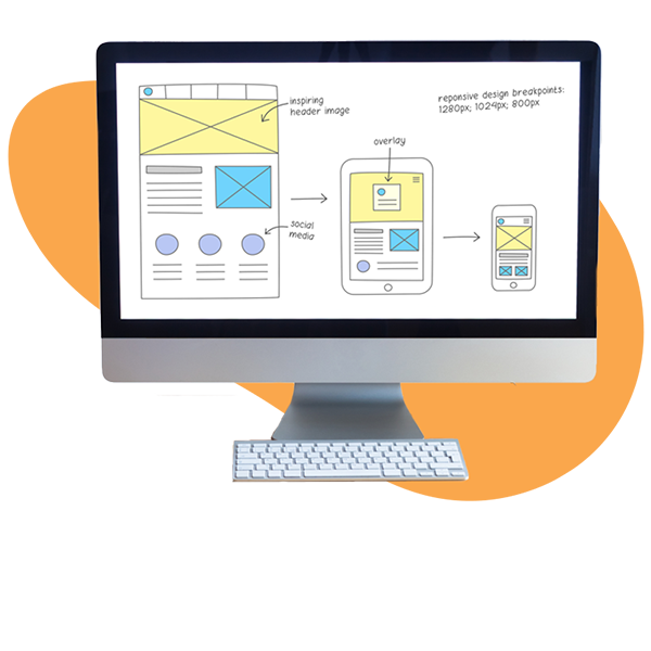
Responsive design, which adapts the layout and content to different screen sizes, is necessary to reach a wider audience and provide a seamless user experience.
According to the World Health Organization and the CDC, 16% of the world’s population and 26% of the U.S. population have a disability. That’s over 1 billion people worldwide and around 86 million in the U.S. alone.
Let that sink in.
If your SaaS platform’s website isn’t accessible, you may miss out on a massive chunk of your market.
Plus, not only is designing for accessibility a matter of inclusivity and ethical responsibility, but it also has legal implications. Many countries have regulations requiring websites to be accessible to people with disabilities.
So, how can you improve your website’s mobile optimization and accessibility?
- Responsive design: Ensure your website automatically adjusts to different screen sizes and resolutions, providing an optimal viewing experience across devices.
- Clear navigation: Use a simple and intuitive menu structure that is easy to navigate on smaller screens. Consider using a hamburger menu or a sticky navigation bar for improved usability.
- Font size and contrast: Choose legible fonts and ensure sufficient contrast between text and background colors to improve readability for visually impaired users.
- Touch targets: Make sure buttons and links are large enough and have enough space around them to be easily tapped with a finger.
- Alternative text for images: Provide descriptive alternative text for images so that screen readers can convey their content to visually impaired users.
- Keyboard navigation: Ensure that all website functionalities can be accessed and operated using a keyboard alone, as some users may not be able to use a mouse.
- Testing: Regularly test your website on different devices and screen sizes and with assistive technologies like screen readers to identify and fix any accessibility issues.
Utilizing these guidelines and tools will help you create a B2B SaaS site that is visually appealing and widely accessible.
Use of AI and Advanced Technologies
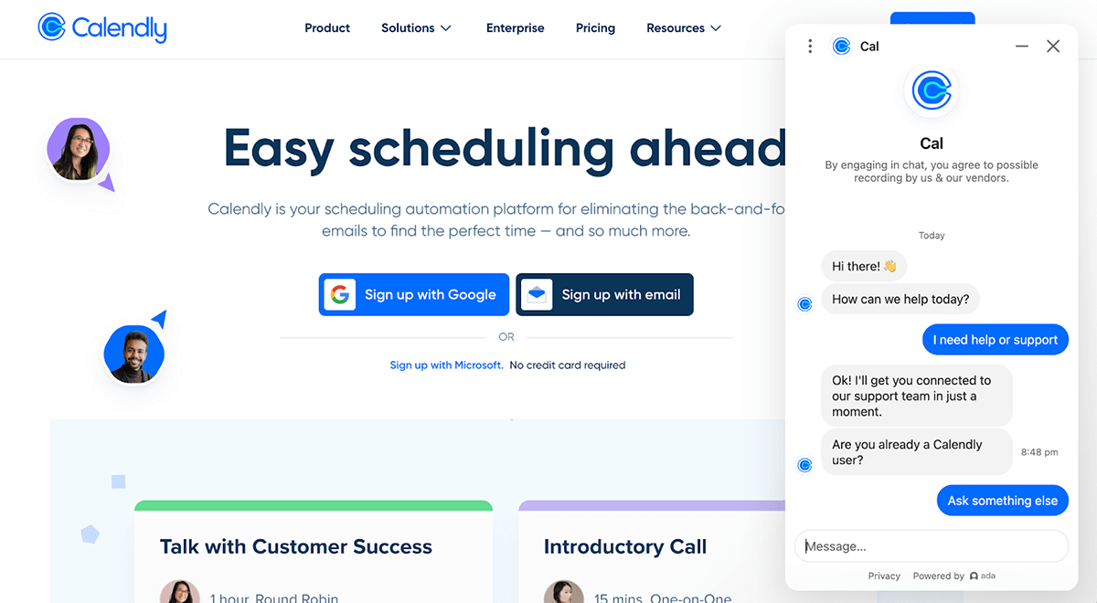
AI can improve your website by adding features like personalized SaaS product recommendations and intelligent search capabilities. For example, AI-powered chatbots can understand natural language, provide instant customer support, and even guide users through the sales funnel.
Calendly’s chatbot, for instance, uses NLP to understand user queries in natural language, making interactions more intuitive and conversational.
The chatbot eliminates the need for users to navigate complex menus or search for answers.
The AI chatbot could suggest the most relevant scheduling options or resources by analyzing user behavior and preferences.
Plus, unlike human agents, AI chatbots provide instant assistance around the clock. This ensures that users promptly get the help they need to improve overall satisfaction.
AI-powered chatbots learn and improve over time. They can refine their responses and recommendations as they interact with more users.
“While AI-generated content has its place, the future lies in using AI more strategically to enhance human creativity and productivity,” says Ginger Shimp, Global Content Lead at SAP. “This includes leveraging AI for tasks like data analysis, content optimization, and even personalized content recommendations.”
Social Proof and Trust Signals
Potential customers need assurance that your product delivers on its promises and can solve their specific challenges.
Testimonials, case studies, and client logos validate your claims and demonstrate your solution’s value to others. They allow potential buyers to see themselves in the success stories of others, reinforcing the idea that your solution can work for them, too.
Hotjar has a dedicated case studies page for social proof. This page showcases how businesses across different industries and use cases have successfully employed Hotjar to understand their users, improve UX, and create customer loyalty.
It shows Hotjar’s versatility by showcasing case studies from various industries, such as marketing agencies (360), e-commerce (Canyon), and conversion rate optimization agencies (Credo). This variety appeals to a broader audience and reinforces the idea that Hotjar is a solution that can cater to different business needs.
Each case study also highlights specific, measurable outcomes achieved by using Hotjar. These quantifiable results add credibility to the testimonials and give Hotjar more credibility.
Lastly, the page is well-organized, with straightforward navigation and filtering options based on industry, use case, and role. Potential customers can quickly find case studies relevant to their interests and needs.
