Why SEO & UX Are Like PB&J

Some things just go together. Spaghetti and meatballs. Hot fudge and sundaes. Calvin and Hobbes. Brangelina. And of course…peanut butter and jelly.
Now add SEO and UX to the list.
Although there’s been a great deal of misunderstanding and mistrust between web professionals responsible for SEO (search engine optimization) and UX (user experience), SEO and UX deserve to be grouped together as a pair like the items listed above. Historically, there’s been a perception by the UX community that SEO is about gaming the system and clutters up the page with text, and there’s been a perception by the SEO community that UX designers do not understand how to drive traffic and revenue. These perceptions are superficial and miss the point. The best SEO specialists and UX designers are all aiming for the same thing: achievement of the organization’s goals. This could be lead generation, sales, event registration, etc.
When integrated effectively, SEO and UX are a powerful force towards a website that brings high volumes of traffic and also converts like a machine. SEO is your off-site traffic driver, making highly qualified traffic stick to your site. UX is what makes their experience on your site sweet as jelly, and gives them a warm and fuzzy whenever they think about your brand.
How can you integrate SEO and UX effectively? Glad you asked. Here are a few ways to get you started:
Start at the Start

Too many companies build a site, and then turn to the folks responsible for SEO and say, “OK, it’s done, now make it show up on Google Page One.” Ridiculous. Short-sighted. Silly.
If you want high search rankings and you want the folks who actually click through and make it onto your site to enjoy the experience, then there’s no avoiding a solid planning process. And your process needs to include those responsible for both SEO and UX. Bolting on features, changing layouts and adding paragraphs of text retroactively at the last-minute are surefire ways to create a Frankenstein of a site, satisfying no one. Do it this way and your site will never get seen and your conversions will be lackluster at best.
Years ago brands at P&G used to roll out new microsites regularly, and only after the site was completed would anyone give a thought to SEO. Then around 2008 they had the “Ah-ha!” moment, realizing that if you bring everyone to the table at the time of initial concepting of a new site, the website will be much more likely to hit its marketing goals. By gathering the full team together early in the process, SEO, UX and brand knowledge transform into INSIGHTS that guide the direction of the initiative. It’s a complete 180 degree change in process, leading to completely different outcomes.
Develop Personas
If you don’t know exactly whom you are targeting, how in the world are you going to reach them and build a relationship with them? This is where personas come in. They help you to clarify whom you are targeting, and in turn how to find them, how to communicate with them and how to define objectives with them in mind.
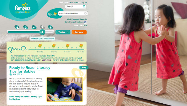
Taking another P&G example, check out the Pampers website. You may think that a mom is a mom is a mom. But Pampers knows better. The brand segments its audience into pregnant women, moms with newborns, moms with toddlers and moms with preschoolers. (It actually goes further by segmenting additional audiences through other baby care brands, but that’s a story for another day and another post…)
This enables Pampers to build its website to cater to the very distinct audiences. They are then able to build sections of the site that only that particular segment cares about and is most interested in and to build segment-based content accordingly. This helps greatly with SEO and getting your content not only ranked, but in front of the right group at the right time. They then also have a super easy-to-use self-segmenting tool right at the top of the page, empowering the mom site visitor to self select the audience segment that’s right for her, funneling her directly to her specific interests. Smart.
Categorize, Categorize, Categorize
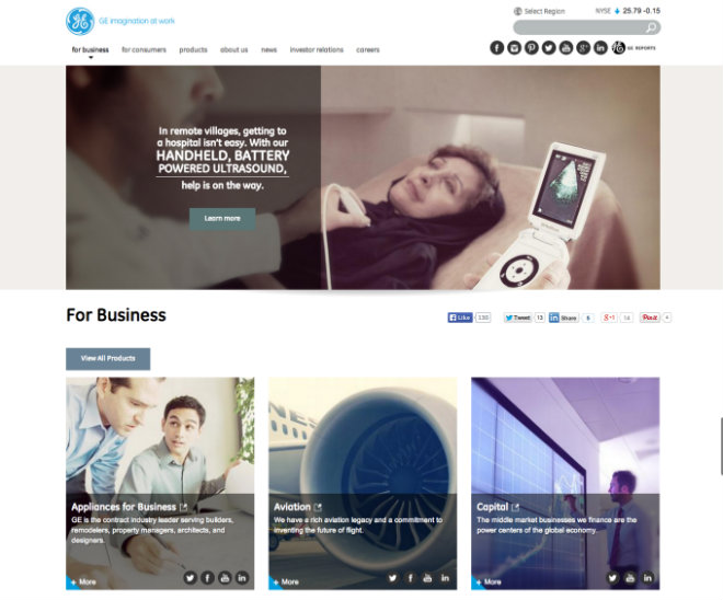
For a business that has endless, endless, endless content on its website, GE does a remarkable job of categorization. Instead of hitting the site user with a paralyzing array of choices, the site guides the visitor through a logical progression to find the information or solutions they are seeking.
What do we mean? Well, let’s say you work for a hospital. You visit GE.com and then immediately select the “For Business” navigational option, which then allows you to drill down by business unit. You then select Healthcare, which takes you to the GE Healthcare website, with further categorized options for products. You then drill down into products for Advanced Visualization or Healthcare IT or Surgical Imaging, etc. Let’s say that you select Advanced Visualization, and then you are presented with further options for Cardiology Imaging Software, Neurology Imaging Software, Oncology Imaging Software, etc. On and on…
Let’s face it, to place all the information or all of those choices (multiplied by their many other business units and sub-business units) upfront in the process just wouldn’t work. It would be a confusing mess. By categorizing their information, they greatly increase their chances that Google will recognize the right pages as authoritative to bring in highly qualified searchers at the precise moment they are seeking the information. And they also provide a great user experience in enabling their site visitors to cut through their vast library of information to get right to the product or topic of choice.
Too many sites try to do too much on a single page, and this can hurt both SEO and UX. Learn from GE, and use categorization strategically to make mountains of information as easy as pie to cut through!
Create a Ridiculously Awesome Content Strategy
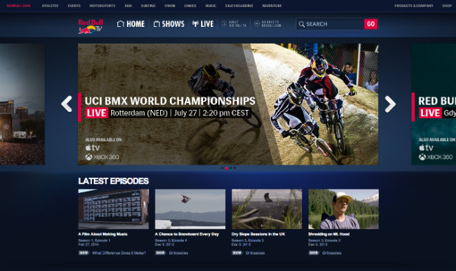
Want your audience to love you? To REALLY love you? Then follow Red Bull‘s lead. They have transformed content marketing with their embrace of extreme sports, in line with their audience’s passions. It seems that no stunt is too daring for Red Bull Athletes: windsurfing, air racing, free-climbing, kiteboarding, freerunning, cliff diving, B.A.S.E. jumping, and how about Felix Baumgartner’s 2012 jump from space? Each one more daring than the last, these sponsored stunts give exceptional meaning to the energy drink’s longtime slogan: IT GIVES YOU WINGS.
Red Bull is a lifestyle brand associated with world-class talent, determination and intensity. Serving up thrill after thrill, Red Bull has the entire world watching to see what its band of international athletes will do next–not what new flavors they plan to release or the latest features of their can.
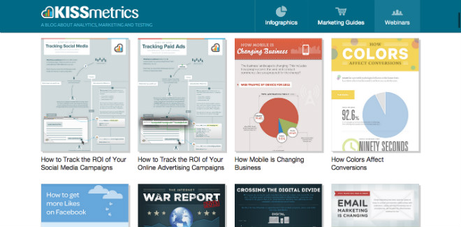
Need another example? How about KISSmetrics? All this analytics software company has done is create a blog that generates a readership of a whopping 350,000 monthly uniques. Their long-form content produces big-time, and their infographics and guides are steady producers of traffic. An astounding 82% of their overall traffic comes through the blog and 70% of their customer leads are sourced from the blog, as well. According to Neil Patel, one of the co-founders, from 47 infographics published during a two-year period, the company generated 2,512,596 site visitors, 41,142 backlinks and 41,359 Twitter shares. Whoa!!
Make It Super Simple & Freakishly Fast
Want better SEO results? Want better customer experiences on your site? Want better website results? Then streamline your website and make it freakishly fast.
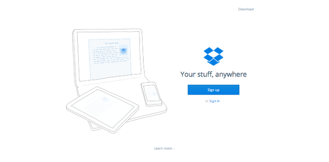
Take a look at Dropbox. It’s a minimalist approach to website design, with a load time of 1.81 seconds according to Pingdom’s Website Speed Test and with an 86/100 score on Google Developers’ PageSpeed tool. The user experience on Dropbox is brilliant. The site is so ridiculously easy to use, the layout so simple, clean and uncluttered, you are able to find the information you want and execute on your objectives intuitively and immediately. According to a study by Google titled “The Role of Visual Complexity and Prototypicality Regarding First Impression of Websites: Working towards Understanding of Aesthetic Judgments”, visually complex websites are consistently viewed as less beautiful than their simpler counterparts.
Google loves quick-loading pages and rewards them accordingly. And users love them even more, rewarding your business accordingly. The conclusion? Make it simple and fast!!