6 Top Responsive Web Design Testing Tools

Websites should be designed in a way to reflect the real-life ways that your audience is viewing your site. For certain businesses, mobile viewership may be only 10% or 20% of your overall traffic. We have certain clients where the majority of site visitors are seeing the site on their smartphones.
Responsive web design is an approach to websites in which design and development respond to the user’s environment based on screen size and orientation. This eliminates the need for a new design and new set of code for each new device. With responsive design, there’s one set of code that flexibly accommodates the different devices and dimensions your audience uses.
If your website is not responsive, your business is in the dark ages. That’s a joke (but not really).
Stratabeat made the decision to go 100% responsive with every new website, microsite, and landing page back in 2012. Back then, there were extremely few tools available to assist with the process. My, my, my, how things have changed. Today, fortunately, there are a wide range of tools to expedite the process, including some truly useful testing tools.
Want to Captivate Your Audience?
Learn how to strengthen your brand with better B2B web design. Let’s Talk!
No matter how you code up your web pages, you need to test the responsiveness prior to going live. To that end, here is a list of six testing tools to ensure your hard work in making beautifully responsive sites is achieving your objectives and not failing your mobile users no matter where they end up in your site.
1. Browserstack
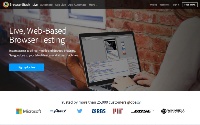
Browserstack has long been a favorite browser and device testing tool here at Stratabeat. We’re not alone – Browserstack boasts more than 25,000 customers. With Browserstack, you can test not only a wide range of desktop browsers on Windows and Mac, you can also test Android and iOS mobile devices and the different browsers supported by each device. The breadth of testing options is invaluable, and the ease-of-use of the tool makes testing much faster.
2. CrossBrowser Testing
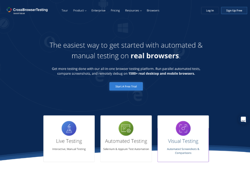
CrossBrowser Testing is another awesome all-in-one browser testing platform. You can run parallel automated tests, and remotely test on 1500+ desktop and mobile browsers. For your automated tests, you can run them against real iOS, Androids, & other desktop browsers. Take pixel-perfect full-page or above-the-fold screenshots of your website’s layout across hundreds of devices at once, and compare your screenshots against historical versions.
3. Google Resizer
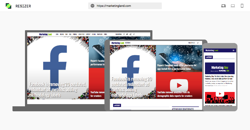
Google is now offering Material Design guidance around breakpoints, responsive grids, surface behaviors, and user interface patterns. Resizer is Google’s testing tool to enable users to test that guidance. It’s super clean and super easy to use. The screens in the responsive multi-device view are interactive, and if you engage in the desktop or mobile view you can quickly and easily adjust the dimensions with a simple click.
Head-Turning, Jaw-Dropping B2B Websites
Ready to differentiate yourself from the competition? Let’s Talk!
4. Am I Responsive
Am I Responsive is a quick, simple, and easy-to-use responsive testing tool, without all the bells and whistles. You can rearrange the devices on the screen by clicking and dragging on each device. If you drag the Am I Responsive Bookmarklet to your bookmarks bar, you can test the responsiveness of any website right in your browser.
5. XRespond
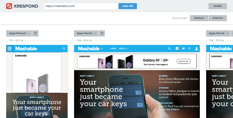
XRespond is a cool responsive testing tool, in that you can test multiple device views side-by-side (or side-by-side-by-side-by-side), expediting the testing process across a range of similar devices (e.g., multiple versions of the iPhone, etc.) or across completely different devices.
6. Screenfly
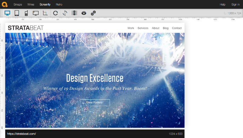
Screenfly is a responsive testing tool that has the added benefit of including pixel measurements. You have the option of viewing static screens or enabling scrolling, depending on what you’re testing.

Related Items