3 Captivating B2B Rebranding Examples

B2B branding. It’s stuffy, it’s gray, it’s dull, it uses awkward stock photos straight from the 80s, right?
B2C brands are the ones who get all the fun, right?
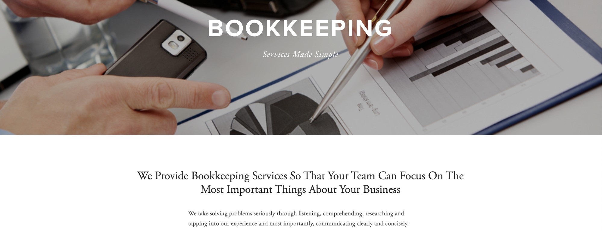
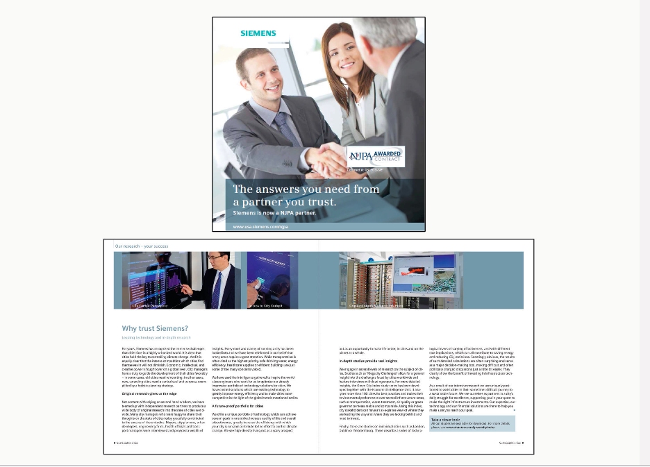
If these thoughts have ever crossed your mind, we can’t really blame you. After all, a few minutes scouring the SERPs for B2B branding will lead you to rebranding examples like this:

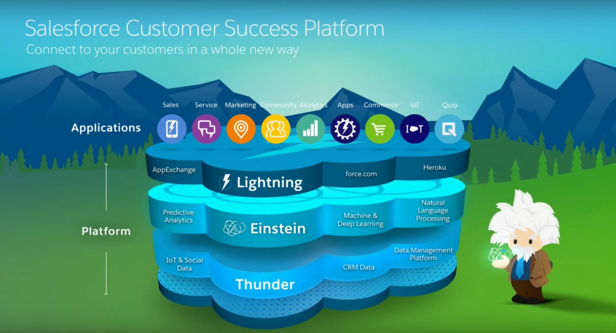
And this…
Yawnnnnn.
With sites like these, it’s no wonder everyone assumes B2B branding is boring.
However, the reality is that many of the most successful and valuable B2B companies in the market are fully committed to exceptional branding. Think Intel, Apple, Accenture, SAP and Salesforce, for example. Strong branding correlates with higher conversion rates and the ability to maintain pricing premiums. Salesforce, committed to distinctive branding from the start, became the fastest enterprise software company to hit $10 billion in annual revenue. Its annual Dreamforce user conference attracts more than 170,000 rapid fans.
The ROI of branding is especially high for B2B companies. With a concerted commitment to strong branding, B2Bs can expect stronger traffic, conversions, leads, pricing premiums, close ratios, revenue, brand loyalty, along with a lower cost per acquisition.
Eager to see high-performance branding in action? Check out these B2B rebranding examples, and see just how awesome B2B branding can be.
Vi3
Up first, Vi3 – formerly known as Valmarc.
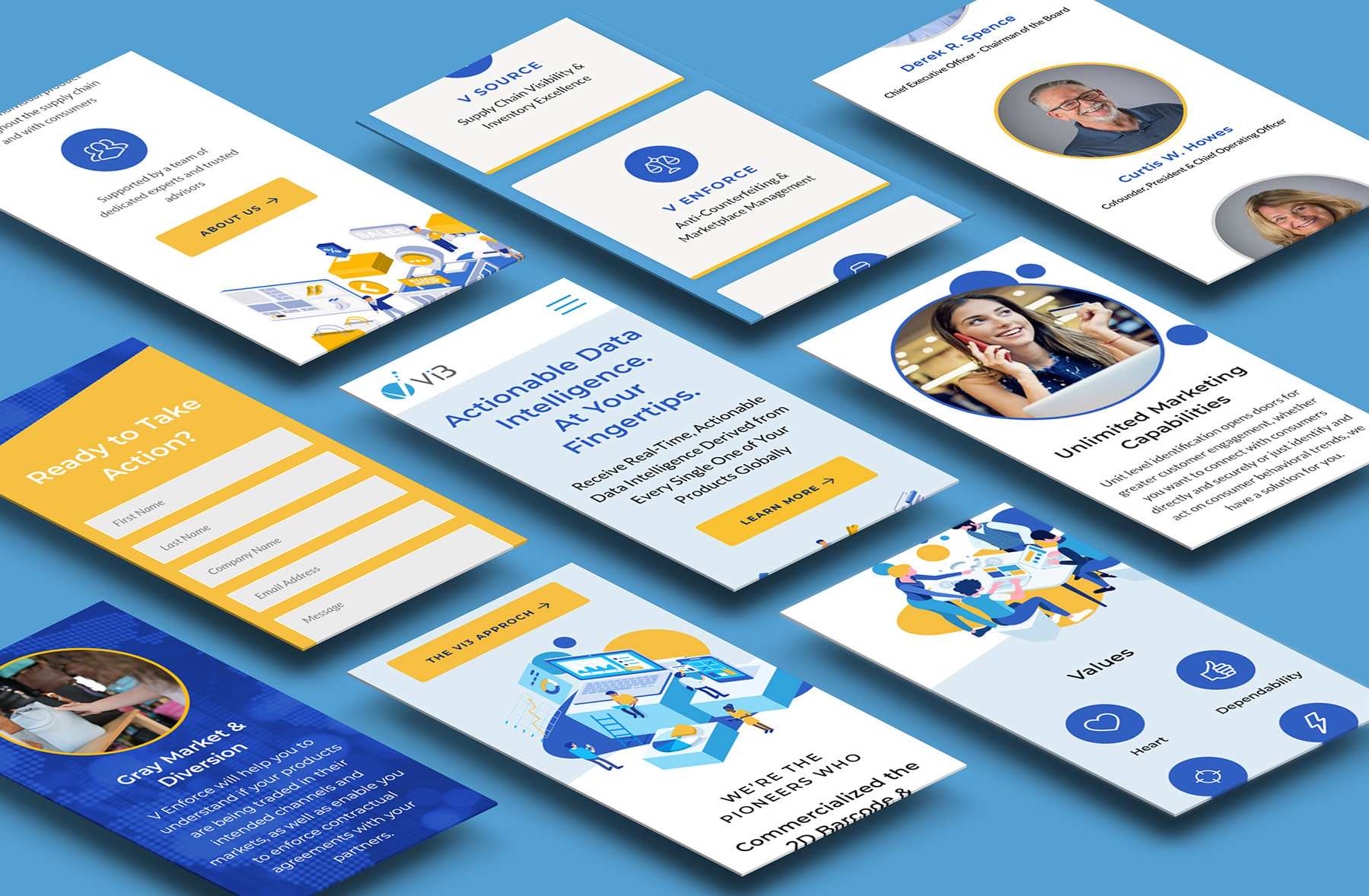
Stratabeat worked with Vi3, an innovative real-time data intelligence solutions provider, to both develop and implement a robust rebranding strategy. This included a new brand name and logo, visual branding, a new website, a sales presentation, stationery, a van wrap and marketing collateral.
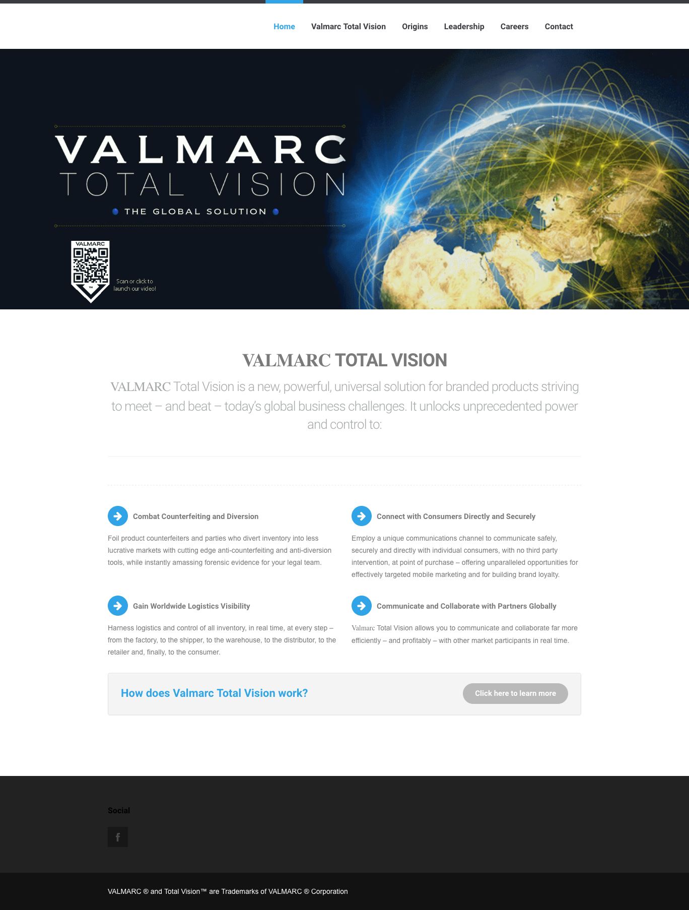
Before the Rebrand
Before the rebrand, Vi3’s name and website did little to reflect their industry-leading technology and superior customer service. The design felt out-dated and stiff – the total opposite of the Vi3 team, who is compassionate, driven and absolutely brilliant. We wanted to capture their true essence and have that communicated more accurately and powerfully through the new branding.
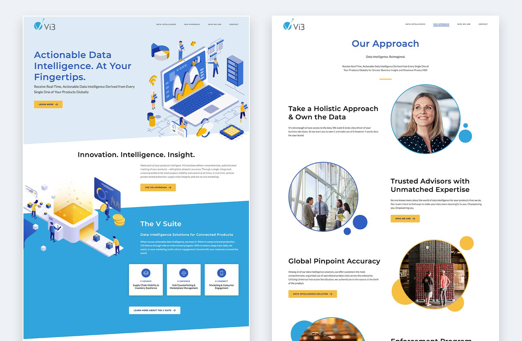
After the Rebrand
In a 156-page Brand Strategy, Stratabeat identified real-time “Data Intelligence” as a white space opportunity within the competitive landscape. In addition, we guided Vi3 through a brand naming process, creating a name that demonstrates Vi3’s commitment to innovation, intelligence and insight.
We also refreshed their look with a new logo, vibrant color palette and engaging graphics. All these elements make the new brand highly accessible and, most importantly, modern – essential for a technology company.
Strengthening the structure and messaging in the decks to be even more compelling, Stratabeat also overhauled Vi3’s sales deck so that pitches are 100% client focused, with ample social proof.
Now, Vi3 has a brand that meets the same high standards their team, technology and customer service meets every day.
A Rebrand that WOWs
Ready to differentiate yourself from the competition? Let’s Talk!
Siemens
Up next on our list of rebranding examples: Siemens.
After 170 years in operation, many brands might struggle to stay relevant. Siemens, however, knew their brand had to be as innovative and dynamic as their services and products.
But their old brand? It was stuck in the 1990s.
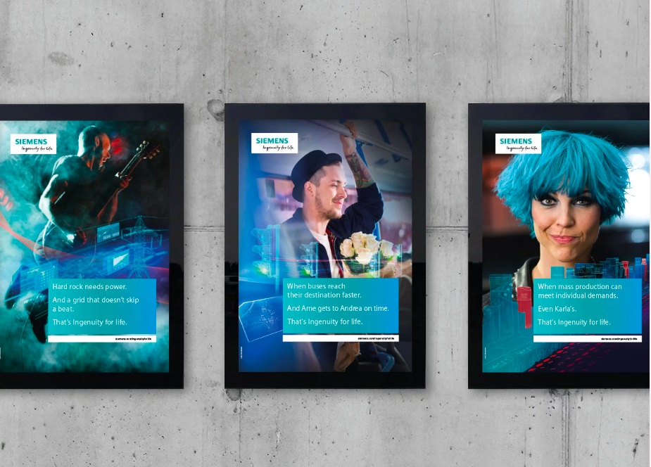
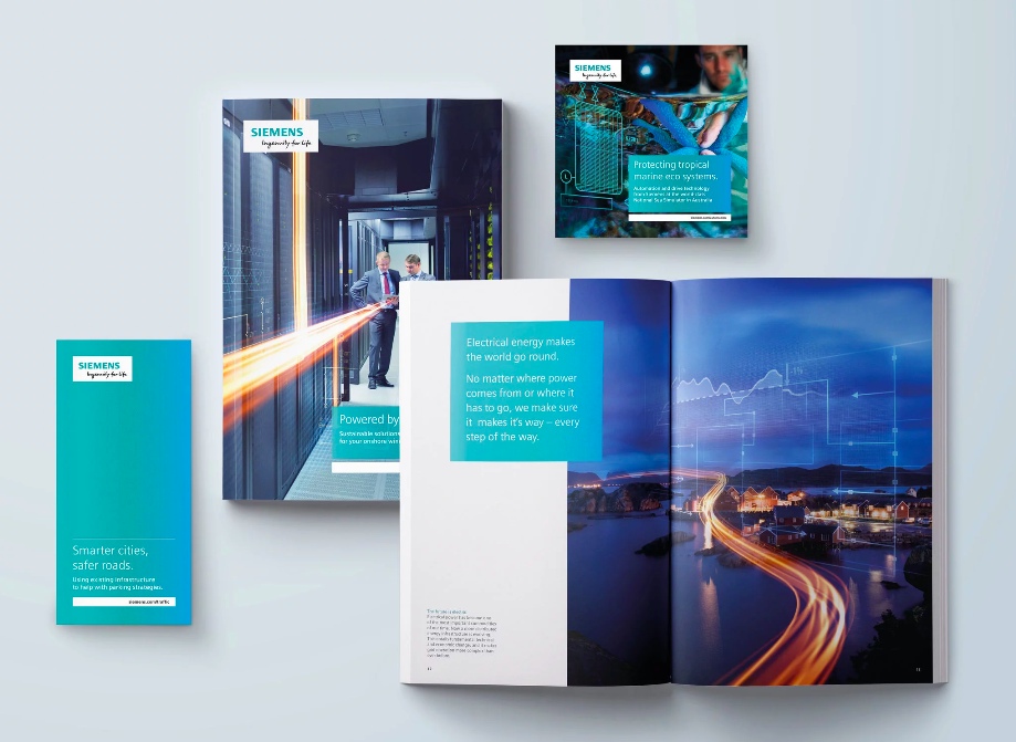
So in 2018, they reinvented their brand to reflect their dedication to “ingenuity for life” – pairing technology with purpose.
Before the Rebrand
After the Rebrand
The result of the rebrand was a website that united Siemens departments across the globe with consistent layouts and engaging visuals.
No more stuffy gray colors and “blah” 90s suit-and-tie stock photos. Siemens’s new electric blue color and edgy portraits reflect their innovative and entrepreneurial spirit. I mean, just look at that hair!
Officeworks
Our final brand on this rebranding examples list: Officeworks.
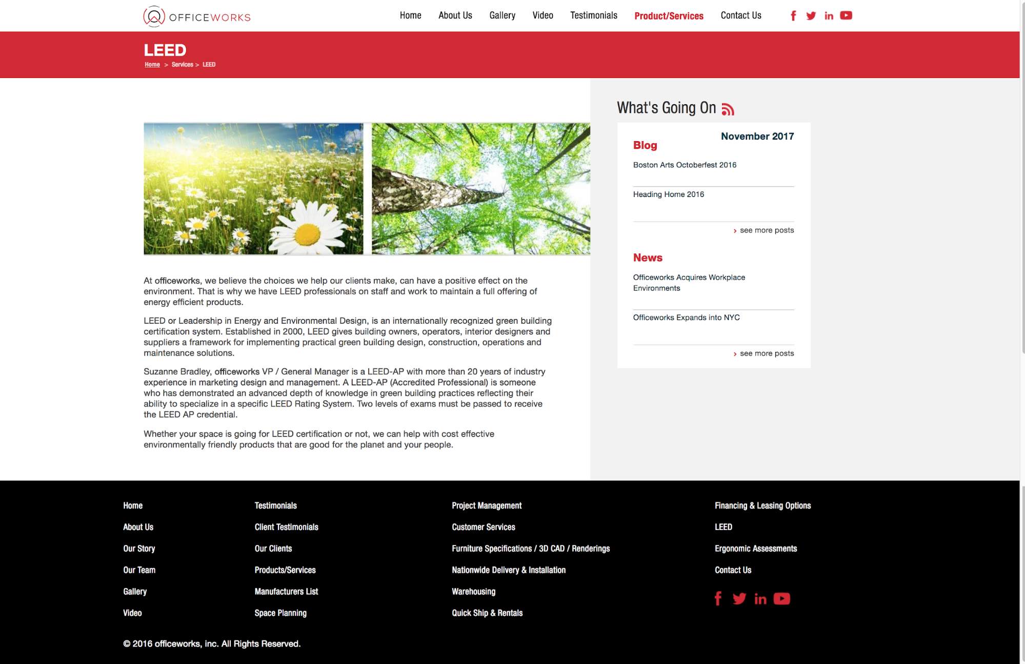
Before the Rebrand
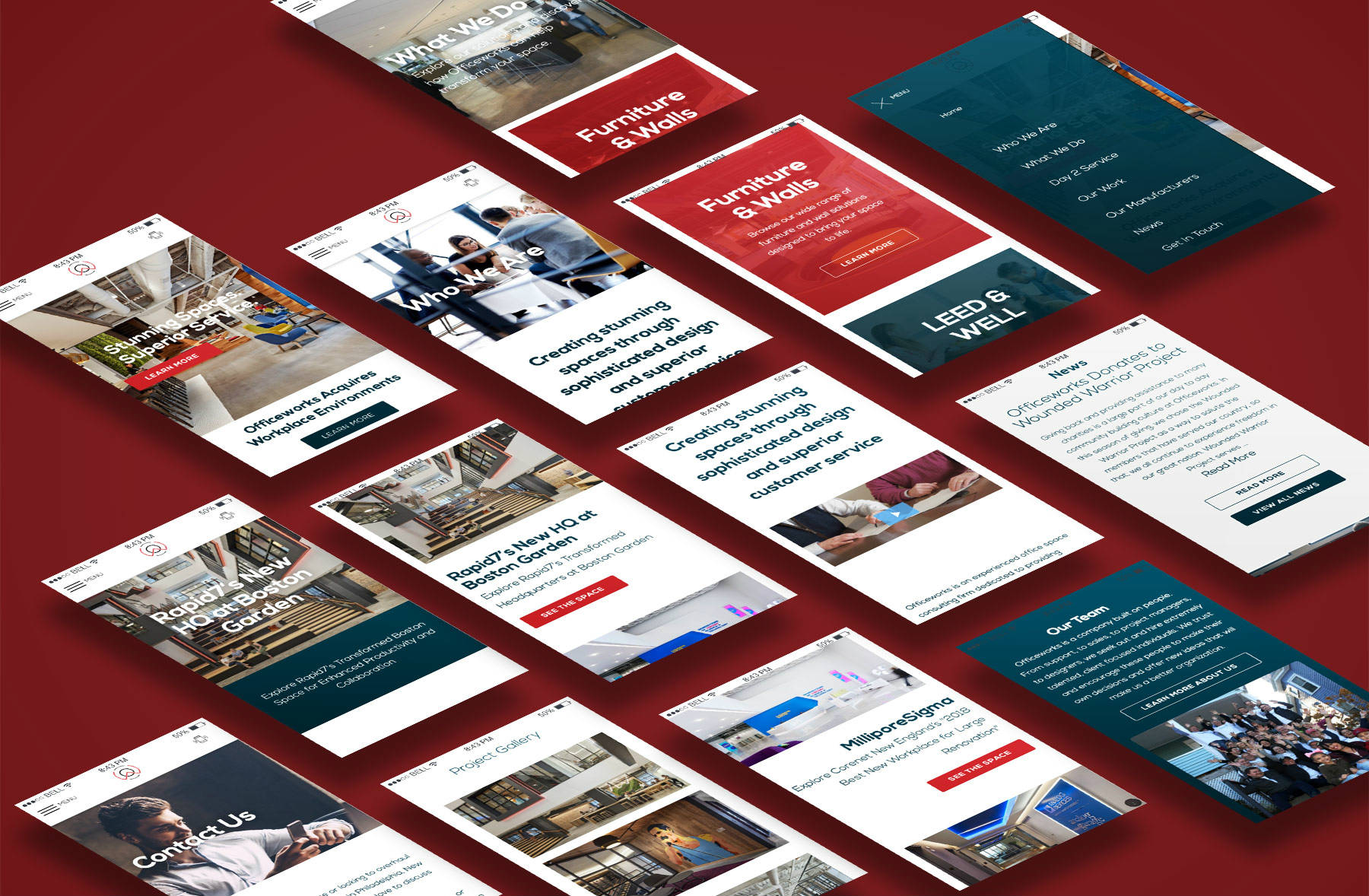
Officeworks creates stunning interiors and office spaces and offers an unparalleled customer experience, but you wouldn’t have guessed as much by looking at their old website.
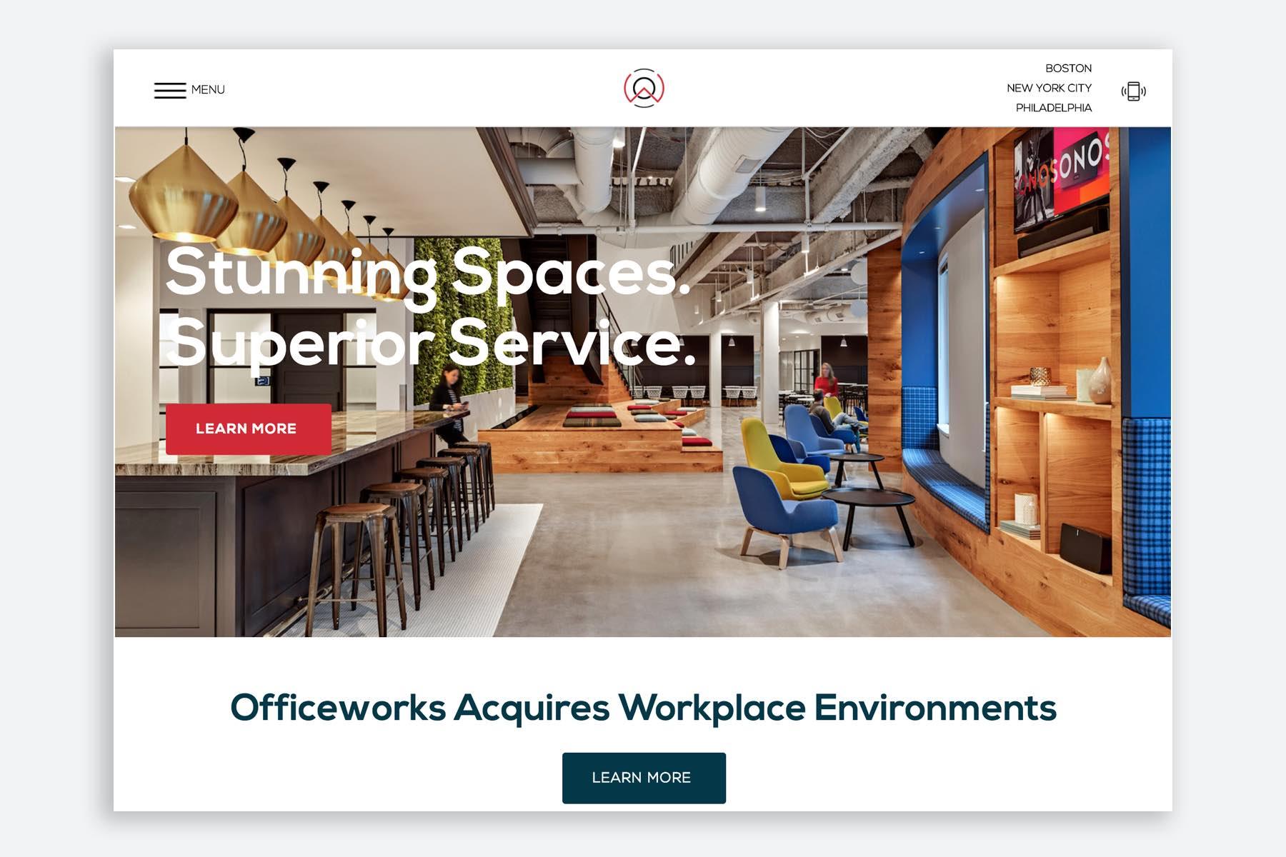
After the Rebrand
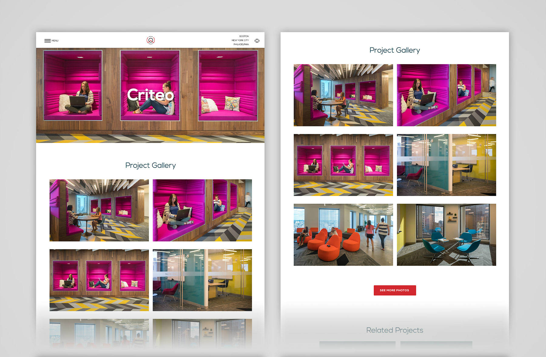
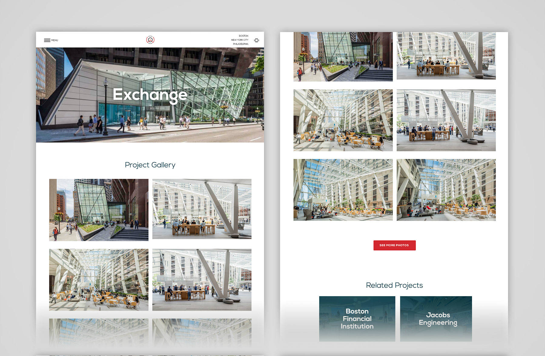
Stratabeat identified “Customer Service” as a white space opportunity within Officeworks’s competitive landscape. From there, Stratabeat created a new, modern look and feel through the design of a new logo, color palette and brand styles. Based on this new foundation, we created a responsive, sleek, contemporary website to bring Officeworks’s stunning interiors and dedication to customer service to the forefront of their brand.
Their new brand was cohesively implemented across stationery, marketing collateral and a new proposal template. Stratabeat also created a corporate video and designed a 32-page entry for a national industry awards competition, helping Officeworks to win 1st place honors. (Go, Officeworks!!!)
Since the rebrand, Officeworks has tripled its growth. Now, their brand is just as sleek as their interiors.
Summary
If you think B2B brands have to be stuffy and monochrome, think again. These rebranding examples are proof that B2B branding should be just as exciting as B2C.
If your brand makes you say “hell yeah” but your branding leaves you saying “meh,” that should be a sign that something isn’t right. If your products, services and team are forward-thinking, innovative and highly effective, it’s time for your brand to showcase that.
