Designing More Effective Websites with the Psychology of Surprise

It was the surprise ending to top all surprise endings.
For two hours, we had watched Bruce Willis go about his business, trying to reestablish his relationship with this wife and helping the young boy who saw dead people. Then, at the end of the movie, came the ultimate twist: Willis himself was dead and had been dead for the entire movie.
It was a shocking ending and one that had people talking. Everyone wanted to know: “Have you seen The Sixth Sense?” The shocking surprise at the end caused millions of people to want to see the movie.
We like to be surprised.
Turning the Status Quo on Its Head
The truth is that in a world where books and movies recycle the same plots again and again (Hollywood movies, anyone?), elements of surprise make plots much more enjoyable. And while Hallmark movies and Nicholas Sparks books can be enjoyable for some people, they’re highly predictable and not winning Oscars or National Book Awards.
The best books and movies are the ones that surprise the reader with a plot twist, such as the main character being dead for the entire movie. We love something that turns the status quo on its head.
Flip the Status Quo
Ready for a jaw-dropping, awe-inspiring, conversion-driving website? Give Us a Shout!
The reality is that your brain actually enjoys being surprised more than it does the status quo. Yes, the pleasure center in your brain lights up when it encounters something familiar that it likes. But that same pleasure center lights up even more when it encounters a surprise or the unexpected.

Science backs this principle up.
Emory University neuroscientist Gregory Burns and his team performed a test that proved the human brain loves the element of surprise more than almost anything else. His study showed that when the brain encounters something new and surprising, it enjoys that experience even more than when it encounters something familiar it enjoys.
The team performed their famous test using Kool-Aid and flavorless water to determine how the brain responds to surprise. As Josh Gewolb notes in Science Magazine:
[Gregory] Berns and [E. Read] Montague examined neural activity in 25 people as they were fed 28 teaspoon-sized hits of Kool-Aid and water. Sometimes the slurps of sweet and tasteless liquid were delivered in a simple alternating pattern. Other times, the Kool-Aid came at random intervals that were impossible to predict. Most of the subjects didn’t report noticing a difference between the predictable and unpredictable sequences. But functional magnetic resonance imaging revealed that their brains loved the randomness: Only the unpredictable sequences strongly activated the nucleus accumbens and nearby regions of the brain.
Did you catch that? Even though the test participants didn’t report any additional pleasure from the random pattern, their brain showed otherwise. When they were surprised to receive Kool-Aid instead of water, the pleasure centers of their brains lit up.
Author Carmen Simon, PhD likes to say that the brain is a prediction engine. It is always trying to predict what’s coming next. The more it can predict what’s coming next, the more it will tune out. If, however, you can disrupt the predictions through the element of surprise, you can immediately capture the brain’s attention. On top of this, you can ensure your message is more memorable and actionable.
Effective Websites
Now, how does all this apply to creating effective B2B websites? If you want a more effective website – if you want your visitors to react strongly to your site and be more likely to convert – then trigger the pleasure center of the brain with surprising stimuli. If you want to keep visitors browsing and consuming, delight and surprise them. You can’t feed them the same old thing. You need something new and fresh.
Instead of having the same design and text position all the way throughout your site, mix it up. Use unique color combinations, shapes, animations, video, photography, illustrations, etc. Do whatever is necessary (within reason, of course) to catch your visitors by surprise and keep them interested in your website. The more your can surprise and delight your visitors, the more you’ll keep them engaged on your website.
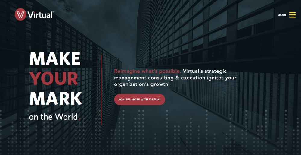
Virtual Inc. does an outstanding job of using surprise on their website. They use asymmetry, interesting secondary colors, different textures and backgrounds, and animated elements on their homepage. As you scroll down the page, every frame is unique. All these elements ensure that you never see something predictable. You’re continually surprised the further you scroll.
Do you remember the Million Dollar Home Page? Essentially, it worked like this. Any business could purchase advertising space on the home page for a price of $1 per pixel. The result was certainly not what you would call effective web design. The home page was basically a garish mish-mash of dozens of banner ads for businesses.
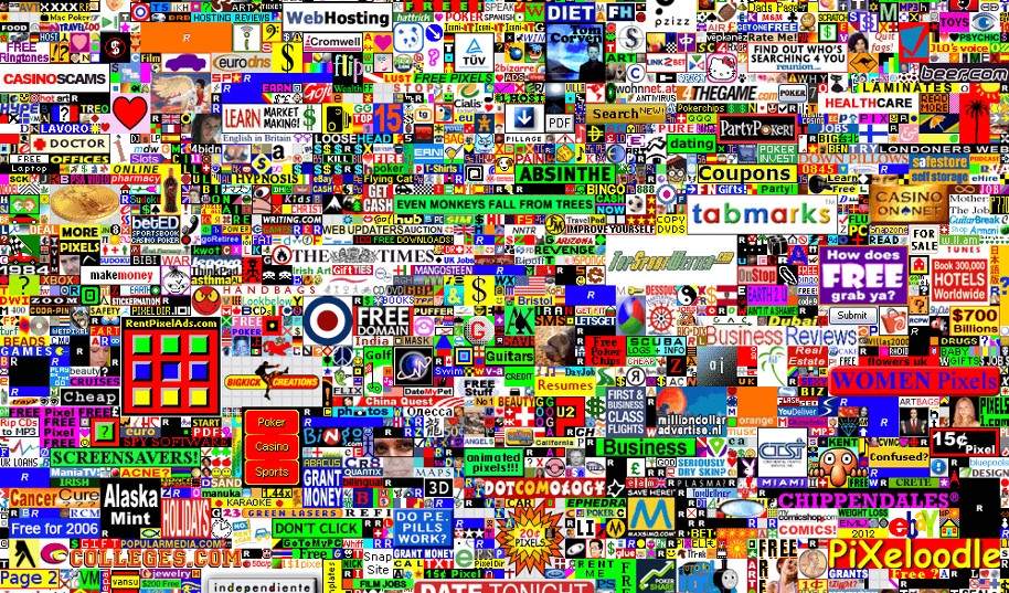
And yet it was actually highly effective and brought in over a million dollars in revenue for the creator of the page. Why was it effective? Because of the novelty of the concept. The idea of a million dollar home page was surprising to people and actually attracted them. People were genuinely curious what a million dollar homepage looked like.
And while we certainly don’t recommend filling your website with garish banner ads (please don’t!) we do recommend trying to find elements of surprise and novelty to incorporate.
Ways To Incorporate Surprise Into Your Website
There are numerous ways to incorporate elements of surprise for more effective websites. For example, Kickstarter includes an image of scissors just above the global footer. If you click on the scissors, a new, previously hidden section of the page appears.
This section guides you into an interactive experience where they present you with a fillable form. You answer five quick questions and then they match you up with a project that might appeal to you.
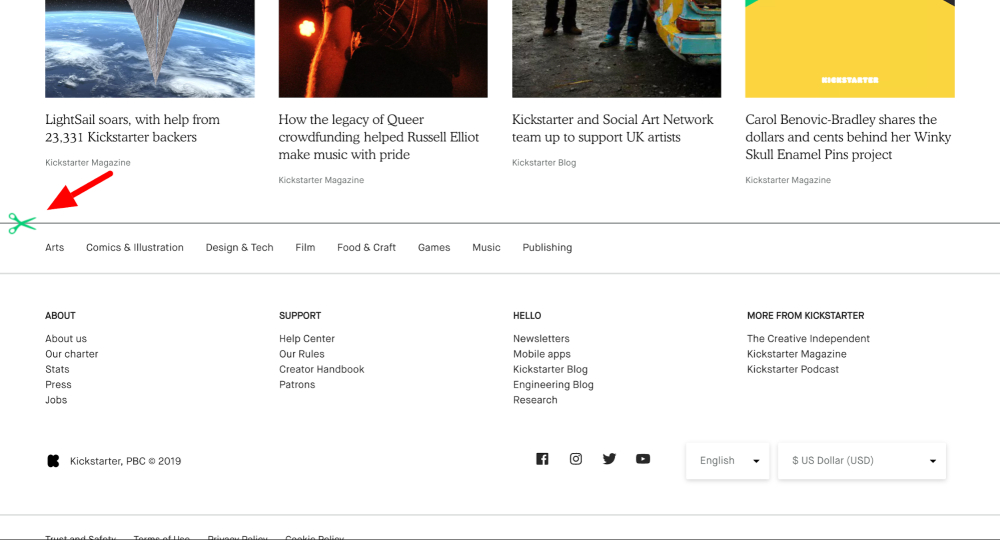
It’s totally unexpected, includes the element of surprise, and is much more likely to make visitors engage and stick around longer.
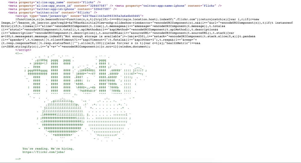
Or you might include something hidden in the HTML code of your site for those who are curious enough to be looking around under the hood. For example, Flickr includes artwork in its HTML to delight those who are adventurous enough to explore it.
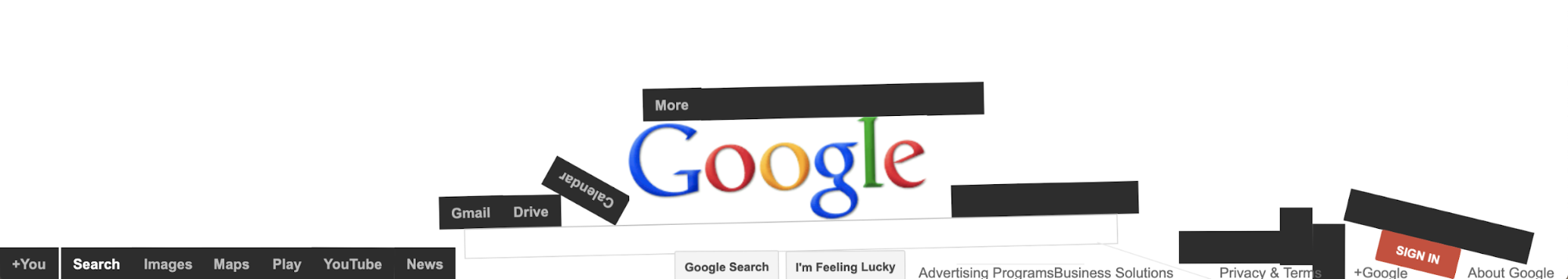
Some effective websites hide Easter Eggs throughout the site that thrill audiences when they discover them. This is a great way to go viral as well. Google is the master of hiding Easter Eggs. For example, if you type “do a barrel roll” into the search engine, the entire screen will do a barrel roll right before your eyes.
Or if you type, “No gravity,” and then click, “I’m Feeling Lucky,” all the elements of the screen will fall to the bottom.
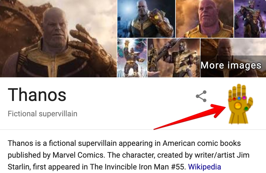
Or if you search “Thanos” (from The Avengers), you’ll see a Knowledge Graph with the Infinity Gauntlet displayed. If you click on it, the fingers will snap (like in the movie), and half the search results will disappear (a reference to The Avengers: Infinity War).
If you search “zerg rush” (from the strategy game “Starcraft”), you’ll see a platoon of Google “O’s” descending from the top of the screen, slowly destroying your SERP while you battle the O’s through clicks to stop the onslaught.
Why does Google go to such efforts to create these Easter Eggs? Why do they regularly feature “doodles” on their homepage related to the particular day of the year (a picture of Martin Luther King Jr., etc.)? Why do they invest the time and resources in these things when they could save time and resources and simply be providing search services?
Because Google gets something that many other firms don’t. They understand that surprise completely delights the senses and turns ordinary tasks into memorable experiences. And they know if you’re delighted, you’re going to tell other people as well, which will drive more visitors to their website.
A predictable website = a boring website. A boring website = bored brains.
Bored brains are a conversion rate killer and will dramatically hurt your lead generation efforts.
Incorporate Surprise in Your Web Design for Better Results
Interested in learning how to inject surprise into your design and improve your website results? Let’s Talk!
“Surprising” Doesn’t Equal “Confusing”
As we talk about the importance of surprise in creating effective websites, it’s critical to remember that a surprising website doesn’t equal a confusing website. While Virtual Inc.’s website may be surprising, it’s certainly not confusing. It’s intuitive and easy to read. There is a clear hierarchy and recognizable calls to action. These allow the reader to easily understand the content even though it’s being presented in a unique and unexpected way. The element of surprise on the site makes site visitors more engaged, and this leads to a better user experience.
Kickstarter’s trick enhances the user experience without getting in the way of it. Google’s Easter Eggs must be intentionally sought out and they never interfere with the overall search experience unless you want them to.
The bottom line is that when it comes to web design, surprise works wonders when it’s thoughtfully put into place. As you think about designing your website, put your M. Night Shyamalan (the director of The Sixth Sense) thinking cap on. Are there ways you can thoughtfully incorporate surprise into your website? Are there ways you can delight your visitors while still maintaining the effectiveness of your website?
Generally speaking, if Google does something, you should at least pay attention. If Google thinks surprise is important, perhaps you should as well.