The Top Web Design Trends for 2020

Your website is the digital hub for your B2B business. Are you giving it all the time, attention and love that it deserves as the centerpiece of your digital marketing?
Your web design – from its aesthetic to user friendliness – has a critical effect on how prospects perceive your business. It has an equally impactful influence on audience engagement, conversions and lead generation. Your website can literally help you to spur massive growth. (Or alternatively, it can cause you to lose prospective leads and hinder growth.)
Everything from the white space on the page to the messaging, colors, images, video and typefaces you use play a role in delivering either a positive or negative site experience. A poorly designed site signals to users that a business is unprofessional – maybe even untrustworthy. No matter how incredible your offering is, an ugly, amateurish or difficult-to-navigate site is going to create leaks in your lead generation process.
On the other hand, a gorgeous B2B website with user-friendly features and a clean design suggests that not only is your brand trustworthy, but your products or services are, too. Effective website design is aligned with your branding and is fine tuned to generate substantial marketing results.
That said, web design trends are continually changing, and it’s therefore important to keep up with the latest design opportunities to fuel your website success most effectively.
To that end, we’ve compiled a list of some of the most significant web design trends to expect in 2020, so you can keep your site fresh and rake in the leads.
Behavioral Intelligence-Based Design
As an agency, we’re surprised at the number of companies that do not regularly review behavioral analytics for their website. We believe, though, that more and more brands are beginning to see the massive value that behavioral analysis brings to the optimization of website design and therefore are listing it as our first web design trend of 2020.
By studying the digital body language of your site visitors through behavioral analytics, you’re able to see which pages are working well and which pages involve high levels of friction for your site visitors. In addition, by seeing exactly what they are paying attention to on the page, how far down the page they are scrolling, what they are clicking on and where they are hovering, you can glean critical insight into how to adjust and improve your design, layout and content in a way that delivers far greater value to your site visitors.

Expect more companies in 2020 to be capitalizing on the insight from behavioral intelligence tools like Decibel, Clicktale, Mouseflow, Hotjar, Smartlook and FullStory.
User Experience
Companies are now focused on the user experience (UX) more than ever before. And as our next web design trend, this focus will only intensify moving forward.
When designing a website, teams are no longer just looking to build and design pages, but instead are intent on supporting the customer journey and delivering a great user experience.
Today, customer experience is one of the most critical factors of website success. The benefits of customizing experiences based on audience segment and persona are indisputable.
Your site visitors now expect smooth and easy user experiences, regardless of your products or services. Expect to see web design teams answering the call with more enjoyable websites.
Animation
Another web design trend is animation. Innovative websites are not just using animation as an accent or decoration, but instead are incorporating animation into the very experience of the site.
With animation, your website can come to life, delivering a more eye-catching and enjoyable experience.
Cash App uses the entire screen to deliver its animated messaging, captivating you in the process. Click on the only CTA that’s visible by default, and enter an educational animated walkthrough to teach site visitors about investing. It’s an example of using animation in a deeply engaging way.
The Dataveyes website features animation not only as a design element, but also as a core element in its storytelling.
Diagonal Design
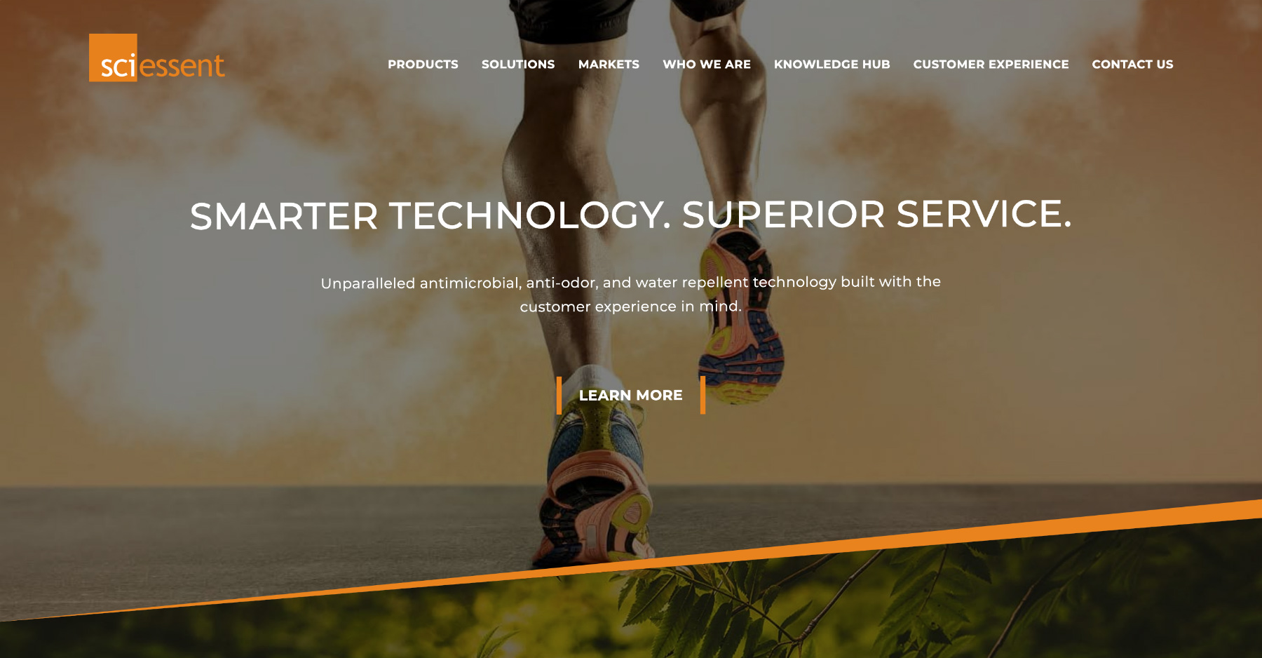
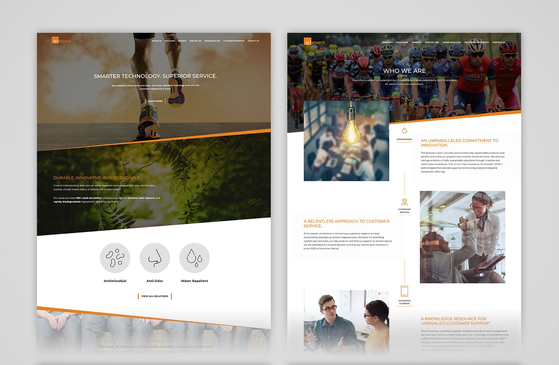
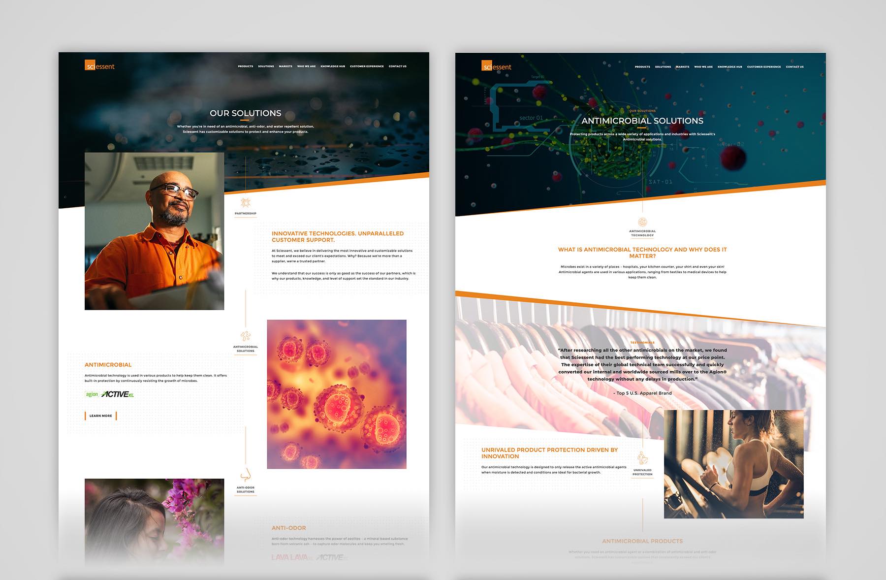
In 2020, expect to see more web design that incorporates diagonal frames, angled headers and diagonal shapes. The common web page layout of horizontal layer over horizontal layer over horizontal layer, etc. needs a refresh. Expect many web designers to look to diagonals as a way to freshen up page design in a way that’s sleek, cool yet frictionless.
An example of this is the Sciessent website, which we recently launched. Frames were structured with diagonally rising slants across the entire website, so that the branding is highly consistent, but in a fresh, vibrant manner. Expect more and more sites to incorporate this type of dynamic treatment moving forward.
Business Strategy-Based Design
Web design, when focused on strategy, can have a massive impact on business growth, and correspondingly more businesses are now realizing the business impact of effective web design. We are coming into contact with fewer companies looking to merely “refresh their website” or “modernize their website” (Thank Goodness!!!)
Instead, we are pushing companies to dig deeper and treat their websites as core business drivers. And not just their product and service pages, either. Companies should be viewing every section of their site, including content areas, as platforms for growth. This involves everything from branding to marketing strategy, customer-centricity, SEO, conversion optimization and behavioral analysis (see above).
And we’re not the only ones advancing this evolution of web design. Just take a look at IDEO’s “Business Designer” job description: “Business designers take juicy, creative, human-centered innovation and make it succeed out there in the real world. We use strategy, analysis, and financial modeling as generative design tools, and help organizations turn their biggest, wildest ideas into businesses with long-term viability.”
Dynamic Content Personalization
If your website is static, get ready to shake things up in 2020 with dynamic content personalization. You can implement dynamic content personalization based on audience segment or on onsite behavioral triggers.
If someone has already signed up for your mailing list, for example, you can show them messaging specific to their company. If someone has already downloaded a whitepaper, you can offer them contextually relevant follow-up content and offers. Keep a sharp eye on this trend, as we believe it’s an area positioned for strong, future innovation.
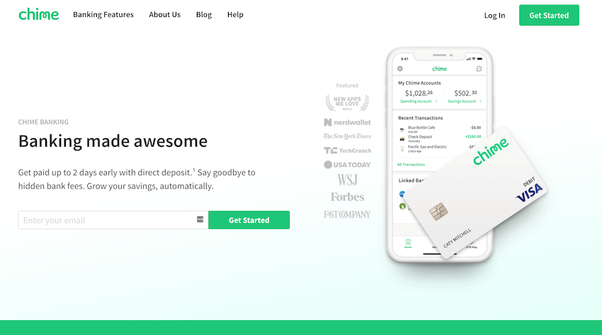
Minimalism
Minimalism in web design means doing more with less in your website. Instead of filling the page, you aim to include only what’s absolutely needed, with a simple, clean interface along with plenty of whitespace to allow the page to breath.
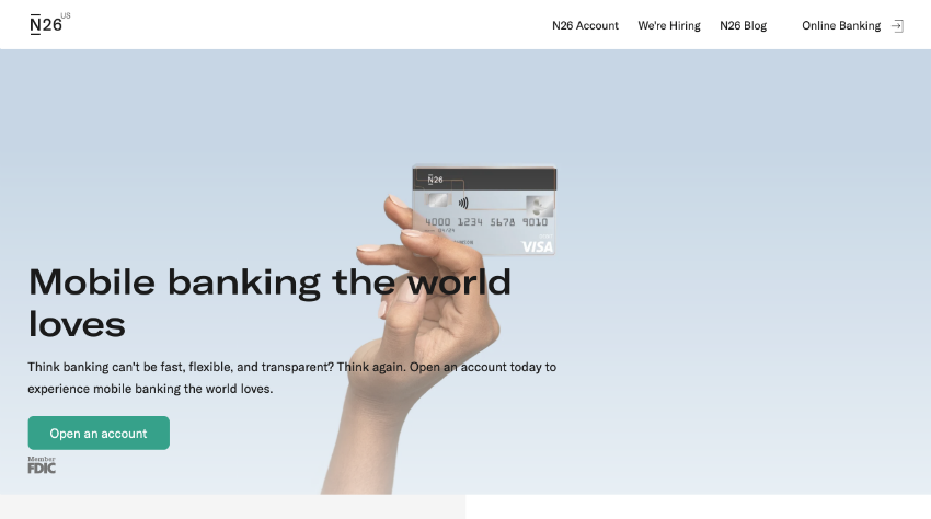
Examples of minimalism are being seen more and more, especially in financial services. Whereas the Fortune 500 financial institutions tend to have websites that are text-heavy and old-school in their design aesthetics, many new entrants are taking a clean, friendly, minimalistic approach.
For example, Chime Bank and N26:
Oversized Typography
A strong web design trend that’s a continuation from the past year is big, bold, oversized typography. There are many benefits to this type of design element, as it grabs your attention, dramatizes your message and delivers a strong, striking effect to your web design.
Innovative Uses of Video
Many companies started incorporating a video background in their home page hero over the past few years, but you should get ready for a new wave of innovation and exploration in the area of video in web design that goes far beyond background heroes.
For example, the Tesla website is full of various types of videos. Whether hero backgrounds or informational videos with text overlays or full-screen videos for dramatic effect, the site integrates video with animation throughout.
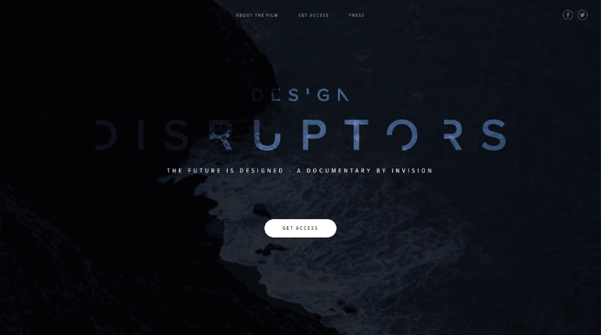
Various companies are going all in on branded video content, as well. For example, DesignDisruptors.com is a documentary produced by InvisionApp.
Engaging client features using video are a way of taking client testimonials to an entirely new level, as well, as expertly demonstrated by Salesforce and HubSpot below.
Web Design Trends Summary
As the digital hub of your marketing, your website is critical in bringing in leads for your business. Take note of the web design trends listed above to take your website to another level in 2020. From optimizing your site based on behavioral intelligence, to incorporating diagonal design to being more innovative with video in your website, these trends will help you to make your website more eye-catching, memorable and high-performing.