The Art & Science of a Successful Website

If you want your website visitors to go crazy for your brand, you’ll need a site that delivers not only visually, but also has the right messaging and enables your visitors to achieve their site objectives. Your website can be a dynamic centerpiece of your marketing that makes your audience say, “Awesome!” However, it takes proper planning and execution.
To that end, let’s explore the art and science of building a massively successful website.
The Art
The art of a massively successful website begins with the “Wow” factor. That’s the best place to start with your website design. If you don’t seize your visitor quickly, you may lose them – maybe forever. You want them saying, “Wow, I love this site!”
What ultimately creates the “Wow” factor will be different for each site. It could be the messaging or the visuals. It might be some tremendous offers, incredible insights or engagement opportunities. It may be the site’s simplicity and ease-of-use. But whatever it is, you need to know your audience and do what it takes to get them to go nuts about you.
Once your site has grabbed them, how do you want them to feel? Now we’re talking about your branding. You want to make an emotional connection with your visitor. What should their EXPERIENCE be? Your messaging and design need to integrate that experience with your branding.
Finally, how are you different from your competition? What makes your product or service unique? What will make your audience fall in love with your site vs. your competitors’ sites?
The Science
The science of a massively successful website begins with getting the results you want. Set your goals and determine your success metrics upfront. Are you looking for leads? Online sales? Engagement? In what quantity and within what time period?
Also, the design needs to be consistent – in navigation, color, and UI elements. Don’t confuse your visitors. They need to be comfortable as they explore your site. The end result is a better, more intuitive user experience.
The best design and all the creativity in the world won’t make a difference if your site is not focused on your users. What’s in it for them? Provide real value (and much greater value than your competitors’ sites). Help them solve their problems and achieve their goals. When they leave your site, they should be happier than before they arrived.
And remember to develop for speed. The average person waits two seconds for a site to load. After 10 seconds, half of your visitors will be gone. Keep your code clean, configure server caching and avoid the use of Flash.
Successful Websites
The following are a number of sites that do a successful job with the art and science of building an amazing site. First, let’s start with B2B website examples:
Captain Dash
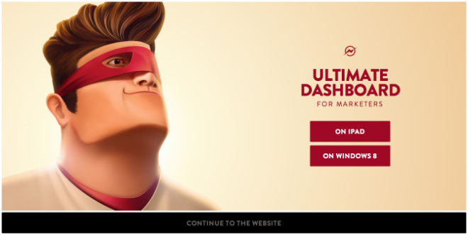
Through the effective use of a comics theme, the Captain Dash website is fun at the same time that it’s effective in communicating its message to its target audience of marketers.
Wave
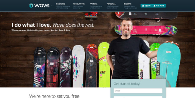
Wave successfully makes the complexity of accounting software simple, through a very visual and easy-to-navigate website.
Chartbeat
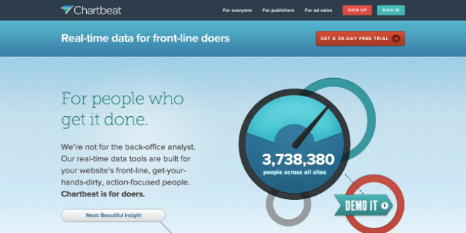
Chartbeat offers real-time web analytics, and the site entertains the site visitor with examples of its analytics in action right there on the site (for example, tracking how many pixels the visitor has scrolled down the page, etc.).
Catalyst
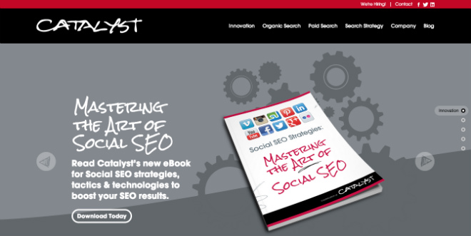
Catalyst’s responsive website is full of creative imagery, video and insights in support of the agency’s explorations in innovation.
SilverPop
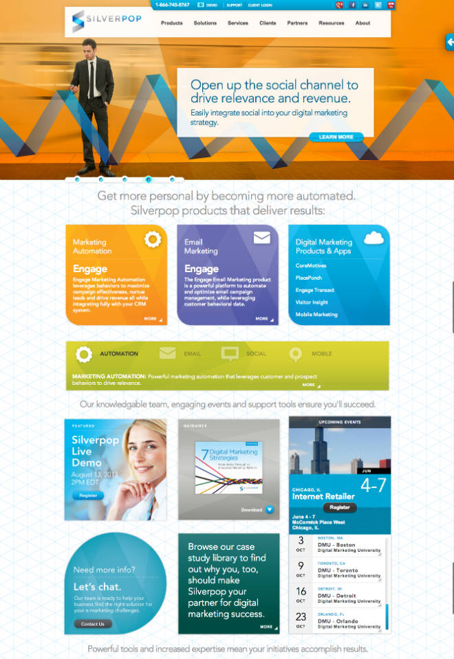
Silverpop does a good job of communicating its software options for marketers, and then goes way beyond this by providing a mountain of information through easily digestible and visually attractive elements. Whether it’s their events or special reports or access to live chat, it’s easy to get what you are looking for.
The following are B2C examples of sites that ROCK:
Reebok
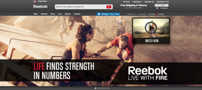
Reebok’s visuals are stunning, and they cover much more than merely product images (although their product photography is actually gorgeous, as well…). Whether the site is asking the site visitor to live with fire, or to try yoga or to jump into the world of cross-fit training, the site is an explosion of passion and energy.
Apple
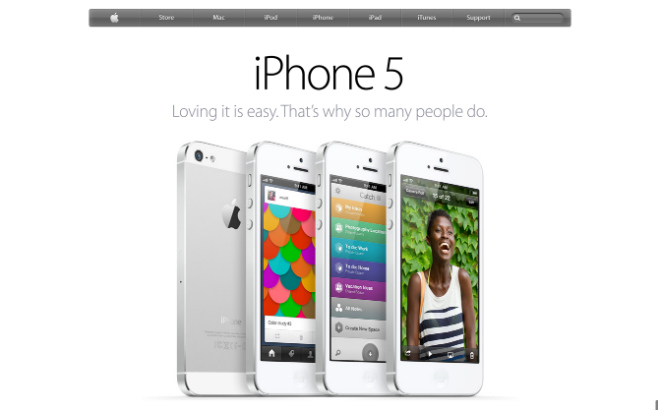
Apple is the quintessential website when discussing sleek, stunning and cool website design. To visit the Apple.com website is to fall in love with everything Apple.
TED Ed
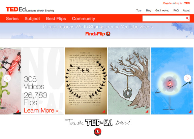
TED Ed is a site dedicated to the unique concept of allowing users to upload educational videos containing lessons to be shared with other users and even incorporated into their custom lesson plans.
Sugarpova
With stylish candy comes a super stylish website. The photography in the Sugarpova website is brilliant, matching the fun, fashionable flavors being offered on the site.
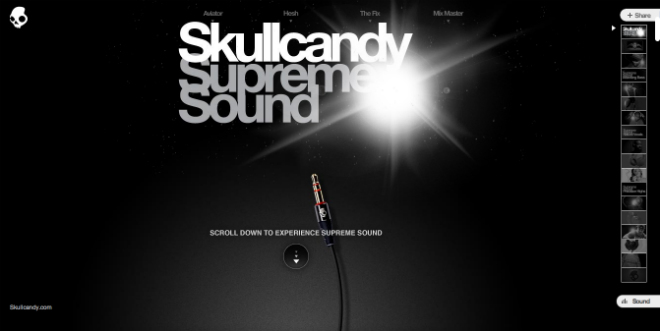
SkullCandy
The Skullcandy Supreme Sound Journey website, with its vertical and horizontal scrolling effects, is just as “rad” as the brand would suggest it should be. Very cool stuff.
Massively Successful
What is success? You’ll achieve massive success if your website is adding tremendous value for your visitors, and helping them to thoroughly enjoy the journey along the way. Whether it’s accounting software or cool headphones, your website can help you stand above the crowd, build loyal bonds with your audience and take your brand to new heights.
Your website is the face of your business. Make sure it provides a truly powerful “POP!” to your marketing.
