The Power of BIG in Web Design

Go BIG or go home!
Thinking big in design can be powerful. So can using big imagery, big typography, and big messaging to communicate your ideas. When these website design approaches collide, you can achieve explosive marketing results.
With this in mind, here’s a collection of website designs that employ big, large, and bold elements to deliver big, large, and bold results.
Full-Width Imagery
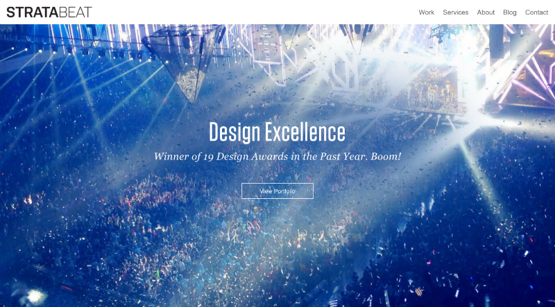
As the Stratabeat website itself employs, you can use full-width or full-screen imagery to make your message more impactful. We keep our messaging short and punchy, for a compound effect.
Immersive Design
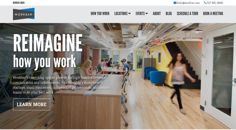
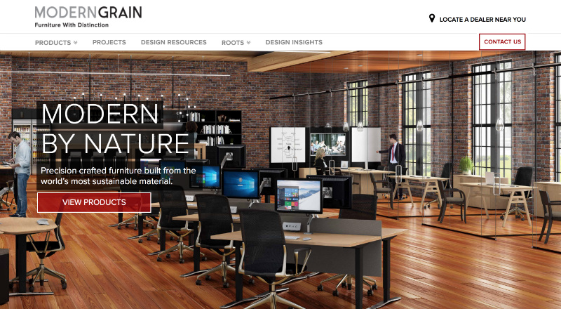
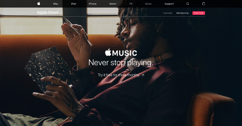
With the Workbar website, we wanted to transport the site visitor to the actual Workbar workspace so that they could feel what it’s like to actually be there and work there. This was achieved through a custom photo shoot, full-width imagery of the workspace, oversized typography, and thought-provoking messaging that tied directly to the imagery. Similarly with the ModernGrain website, a modern office furniture company, the idea was to use large imagery to help the site visitor gain an immersive sense of the beauty and sophistication of office space when filled with ModernGrain’s works of art. The third example below is of Apple Music, proving that you can create an effectively immersive experience even when bringing it all the way down to a personal level.
Huge Typography
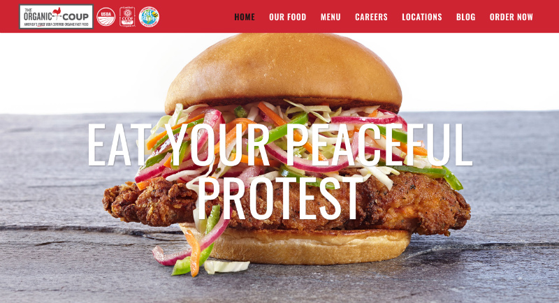
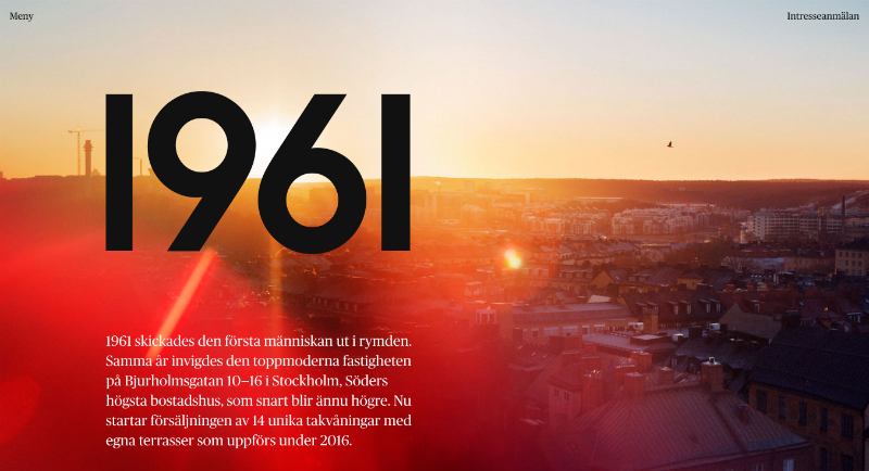
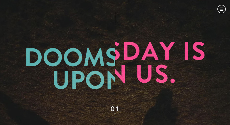
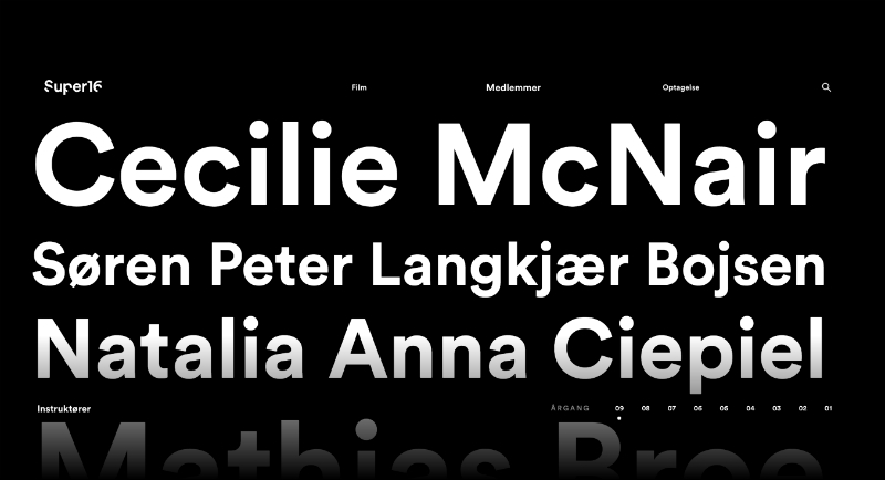
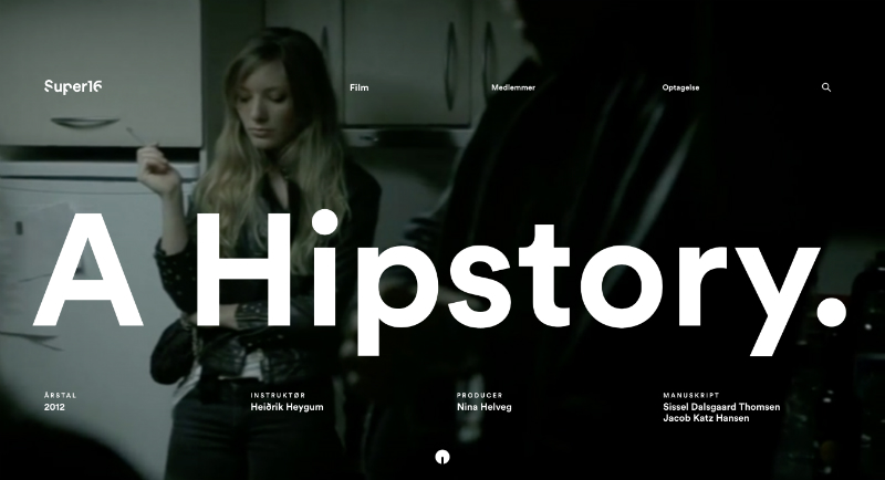
It’s not only images that can work effectively when fully sized. Using oversized typography can be just as powerful. Combining large copy with a strong message can intensify what you are trying to communicate, as seen in the web design for The Organic Coup, the first organic fast food joint in the U.S.
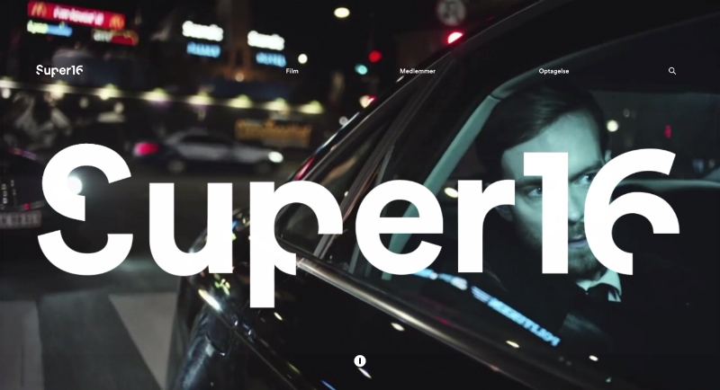
Here’s an interesting Danish website for an entertainment company filled with screens of oversized typography, whether the home page, credits page, or individual film pages. The huge typography delivers a stylish, confident, and uber cool feeling to the site.
Evoking an Emotional Response
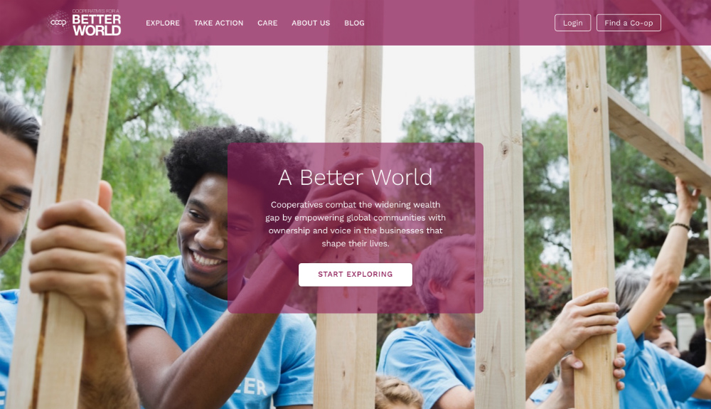
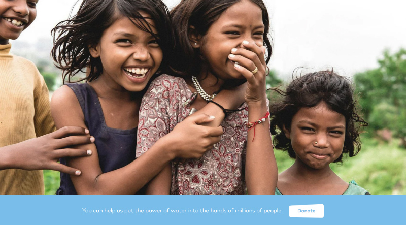
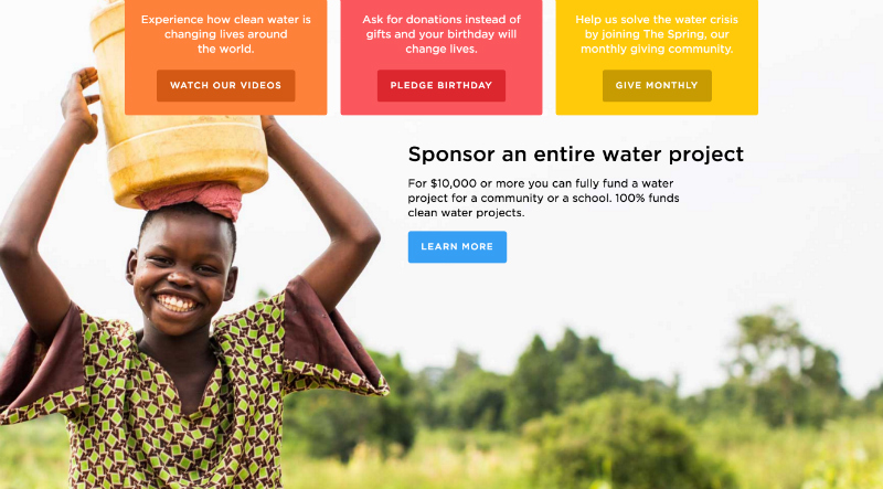
The human brain processes visuals 60,000 times faster than text. With that in mind, by using large images of actual people, organizations are better able to evoke an emotional response from site visitors in driving them to action. In the three examples below, you can see how non-profits specifically guide site visitors to donate, volunteer, and get involved. Try to imagine the following three examples with small images or with overly staged stock images, and it’s obvious that the impact would dramatically decline.
Also fueling the emotional impact of these particular websites are the organizations’ ambitious goals, whether empowering global communities or providing clean water to those in need around the world. Regardless of the type of organization, though, thinking big, having ambitious goals, and communicating through large visuals of people in contextually relevant environments all help to create a strong emotional response from site visitors.
Full-Screen Movement
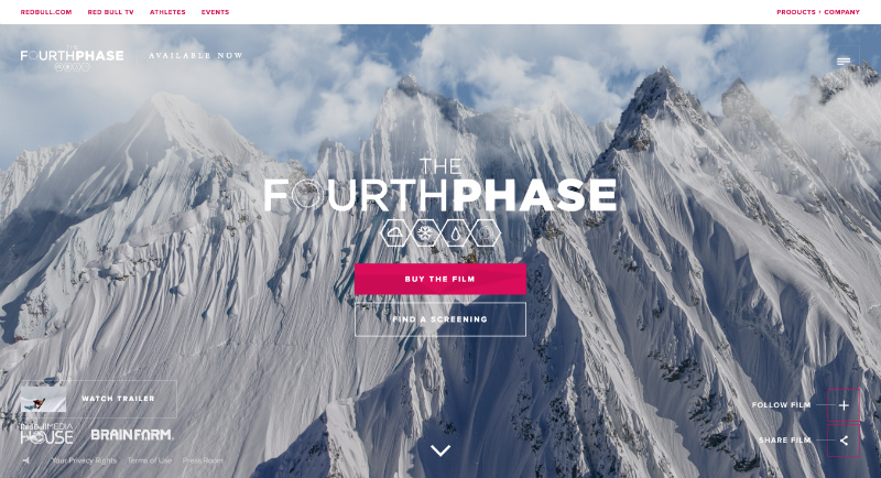
Video, animation, and movement present additional techniques for going big with your web design. Taking immersion to another level, The Fourth Phase is a film featuring iconic snowboarder Travis Rice and his team as they embark on a 16,000 mile journey to dreamlike landscapes around the North Pacific. Land on the The Fourth Phase website for breathtaking full-screen video. Take a trip to The Fourth Phase website, and move your cursor around the screen to experience the interactivity.
