The Fascinating Evolution of Logo Design Through the Years

A logo is a dynamic representation of your brand, ever changing to keep up with current design trends and evolutions in the market and your company. A static asset it is not.
In this way, logos are similar to homes. They are designed based on current styles and continually updated throughout their life to adapt to changing design trends. Like removing outdated shag carpeting from your living room and replacing it with hardwood, logos must be routinely analyzed and updated to ensure they evolve with the needs and expectations of the target market. The challenge lies in tweaking particular design elements while keeping the core elements of your logo the same to prevent a loss in brand recognition.
Logo Design Evolution
Over the past four decades, logos have experienced significant shifts in their use of design elements, including shape, color, shadows, backgrounds, typography, etc. Each of these elements has an impact on the look and feel of your logo, making each tweak vital in the quest for a design that will resonate with your current target audience. It is important, though, to ensure the logo is not being altered in such a way that it will no longer be recognizable to your audience. This balancing act is an ongoing challenge for even the largest corporations and can be highlighted by the evolution of Coca-Cola’s and Pepsi’s logos over the last 40 years.
1970s – 1980s Logo Design Trends
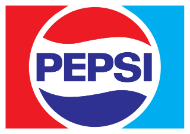
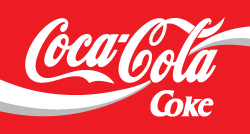
Throughout the 1970s and 1980s logo designs were dominated by bold colorful backgrounds that were in most instances square or rectangular in shape. The designs were also relatively simplistic. They primarily leveraged only a few core brand colors, flat design styles, and limited any cluttering details, which in turn directed the consumers’ focus directly on the icon and brand colors. Both Coca-Cola and Pepsi embraced these design trends throughout this time period as illustrated in the examples below. However, it was not long before they were adapting to the changing design trends of the 1990s.
1990s – 2000s Logo Design Trends
The 1990s and early 2000s saw a significant change in the way logos were being designed. Likely attributed to the emergence of 3D animation and the subsequent wave of design advancements, logos began incorporating three dimensional elements outside of simple accent shadowing. This change caused logos to look more like a piece of graphic art than the simple logo designs of the 19070s and 1980s.
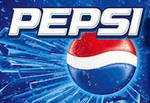
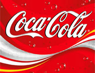
As illustrated below, Coca-Cola and Pepsi added carbonation bubbles and dripping beads of water to their logo designs. This was likely an intentional method of creating realistic design elements aimed at evoking a feeling of thirst from consumers. Furthermore, each brand added additional colors to their designs often blending them to create deep shadows for added depth. Typography was also given depth by adding accent shadowing behind each letter. Lastly, the backgrounds were updated further to include cluttering details. From swirled colors, to bubbles, to ice shards, consumers’ eyes were no longer drawn only to the icon and brand colors, but rather the collective feel of the overall design.
Despite these drastic changes in design, the core elements of each design remained the same. Regardless of the 3D elements, shadowing, colors, and clutter, the design is still directly in line with that of the previous decades, ensuring there is no loss in brand recognition. It’s through these modifications that the look and feel of a logo can change, while leaving its core identity intact.
Today
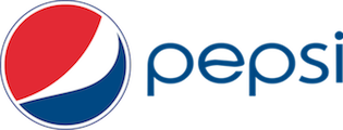
Today’s logo designs are falling more in line with that of the 1970s and 1980s, leveraging minimalism design as noted in a previous blog post, “Hottest Logo Design Trend of 2015”. As illustrated below by Coca-Cola and Pepsi, brands are increasingly removing backgrounds from their designs, which in turn is adding emphasis to the icon and typography. Additionally, they are reverting back to the simplistic use of colors, only leveraging a few core brand colors without blending them or adding shadow features. One of the primary reasons for these simplified designs is versatility.
As more of an emphasis is placed on mobile devices, it is increasingly important to have logo designs that will adapt well to these placements. The internet is littered with clutter, scattered information, spam, etc. Therefore, the more honest and simplified a brand can appear in this space, the more it will resonate with consumers. One key example is Google, which in 1998 was competing with several large search engines each of which cluttered their pages with dozens of links, advertisements, logos etc. Google was able to stand out from the pack by providing a clean and simple design of both their landing page and logo. This allowed consumers to avoid distractions and immediately focus on what they needed.

Conclusion
It is imperative to continually analyze your logo to ensure it is still reflective of the brand’s identity and in line with today’s design trends. Furthermore, brands should tweak design elements carefully to ensure that any changes to the logo do not sacrifice the brand recognition and equity of the original design.
Remember, shag carpeting used to be considered cool and stylish. I’m betting your current home, though, probably doesn’t have any nailed into the floors. Make sure your current logo isn’t decorated with any shag carpeting, as well.
