How Whitespace Transforms Your Web Design

Have you ever noticed that the more people are added to the team responsible for your website design, the more content they feel needs to be included on the page? An encyclopedia has mountains of content included, yet would make for a very poor representation of your brand. So, don’t add so much information to your site that you in essence turn it into an encyclopedia.
In strategy, what you decide to eliminate and say “no” to is just as important as what you decide to focus on. It’s with this in mind that you should prioritize the effective use of whitespace, or negative space, in your web design.
Whitespace is a fundamental building block of good design. All design schools teach it. All design students study it. And all brands should keep it top of mind as they develop new websites.
The benefits of whitespace are numerous, as outlined below:
Confidence
Whitespace exudes an air of confidence. Even with the same message, simply adding an ample amount of whitespace injects the feeling of confidence in a brand.
High-End
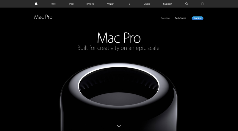
You’ll often see extreme amounts of whitespace in ads for the high-end of the market. This is because less is more. Cramming too much information and too many elements into a defined space makes a brand look less valuable. Allowing your design to breathe exudes a high-end, sophisticated, and premium feel.
Comprehension
As reported in a study by D. Y. M. Lin published in “Computers in Human Behavior,” whitespace
between paragraphs and in the left and right margins increases comprehension by almost 20%.
Usability
Visitors to your website have an objective when they arrive. How easy are you making their experience on your site in achieving their objective? Whitespace removes the “noise” and helps visitors find what they are looking for.
Organization
Whitespace delivers the perception that content is well organized. OK, your information should be well organized anyway. Whitespace enhances your ability to convey that to your site visitors.
Focusing Attention
With individuals encountering 3,000 to 5,000 marketing messages daily, your prospective clients are grappling with cognitive overload. With whitespace you can help them to focus on one thing at a time. Whitespace helps you to call out what’s most important, rather than overwhelming site visitors with a flood of equally-weighted information.
Emotions
With effective imagery and messaging, whitespace makes it easier for your design to evoke an emotional response from site visitors. Instead of forcing them to take in multiple equally weighted elements that fight for their attention, whitespace helps them focus immediately on the main message.
It Just Looks Awesome
Finally, if for no other reason, you should aim to incorporate whitespace in your web design because it really and truly makes your page look awesome. What better reason do you need?
