3 Costly Mistakes to Avoid When Designing a Logo

The Nike swoosh. MTV’s block “M”. Target’s red and white bull’s-eye. The World Wildlife Fund’s panda. Apple’s, well…apple.
These are some of the most iconic logos in recent American history. They are strong, versatile, and memorable.
Like these brands, your logo should leave a lasting and memorable impact on your audience. Its design should be easily recognizable, unique from competitors, and of course, visually appealing.
However, the design process cannot stop there. Designers must think strategically about how and where the logo will be used to ensure it remains visually stunning across any medium. Failure to take usage into consideration can, and likely will, result in costly revisions to your newly created logo.
Want your logo to be as iconic as the Nike swoosh? Start by avoiding the following three common mistakes when creating a new logo.
1. Thin Lines and Intricate Detailing
Too often we see brands incorporating complex and intricate detailing into their logo designs that may look gorgeous in an initial PDF, but significantly hinder effective usage across mediums. Thin and complex lines can easily become distorted and bitmapped online, most commonly when a small size is required such as with a favicon. Think strategically about how well your logo will display across your website, blog, social media, email, and ads. Thin lines and small details do not just affect online usage; they also can affect offline branding such as apparel,marketing collateral, and business cards.
With apparel, thin lines and delicate details can rule out embroidery and other options. If you were adamant about creating embroidered items, you’d most likely need to create an alternative, simplified version of your logo. As for business cards, although thin lines may not affect the printing of the cards themselves, they will limit design features you can incorporate into your card, most notably embossing or debossing. Because the logo must be hit accurately during the embossing/debossing process, the thin weight of the lines makes it extremely difficult to perform precisely. This is in turn limits your business card design to more standard printing practices, potentially resulting in a lack of unique characteristics to help your brand stand out.
Below is an example of a beautiful logo design from Amouria. However, its complexity in lines will significantly limit its usage.
![]()
2. Too Many Colors
A logo should not rely solely on its color palette to be a beautiful design. In fact, as a best practice, logos should be designed in both black and white as well as color variations for versatility across different mediums and background color schemes. Begin by creating your logo in black and white to ensure an aesthetic design absent of color. Only after you love your logo in black and white should undergo a color exploration.
Since offset printing is recommended for high quality printing, and each color is an added cost due to the added complexity of the printing process, we recommend limiting your colors to only what best represents your brand identity while complementing the aesthetic feel of your logo. As a general rule, logos should typically use no more than three colors, a primary, secondary, and tertiary color. This will in turn provide enough opportunity to incorporate your brand colors into your logo without distracting from the overall design aesthetic and inflating printing costs.
The mixing or overlapping of colors to create color shades should also be avoided as this can limit your options for embroidery due to the defined colors of the stitching. The threads cannot be blended to create shades, therefore your embroidered logo will often look very different than your true logo design. If you plan on printing your logo using high quality printing methods or embroidering, be sure to use a maximum of three colors without overlapping colors.
Below is an example of another beautiful logo. The complex use of color here will unfortunately result in a black and white logo that lacks coherence as well as in difficulties in both offset printing and embroidery.
![]()
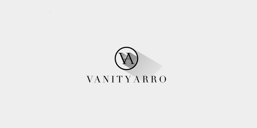
3. Shading, Reflection, and Shadows
Similar to overlapping colors, shading, reflections, and shadows should also be avoided when designing a logo due to the complications with offset printing and embroidering. Although the use of shadows and reflection can enhance the aesthetic of your logo across one medium, such as online, it prevents you from taking full advantage of the design you have created to represent and showcase your brand.
Take, for example, the logo below. Despite a gorgeous and sophisticated design, its use of shadowing significantly limits how it can be used across mediums. Although the shadow creates a sense of depth when digitally printing or displayed online, this design element would be lost if attempting embroidery or offset printing. Therefore, when designing a new logo, ensure the logo design can stand on its own without the use of shadowing, reflections, or shading. Use these elements only to enhance your logo when appropriate to ensure you don’t back yourself into a corner when it comes to the versatility of the design.
Designing an amazing logo can help to define a brand. However, you need to think through the versatility of what you’re designing. Be sure to consider all aspects of how and where your logo will be used (or might be used) to prevent costly revisions and redesigns.
It’s important to remember that one of the goals of your logo design is to make a memorable impact on your audience. Complex designs are more challenging to recall than their simplified counterparts. Like the Nike swoosh or the World Wildlife Fund’s panda, try to keep designs relatively simple, versatile, and capable of standing the test of time as your business evolves.