The Hottest Logo Design Trend of 2015
It’s simple, really. The year 2015 is proving to be the year of simplicity in the world of logo design.
One major brand after another is rethinking its branding and is designing simplicity in not only its logo, but also its overall identity. The trend is partly an attempt to adapt to a new world of diverse devices and screen sizes, and for many brands the move towards simplicity is a welcome modernization of an existing logo. The following are a few recent examples of major brands that went through a logo reboot this year in the spirit of simplicity.
Lenovo
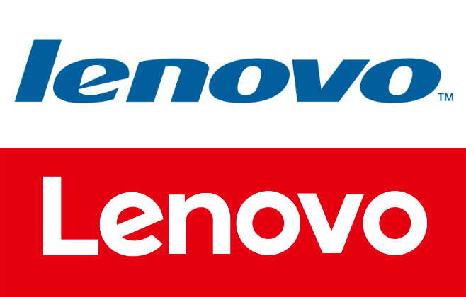
After acquiring IBM’s ThinkPad line of laptops in 2005, Lenovo has gone on to introduce workstations, servers, storage, tablets and smartphones to the market. In other words, it’s a growing, global entity. The Lenovo blog explains that the new logo is made up of two elements: the word Lenovo and the containing frame. The word Lenovo is now more readable to avert pronunciation issues around the world. The containing frame “acts as a window into culture and the world that surrounds us, housing a range of images, colors and patterns.” David Roman, Lenovo’s Chief Marketing Officer, goes further in explaining that the box mirrors Lenovo’s new, innovative attitude, with just about anything able to fit in the box based on the context, whether different colors, materials, animation, video, etc. Compared to the old logo, this rebrand gets a thumbs up.
![]()
After coming out with a new, clean and flat logo in 2013, Google reorganized and rebranded under the new Alphabet brand umbrella this year. And now, it has introduced a new, even simpler Google logo. Tamar Yehoshua, VP of Product Management, and Bobby Nath, Director of User Experience at Google, explain that the new logo is meant to help Google adapt to the new era where a brand needs to work seamlessly across devices of every shape, size and dimension. “We think we’ve taken the best of Google (simple, uncluttered, colorful, friendly), and recast it not just for the Google of today, but for the Google of the future.” Although the new logo is childish, the old logos were as well and they certainly served the company effectively for many years.
Quirky
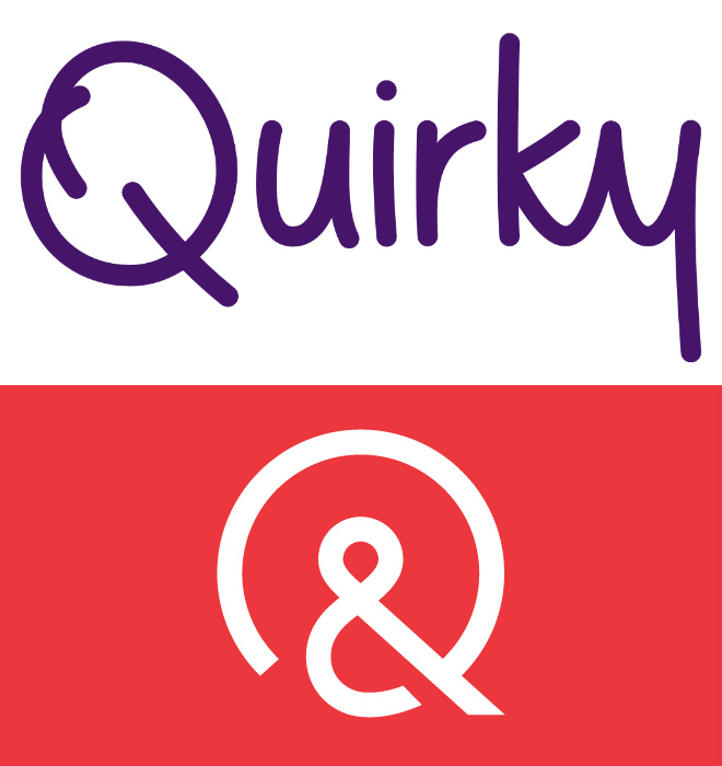
Quirky brings inventors’ ideas to life through community submissions. The company just replaced its logo from two years ago, which had replaced a logo from two years prior. At least for the next two years, Quirky seems to have cleaned up its logo from a fun, somewhat childlike, hand-written logotype to a simple, clean and symbolic logomark. For a company that is now running TV ads and trying to be taken more seriously, the timing for a more mature logo makes sense. Quirky is all about collaboration, and the ampersand works as an appropriate metaphor.
Facebook used to have a very basic logo. With its redesign earlier this year, the social media company now has, well…, a very basic logo. Facebook’s Josh Higgins explained to Brand New that Facebook “set out to modernize the logo to make it feel more friendly and approachable.” It’s surprising, though, that Facebook did not take more ambitious aim at its logo. With that said, by cleaning up the extraneous shadow at the base of its “F” icon logo, and by introducing thinner lettering and by switching from a double-story to a single-story “a” in the full-word-version of the logo, the new look is a move in the direction towards a more mature logo. Plus, the new logo will work better on mobile devices.
StubHub
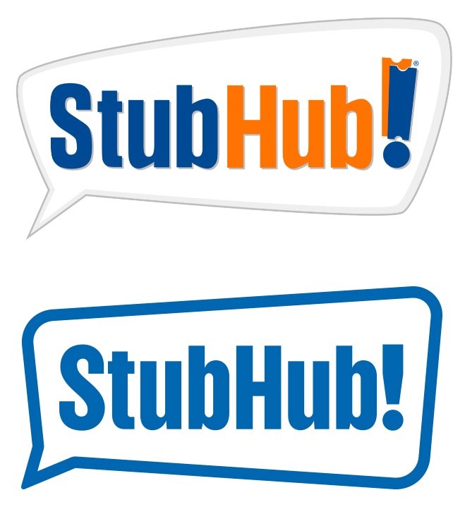
StubHub used to be merely a place to buy tickets on the secondary market. That identity is about to change, if StubHub has any say in the matter. The company launched a new, simplified logo in support of the broader, more holistic, end-to-end event experience company it aims to be. Bridget Burton, Head of Brand Management & Creative at StubHub states, “For us, it’s about our evolution.” The new logo “relates to where we’re going as a company.” The single color moves away from the comparative complexity of the prior duotone logotype with third-color word bubble. It also removes the tickets from the exclamation point, in line with the company’s move away from the ticket reseller image. Overall, a good, clean move to modernize the company.
Verizon
![]()
In an effort to transform itself beyond a telecommunications giant, Verizon rebooted its logo this year. Whereas the old logo had a slightly italic feel, along with a stylized checkmark above and a stylized “z” flowing beneath the logotype, the new logo boasts a clean, simple logotype and a surprisingly rudimentary checkmark to the right of it. The new logotype is certainly clean, more modern and easier to read. The Verizon website explains, “At its most basic level, the new logo is a visual statement that honors our history and reflects an identity that stands for simplicity, honesty and joy in a category rife with confusion, disclaimers and frustration.” Just wish they had put more thought into the checkmark!
Fantastic 4
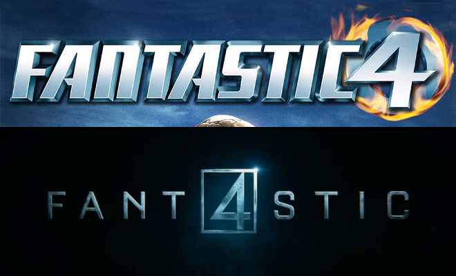
Four outsiders gained superpowers acquired while manning an experimental rocket and became the Fantastic 4, arguably the foundation of the entire Marvel universe to come. The new Fantastic Four movie is a reboot of the film franchise, and in that vein, the new logo is a reboot from prior versions as well. First, the logotype in the new logo is cleaner. In addition, moving the number “4” to the middle of the word “Fantastic” adds symmetry and balance, making the logo feel more grounded than prior versions. Transforming the circle around the “4” to a square makes the logo feel sturdy and solid, with the four corners of the box possibly in reference to the four members of the team (but also working well in social media platforms). Overall, it’s a cleaner and simpler approach to integrating the number “4” into the logo.