Increase Your Conversion Rate by 83.23%

Any savvy B2B marketer wants to increase conversion rates and leads. And you can start by rethinking your landing pages.
Your landing page is the precise fulcrum where you are either going to convert a boatload of visitors, or you are instead going to be thoroughly disappointed. Therefore, it’s one of the most critical areas on which to focus in your digital marketing.
Yet, ridiculously, for every $92 spent acquiring customers, only $1 is spent converting them, according to Bryan Eisenberg. Think about that. Let’s say a B2B marketer is aiming to drive whitepaper downloads. They spend 92X more marketing dollars bringing them to a web page than they do ensuring that the prospect takes the desired action of submitting a form and downloading their publication. This is the equivalent of inviting folks to a party, and they arrive at your front door only to find that the door is jammed shut. That’s just nuts!!
Recently, Digital Marketing NOW worked with a client to revamp their landing pages. The result? An 83.23% increase in conversion rate over the historical baseline rate.
How did we do it?
- We conducted many, many rounds of A/B testing.
- We increased the visuals on the page.
- We moved the form to the top of the page.
- We added multiple, large client testimonials to the page.
- We added a distinct benefit statement to the top of the form.
- We added trust icons.
- We customized the header for each campaign or ad group.
We focused and spent the time to figure out how to get all those visitors to take the specific action we wanted them to take. We ignored the aforementioned 92:1 ratio that most marketers apply, and instead made landing page conversion optimization a core goal.
Increasing traffic is great, but without ensuring that the increased traffic is converting at a high rate, you are missing out on great volumes of leads and potential new revenue for your business. Worse, you might be providing a poor brand experience, leaving your prospects with a bad impression of your company’s ability to fulfill their business needs. In other words, your landing page could actually be doing longer-term damage to your business. Ouch!!
So, if you are ready to increase your landing page conversion rates by 83.23%, invest the time and energy and make it a priority in your marketing mix. To get the ball rolling, try following these simple steps.
Rethink Your Call-to-Action
What is the goal of your landing page? It may be to have leads sign up for a free trial, register for a webinar, or download a whitepaper. The lead most likely needs to fill out a form.
So don’t give them another choice. Remove all navigation from the landing page. These extra user pathways are not only not necessary, they distract your audience from the task at hand and hurt your conversion performance. Give the lead no other choice but to fill out the form. This makes the next step crystal clear, and will increase your lead rate.
Then ensure that the call-to-action is obvious and straightforward. For example a large, colorful, call-to-action button, or an arrow pointing out the directions.
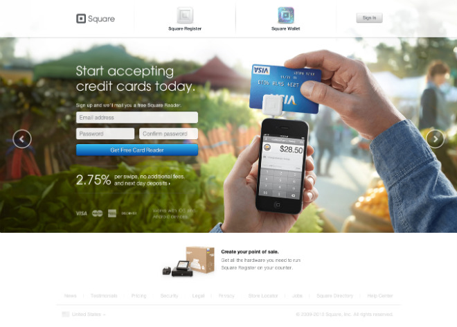
Make the text in the call-to-action button as descriptive as possible. In the example below, Square uses the text “Get Free Card Reader”. This is obviously much more effective than “Submit” or “Get Started”.
And remember to consider the color of your call-to-action button. Test different colors, but remember that contrasting colors tend to perform comparatively well. In other words, if your page already is dominated by the color green, try a red (for example) call-to-action button instead of a green one even if green would be more seamless from a design perspective.
Rethink Your Message
Show your landing pages to someone who is completely unfamiliar with your company. Do they understand what you are offering and why? If not, take a step back, and answer these questions.
- What is your audience’s specific pain point, and how will your product or your service eliminate it?
- How will you make their business lives better?
- How can you connect on an emotional level with your audience?
The message on the landing page should focus on your lead. They have a problem, they found you, and they want a solution. They are thinking about themselves, so you have to, as well.
For example, a start-up is in the process of being acquired, and they are looking for a virtual data room to store their sensitive documentation. The virtual data room company isn’t just offering a place to secure Word documents. Instead they are offering something much larger, with significant legal and financial ramifications. They are offering a vehicle to facilitate a faster, stress-free M&A process, by offering the company complete protection of their sensitive financial and IP information. In this scenario, it would behoove them to test messaging around these types of benefits.
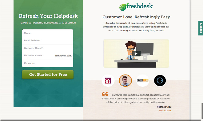
In the example below, Freshdesk makes their value immediately clear: “Customer Love. Refreshingly Easy.” Any customer support manager would be interested in a message like that. The statement “Start Supporting Customers in 29 Seconds” also helps.
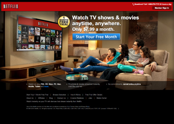
In the Netflix example below, the landing page is clear about the benefit of a Netflix membership — you get to watch TV shows and movies anytime, anywhere, for a mere $7.99 a month. Pretty cool.
Rethink What You Need from Your Leads
Shorten your form! People generally dislike giving their personal information; some may even go so far as providing a fake name.
So rethink. What do you REALLY need from them initially?
Are you able to retrieve additional information later in the sales cycle? For example, can you request just an email address? Then once you have that, send useful emails to the prospect, build a relationship, and then request additional information. They will be much more open to providing details once trust is garnered. This method is called progressive profiling, and a terrific way to build a comprehensive lead base, for which you can gather several pieces of demographic and psychographic information throughout the sales process.
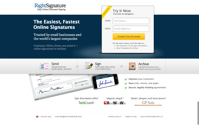
In the example below, RightSignature simply requests the visitor’s name and email address. Short and easy. Nice!
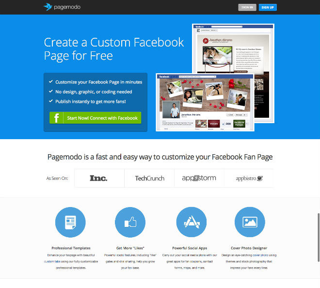
In the example below, PageModo enables the visitor to start using its software platform just by logging in with Facebook Connect. Simple, fast and intuitive for the user. Very smart!
Keep in mind that no matter how short your form is, leads may still be hesitant to enter their information. To ease their worries, speak to your privacy commitments. Not just a link to your boring privacy policy. Instead, state it directly on the landing page. How do you plan to use (or not use) their information? And to further win their trust, include security icons, association logos, and client testimonials.
In the end, how you incorporate all of these conversion optimization tips will change your results. So, test, test, test. Analyze the results, and then test, test, test again. Just like lifting weights, the more you do, the stronger you become. So continue optimizing your landing pages to achieve sky-high conversion rates that will make your CEO smile ear-to-ear.
For additional tips on landing page conversion optimization, check out our post “Steroids for Your Landing Page Conversion Rates.”
